This weekend sees the release of 2015's latest animated feature, Hotel Transylvania 2, and it is somewhat hard to get excited for it. Being an animated sequel will do that.
![]()
Being a movie where all the shots were being called by Adam Sandler will do that, too. Being an animated sequel under the control of Adam Sandler in the same calendar year that witnessed the deeply repugnant Sandler vehicles The Cobbler and Pixelswill do that most of all. But let me put on my bravest face and try to tell you about the thing that is noble and interesting about Hotel Transylvania 2 despite all the obvious ticks against it: it's a Genndy Tartakovsky picture.
"And who is Genndy Tartakovsky?" you may now be asking yourself. I very much hope you are, since answering that question is the reason we're here now. The simple answer is that Tartakovsky is one of the great stylists in contemporary American animation.
His signature aesthetic, of angular figures with giant oval eyes, all outlined in thick black lines, has been one of the most reliable contrasts to the "make it more realistic!" impulse behind the Disney/Pixar-driven approach of damn near all theatrical animation made in the States, and a huge influence on television animators of the Cartoon Network tradition.
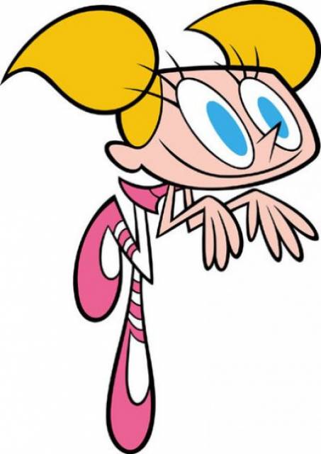
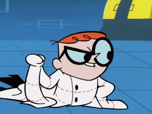
For it was at Cartoon Network that Tartakovsky made his first big splash. He was the creator of Dexter's Laboratory, and directed several episodes of The Powerpuff Girls, created by his CalArts classmate Craig McCracken (who wrote and storyboarded Dexter's Laboratory, because that was pretty much the way these things went on those turn-of-the-century CN shows). While not identical – Tartakovsky's designs had much sharper corners than McCracken's collection of circles – the two shows were part of a generation of brightly-colored, simplified cartoons which set a basic stylistic template that continues to be mined by animators looking for a freer look than Disney's fussy precision (ironically, Disney themselves adopted the style in their new series of Mickey Mouse shorts).
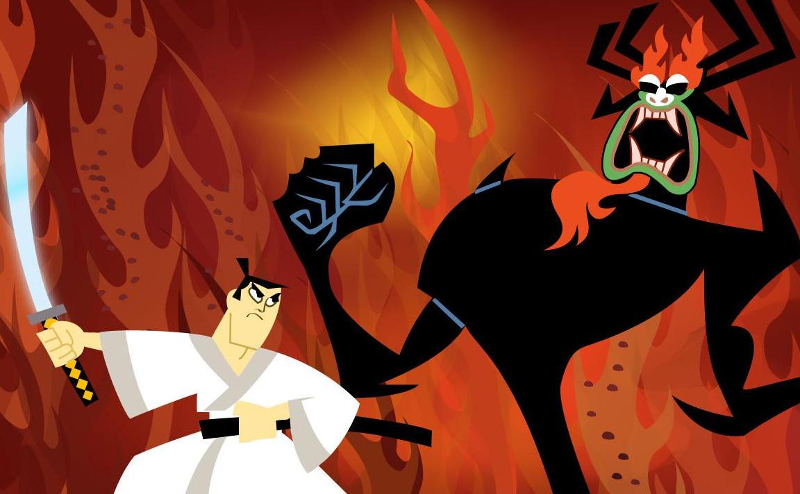
The success of Dexter's Laboratory enabled Tartakovsky to create what is surely his signature work, the 2001-2004 series Samurai Jack. The fantasy/sci-fi/samurai/action hybrid is a one-of-a-kind marvel, blending design elements from Japanese anime and the Cartoon Network house style, and running both through an aesthetic that reduces objects and people to almost abstract arrangements of geometric shapes and color. While it never sacrifices its essential nature as a bright action cartoon for kids, Samurai Jack comes powerfully close at times to being graphic art. The content is more than a little batty, and the genre certainly doesn't seem like it should be everybody's cup of tea, but the potency and originality of the style are more than sufficient to secure the series a position at the very peak of contemporary animation.
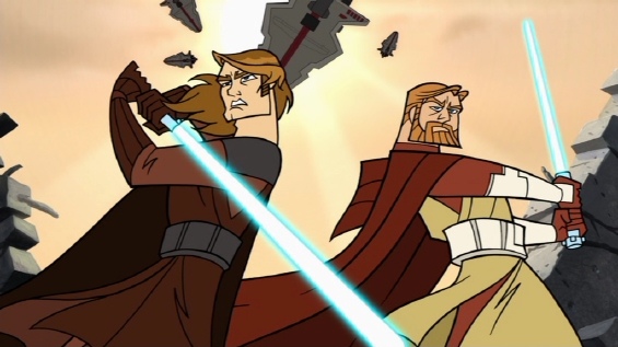
Hot on the heels of Samurai Jack, Tartakovsky was nabbed for the high-profile job of producing a series of micro-narratives set in the Star Wars universe: the first iteration of a Clone Wars cartoon series, first produced in 2003 to fill the gap between 2002's Star Wars: Episode II – Attack of the Clones and 2005's Revenge of the Sith. It's easily – objectively, even! – the best thing to come out of the whole dubious project of the Star Wars prequels, owing above all to its smooth, gliding style, and Tartakovsky's gift for boisterous cartoon action sequences, as honed by Samurai Jack. While the constraints on the series as a narrative, and as a top-down corporate object, both keep it from reaching anything like the heights of Tartakovsky's earlier work, Clone Wars is, in its own right, the equal to any other TV cartoon of its decade.
Following this, and for no apparent reason, Tartakovsky's career downshifted. His next major project wouldn't appear until 2010, in the form of Cartoon Network's Sym-Bionic Titan; this was unceremoniously cancelled after one season. He made his debut in theatrical animation two years later, but in the most inauspicious way possible: he was called up to fix Hotel Transylvania for Sandler after previous directors had no clue what to do with it.
Tartakovsky did the best job of it one could imagine: while the script for Hotel Transylvania is an absolute waste of trite, Romeo & Juliet boilerplate, it's one of the very few CGI animated features that actually resists the arch-realistic impulses of the post-Pixar tradition. Indeed, the animators almost seem to have taken it as a challenge: given the realistic lighting and textures of CGI, how far is it possible to push the stretchy cartoon extremes of character faces and body shapes?
![]()
Reasonably far, is the answer. Hotel Transylvania is hardly the most visually impressive animated feature of recent vintage, but the characters are at least a real triumph: elastic, highly expressive, with the giant ovoid eyes of Tartakovsky at his best. It's a rare example of a major animated feature that comes from the tradition of goofy cartoons, exulting in the loopy, unrealistic excess which that art form, at its pinnacle, can do so well. And in Hotel Transylvania 2, he pushed his animators to go even further in that direction, trying to find some way to put a personal stamp on a film that Sandler fought him on.
![]()
This is not, of course, reason enough for me to insist on all of you rushing out to see the film. But it's enough that I'm not going to root against it, and hope that it finds enough success to get Tartakovsky's inexplicably off-track career (as outlined this week in a wonderful Cartoon Brew interview) back to where it deserves to be.