"The Furniture" is our weekly series on Production Design. Here's Daniel Walber...
 Kirk Douglas nearly drove himself over the edge while filming Lust for Life, inhabiting the character of Vincent van Gogh with a tenacity akin to the Method. The result was an Oscar nomination, likely the closest he ever came to a win. His emotionally volatile performance lends real weight to the oft-sensationalized biography of history’s most famously mad artist.
But the success of Lust for Life isn’t owed entirely to Douglas. Director Vincente Minnelli was a perfect match for the material, which necessitates a balance between the beauty that Van Gogh saw in the world and the feverish passion that drove him away from it. The Oscar-nominated production design team, led by frequent Minnelli collaborator Cedric Gibbons, offer a rich vision of the French countryside that serves as an essential counterpoint to Douglas’s madness.

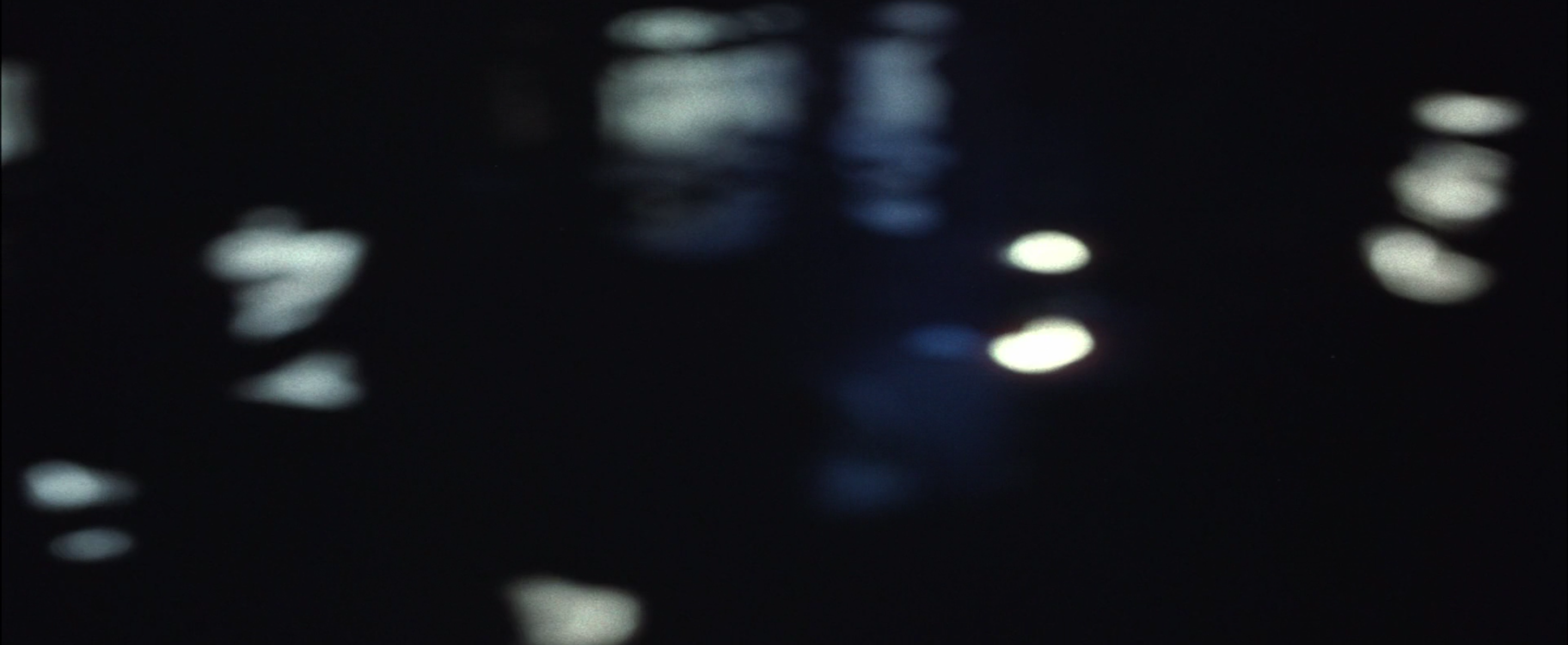
Douglas’s Van Gogh is a man who has tremendous feelings but no socially acceptable way to express them. This pent up energy manifests in his shouts and body language, but it also dominates Russell Harlan’s cinematography. Here’s the most obvious example, a moment of deep emotion that causes a canal to fall out of focus and thus resemble "Starry Night".
The designers counterbalance the more flamboyant outbursts of Harlan and Douglas. They present Van Gogh’s paintings as true to life, as much the result of his artistic spirit as the self-evident charm of his real surroundings. Some sets are near-exact copies, like his famous bedroom at Arles.

There are also replicas of his paintings, in various states of completion. These carefully detailed decorations may very well be the primary reason that the film’s design was recognized by the Academy.

Yet I’d argue the real triumph of the design team is in the subtler details. Between his sensational life story and the fantastical mood of his late masterpieces, it can be easy to forget that he painted many scenes of labor and nearly 100 still lifes. Gibbons and his team reconstruct many of these tableaux, paying tribute to Van Gogh’s own precision.

Other props add an earthy context to his peasant portraits. Van Gogh’s real depiction of this woman consists only of her face and her enormous white hat, but Gibbons et al expand upon her smile with a large bowl of potatoes.

Minnelli frequently cuts from a reenactment and to a still image of the actual painting, but not always. Sometimes the reference is much more oblique, like this pile of books that calls to mind one of Van Gogh’s earliest works.

These references accumulate, to the point that props suggest artistic inspiration in nearly every shot. Fruits and flowers often draw the eye. This picnic, for example, would make an excellent still life.


Gibbons and his team fill many a set with works of art. Every apartment or house in which Van Gogh lives is practically wallpapered with his own compositions. His artist cousin lives in a similar condition, and his art dealer brother is always surrounded by his trade.
