It's our new Production Design series, "The Furniture." Daniel Walber kicked things off last week with the bedroom in The Exorcist. Now a different era and public spaces - Editor
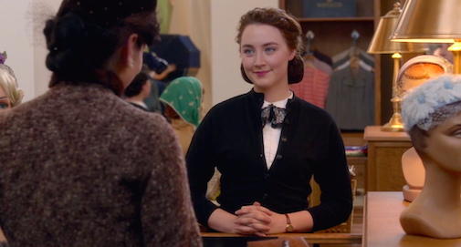
Thanks to Brooklyn and Carol, 2015 was a banner year for the 1950s department store. Both Eilis and Therese spend a fair amount of time as New York City shopgirls, selling to housewives and dealing with stern floor managers. Yet, despite the ostensibly common setting, Brooklyn's Bartocci's and Carol's Frankenberg's could not be more different.
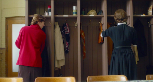
The staff areas are a good place to start. Bartocci’s has a simple enough space for its employees, with open coat lockers to keep their belongings. It’s not beautiful, but the wood lends it a cozy quality. Production designer François Séguin (The Red Violin) and art directors Irene O’Brien (This Must Be the Place) and Robert Parle (Riddick) have a subtle, but assured touch. [More...]
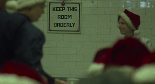
Frankenberg’s staff cafeteria, in comparison, feels subterranean. The walls are covered in the grim white tile of subway stations. A sign on the wall reads “KEEP THIS ROOM ORDERLY.”
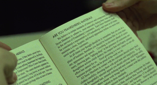
But Therese seems not to notice, instead burying her nose in the store’s manual, another fine example of Frankenberg’s factory-esque ethos. This little book is a striking example of Carol’s detail, expertly arranged by production designer Judy Becker (interviewed) and art director Jesse Rosenthal, who previously worked together on Silver Linings Playbook and American Hustle.
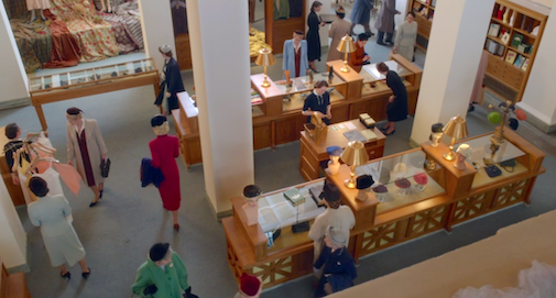
The difference in tone is even more obvious in the showrooms. Bartocci’s is bright, its display cases surrounded by warm woods and brass lamps. The occasional overhead shot of the space shows that it’s a very open space, bustling with women in bright colors and tasteful hats.
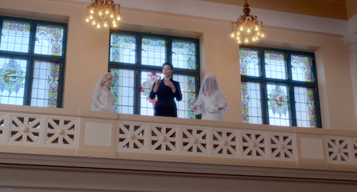
The ceiling is high and there's plenty of natural light, a fact made ever more clear by a shot of Eilis's supervisor watching her from above. The balcony, its bridal mannequins posing in front of stained glass, is about as lovely as a shopping center can get.
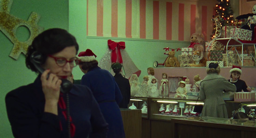
Frankenberg’s showroom, meanwhile, matches the staff room's underground vibe. The space is crammed with toys, all the way up to the evidently low ceilings. The walls are painted mint-green and accented peppermint wallpaper, as if the entire building has been remodeled to participate in this muffled display of Christmas cheer.
The doll cases in particular have an air of strained daintiness, much of which supplied by their own odd wallpaper.
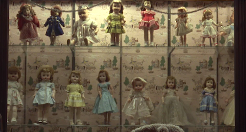
They're also thrown under the bus by Carol’s script, which distinguishes Therese as a girl who was more interested in train sets. The lifeless, occasionally creepy little model children are presented in opposition to the real people. Their miniature clothes, precious examples of stultifying 1950s femininity, have little in common with the costumes of Carol and Therese.
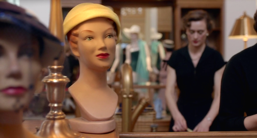
Brooklyn, meanwhile, has much less objectionable mannequins. Here, the production design and the costumes agree with one another. The disembodied head models wear hats that we might imagine Eilis wearing. She fits right into the store, and eventually does so quite happily.
Which, of course, all reinforces the dramatic role of Bartocci’s. The store is part of Eilis’s New York experience, a positive element in her growth toward self-fulfillment in America. Frankenberg’s, meanwhile, is the opposite. Therese grows out of it, just as she grows out of life with Richard. These settings are both entirely believable representatives of the department stores of the 1950s, but each is also imbued with dramatic meaning. And their production design is instrumental in communicating that to the audience.

more on Production Design | more Carol | more Brooklyn