By Daniel Walber.
 The Emmys can be, for lack of a better word, boring. Television is in a "Golden Age," or so everyone says, but its Academy has a tendency to reward the same shows every year. This phenomenon doesn’t only happen at the top of the ticket, either. Game of Thrones has been as much of a mainstay in tech categories as Modern Family was in Best Comedy Series.
And so, rather than fully handicapping the five production design races, I’d like to share some more modest hopes for this year’s winners. Here are some selections from my favorite work in the category, regardless of the odds.
Outstanding Production Design for a Narrative Contemporary or Fantasy Program (One Hour or More)
This is the Game of Thrones category, and it’ll probably stay that way. That said, I find the work on Penny Dreadful a lot more intriguing, at least for this season.

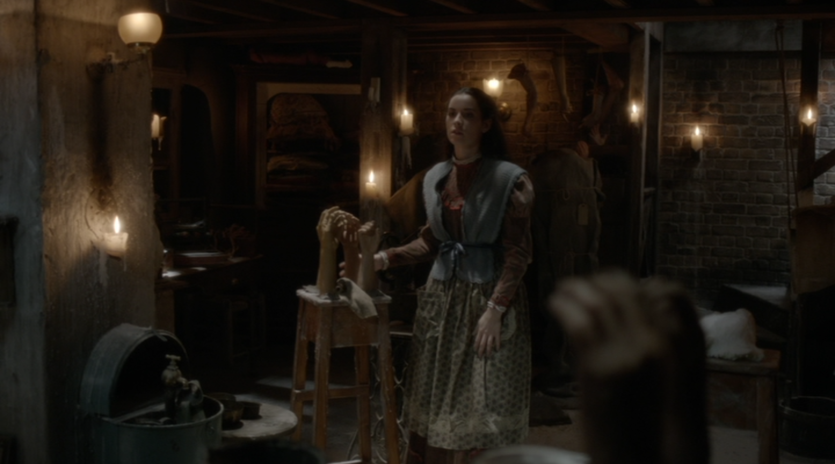
In just one episode, “Evil Spirits in Heavenly Places,” there are at least three sets worthy of recognition. The work so lavish that one wonders if it was canceled because it was too expensive...
The first is the basement of the wax museum, where the blind Lavinia Putney crafts the figures. There are contorted heads, just like the “Hall of Faces” in Game of Thrones, but the mood here is extended by limbs and hands. It’s horror deconstructed, as fascinating as it is unsettling.
On the surface, the wax museum is a world apart from the ladies’ atelier where Vanessa Ives and Victor Frankenstein shop shortly after. Take a step back, and you realize that both spaces are full of incomplete figures, headless mannequins that model the latest in Victorian fashion. The mood is almost imperceptibly extended even into the episode's less immediately creepy scenes.

The enormous table tennis parlor where Dorian Grey takes Angelique is as impressive as it is unexpected. It has all of the charm of Victorian amusement, the elaborate dressing up of pleasures that we now consider mundane. Who knew that ping-pong could be so breathtaking?

Outstanding Production Design for a Narrative Period Program (One Hour or More)
Now that perennial winner Boardwalk Empire is gone, anything can happen in this category. I’d like to recommend something a bit less dour, though perhaps just as violent: Fargo. The color palette is so exactly of the ‘70s, with its wood panelling, dull oranges and omnipresent geometric prints. It’s a wonderful complement to the dark humor hidden in the set decoration.
For example, note the bread rack sitting behind Otto Gerhardt. All of the loaves look perfectly baked, risen to great sizes and browned with skill. This is a brutal crime family that cares deeply about carbs.


Finally, I absolutely adore how quaintly Ed Blumquist hangs a single decorative oar beneath some saw blades in his garage.


Outstanding Production Design for a Variety, Nonfiction, Reality or Reality-Competition Special
This is an odd category. The nominated shows include for one awards show, two live musicals, a theatrically released documentary and Lemonade. Obviously the award should go to Lemonade, a film designed with a sense of color that outdoes everything else nominated in any of these categories.

Just look at it.


The Creative Arts Emmys (honoring craft categories and guest acting and the like) are held on September 10th and 11th. The Televised Emmy Awards (with the major acting and best series prizes) will be held on September 18th.