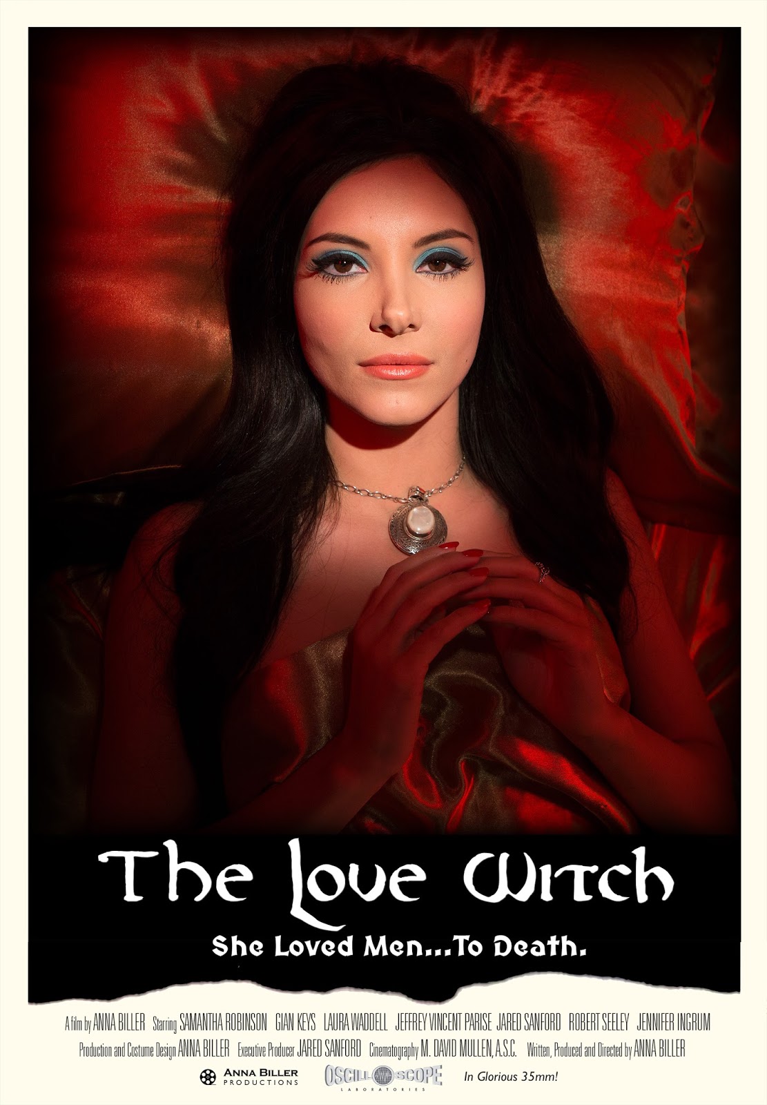
"The Furniture" is our weekly series on Production Design. You can click on the images to see them in much more magnified detail. Here's Daniel Walber...
 Over the last year, I’ve written about a fair number films in which the costume design and production design are intimate companions. The Taming of the Shrew is the most recent example, a visual cornucopia that underlines Zeffirelli’s tendency to paint people and props with the same brush. Yet that flamboyant director was not actually the credited costume designer or production designer. His style, like that of most filmmakers, was the result of artistic collaboration.
Not so for The Love Witch, a much more literal “singular vision.” Director Anna Biller worked as both production designer and costume designer for her film, as well as art director, set decorator, editor, composer, writer and producer. The film’s strikingly unified aesthetic certainly can be attributed to this herculean labor, but that’s hardly the only impact. The magic of The Love Witch is in its details, the cumulative effect of Biller’s meticulous and varied craft.
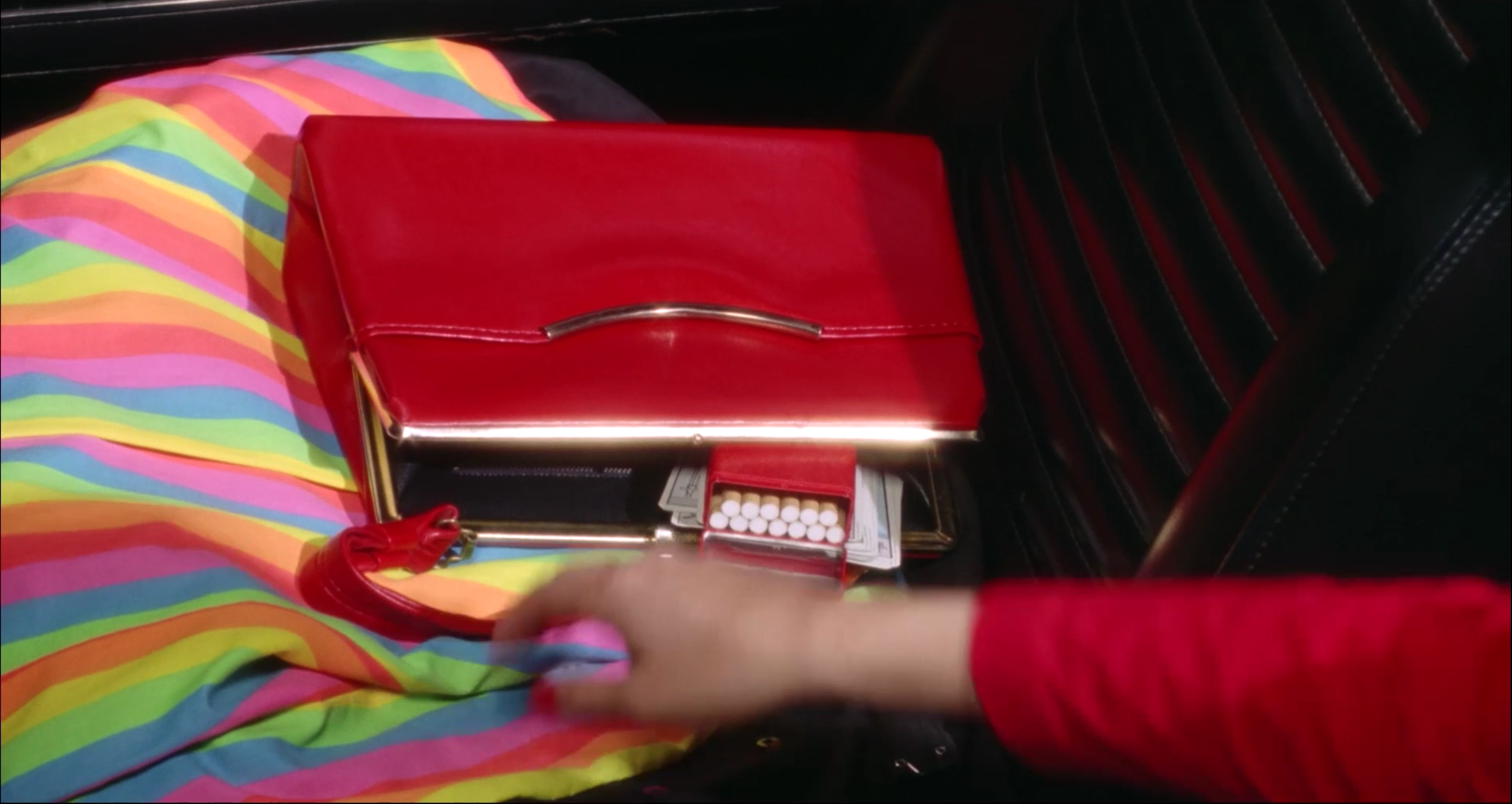
This fervent dedication to style is obvious from the very beginning, when the witchy Elaine (Samantha Robinson) grabs her bright red purse out of her bright red car, complete with the bright red cigarette case that matches her bright red dress.
There are plenty of other bold color schemes in the film, most notably the overwhelmingly pink Victorian tea room. Yet there’s also more going on than monochromatic opulence. For one thing, Biller has an excellent visual sense of humor. Look at this comically huge goblet, which Elaine has served to one of her lovers.
There is also a remarkable unity of technique. Most of the film takes place in locations that appear ripped out of tarot cards. The ubiquitous Rider-Waite tarot deck, illustrated by Pamela Colman Smith, features prominently. Its signature primary colors are all over the place, echoing those that emerge during Elaine’s own readings. They hold sway over her apartment, which upon first entering she declares to be exactly her taste.
Eventually she and her handsome cop wander into an countryside Renaissance party, its centerpiece a red-cloaked stage with a backdrop of sunny yellow and light blue.
Yet, again, the design of The Love Witch is not a quickly conceived panorama of paint-by-numbers sets. As Biller explained in this interview with the AV Club, she was deeply involved with the smallest details. She painted many of the paintings herself, commissioning the rest specifically for the film. This attentiveness shines through.
This lends a psychological intimacy to the production design. Not only does everything in Elaine’s apartment seem to instantly match her character, but she continues to fill the space with her own work. She is frequently shown in the act of creation, not only of paintings, but also of potions and spells. Her crafts are projections as well as depictions, the material with which Elaine conjures her future.
One scene even affords us a look at her drawings. These doodles and sexually explicit cartoons appear to be drafts, practice for the serious work of prophetic painting. They imply a mind and spirit constantly at work.
Eventually, Elaine begins work on a painting that will predict the violent conclusion to her trio of love affairs. A goblet is spilled on the ground, next to a bleeding knight in light jeans. As in the previous painting, her caped avatar stars right ahead, making eye contact with the viewer. It is simple but striking, an almost cartoonish middle-ground between a tarot card and pre-Raphaelite painting.
Yet it isn’t instantly apparent to her what it all means. The revelation is saved for the film’s conclusion. In the meantime, it is the process that keeps The Love Witch moving. The fun is in the process, not the completion. It is in the imagination at work, guided by a very particular and evocative iconography of magic.


