"The Furniture" is our weekly series on Production Design. You can click on the images to see them in much more magnified detail. Here's Daniel Walber...
"The house is a character in its own right," everyone says. It’s one of our more meaningless cliches, poltergeists notwithstanding. But the sentiment behind it is understandable. A building, though hardly alive, can still offer charisma. A dynamic visual language can be built from its beams.
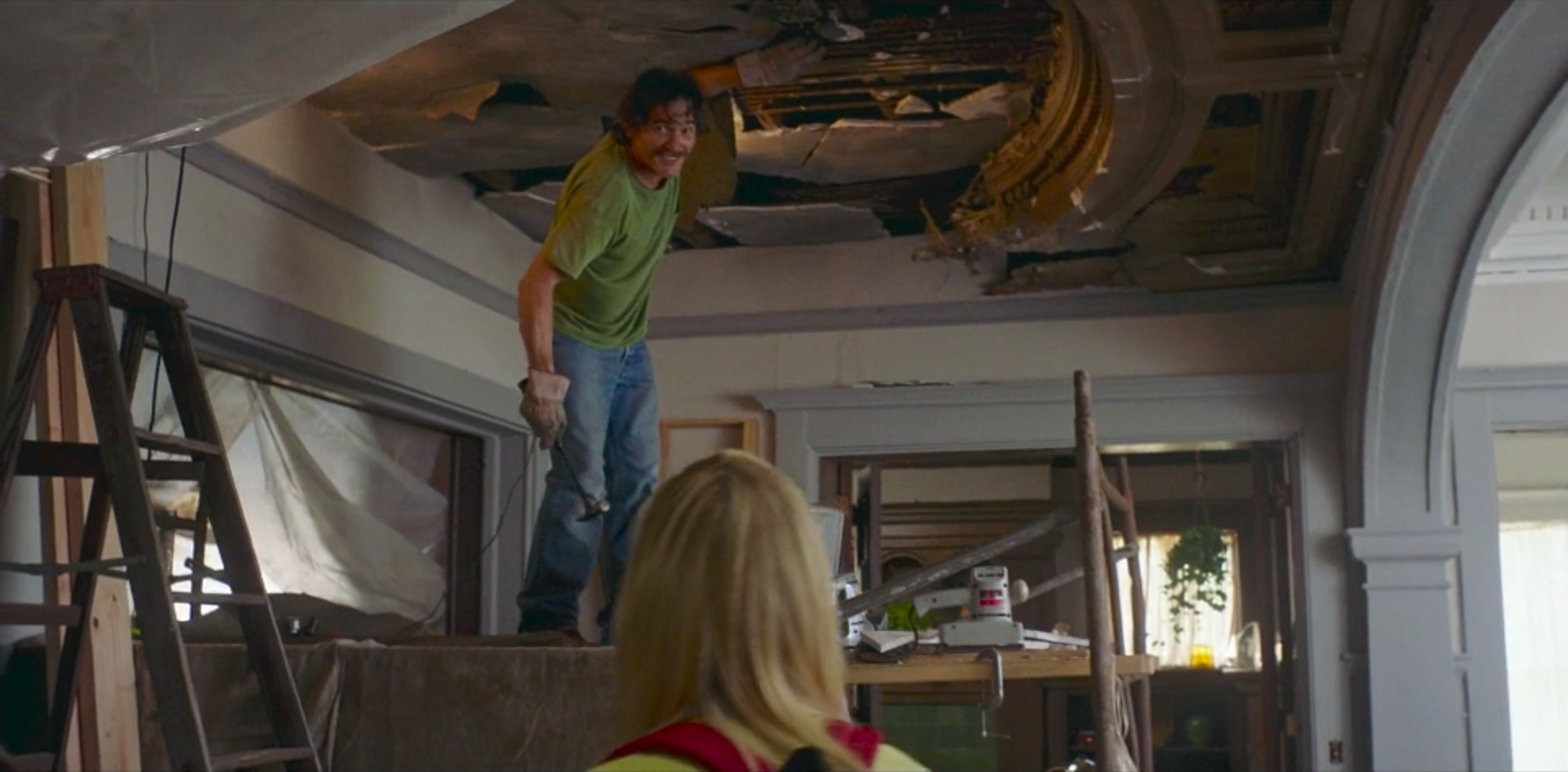
20th Century Women has one of these abodes. The house in question belongs to Dorothea (Annette Bening), who lives with her son Jamie (Lucas Zumann) and two boarders, Abbie (Greta Gerwig) and William (Billy Crudup). As she explains to a fireman she’s invited to a party...
It was built in 1905. The same family had it forever, but they lost all their money during the war, there was a fire - you should’ve been here for that. Anyway, so it was a mess, they just let it fall apart. Then a Bohemian inherited it in the 60s, bunch of free spirits lived here, and they lost it to the bank.
Now it’s 1979. Its state of disrepair is an opportunity, not only for restoration but also to remake it in the image of its newer residents. Production designer Chris Jones and art director Neil Wyzanowski enliven and complicate the rooms, into which cinematographer Sean Porter peers with the curiosity of a friendly ghost.
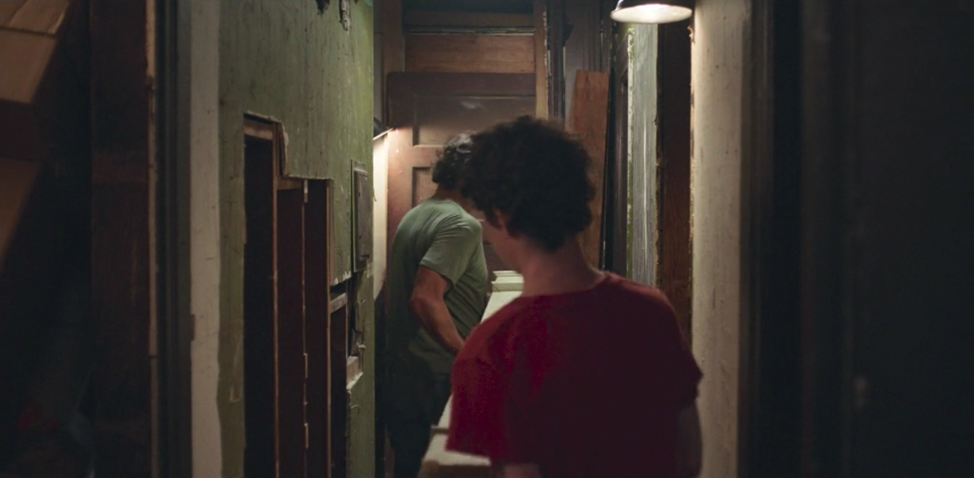
Shots like the image above, from a less-used part of the building, suggest even more work to be done. The house expands in our imagination. There may be hidden alcoves and extraneous chambers, extra-narrative spaces which still lend depth to the characters. Life is a house under construction, but not all of its rooms fit into a single script.
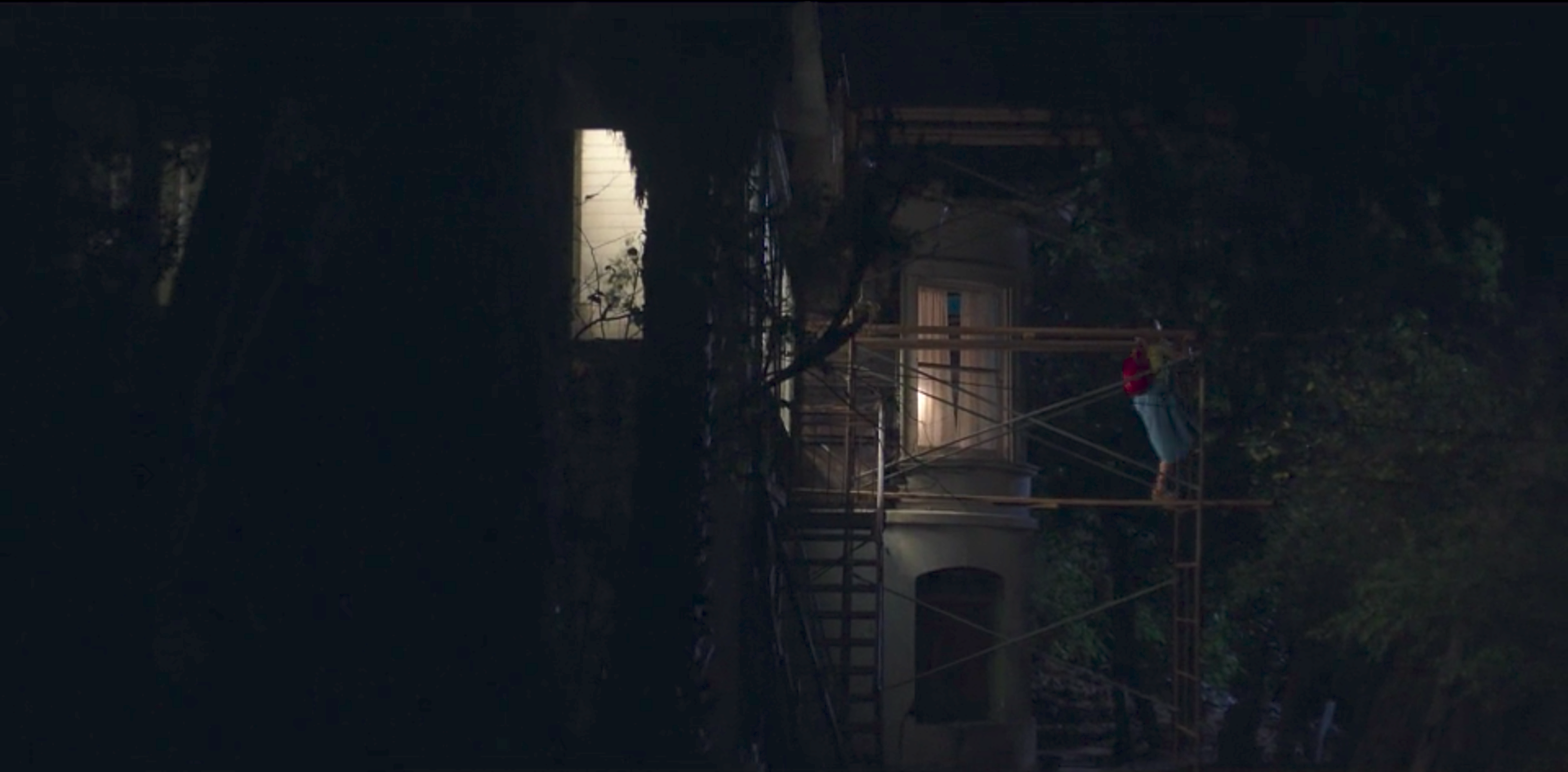
Then there’s the scaffolding outside, which Julie (Elle Fanning) uses to climb into Jamie’s room. She has no space of her own within the house. Not his girlfriend, not quite family, she is nonetheless part of the house. And so she is given this extra structure, a knowing kindness from the set design.
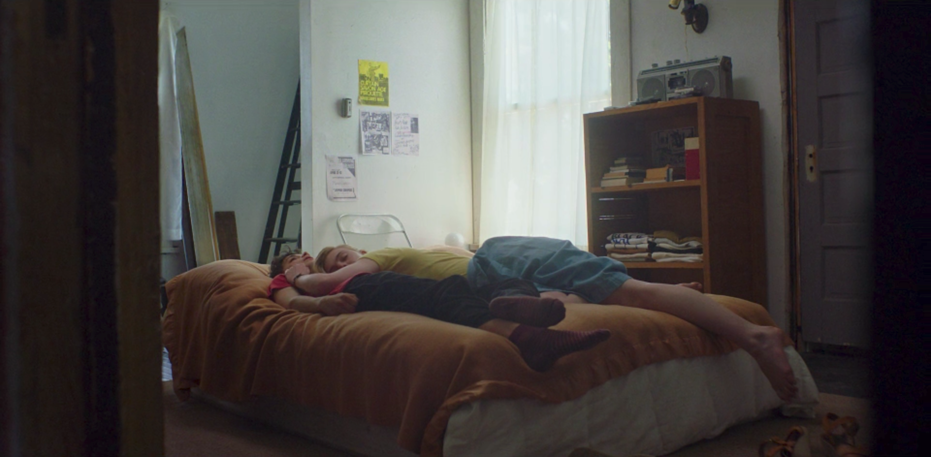
The other characters, meanwhile, do have rooms of their own. Jamie’s is simple, his bed a mattress on the floor. Its white walls are only occasionally accented with flyers for local bands. It’s a home for an unfinished soul, youth in the process of finding itself.
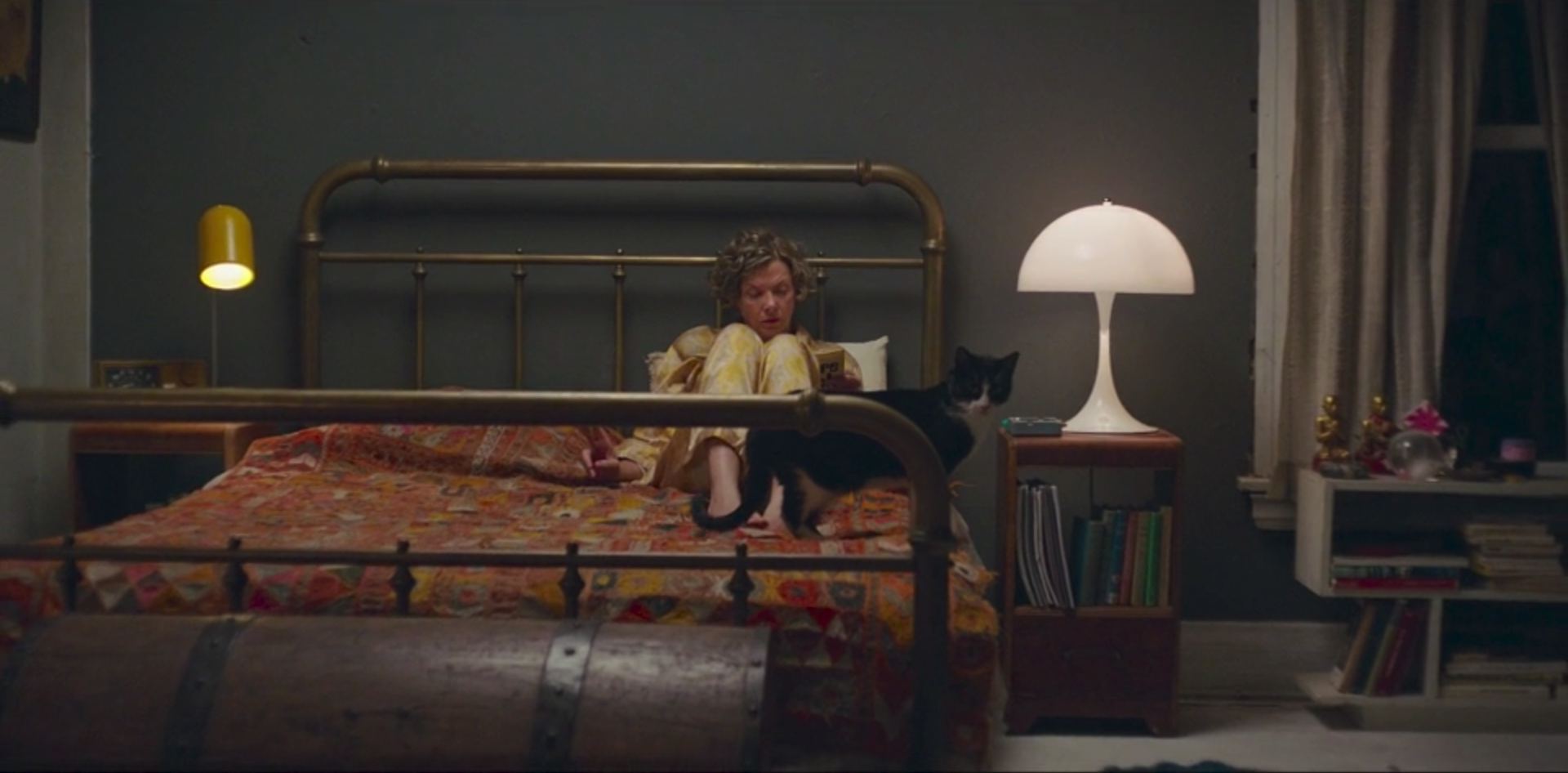
Dorothea’s bedroom is painted dark gray and illuminated by some sleekly designed lamps. Her bed is large, its metal head and footboards adding weight to the atmosphere. She has books in her bedside table. An enormous hope chest rests quietly in the foreground. It’s not minimalist, exactly, but still ordered.
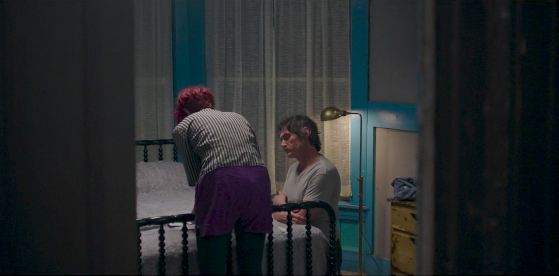
Abbie shows William her recent photographs in a room of blue paint and white curtains, airy and yet intimate. Each of these spaces has a different air, cultivated by its occupant. Yet they all retain a certain architectural similarity, a family resemblance in the wood of the house.
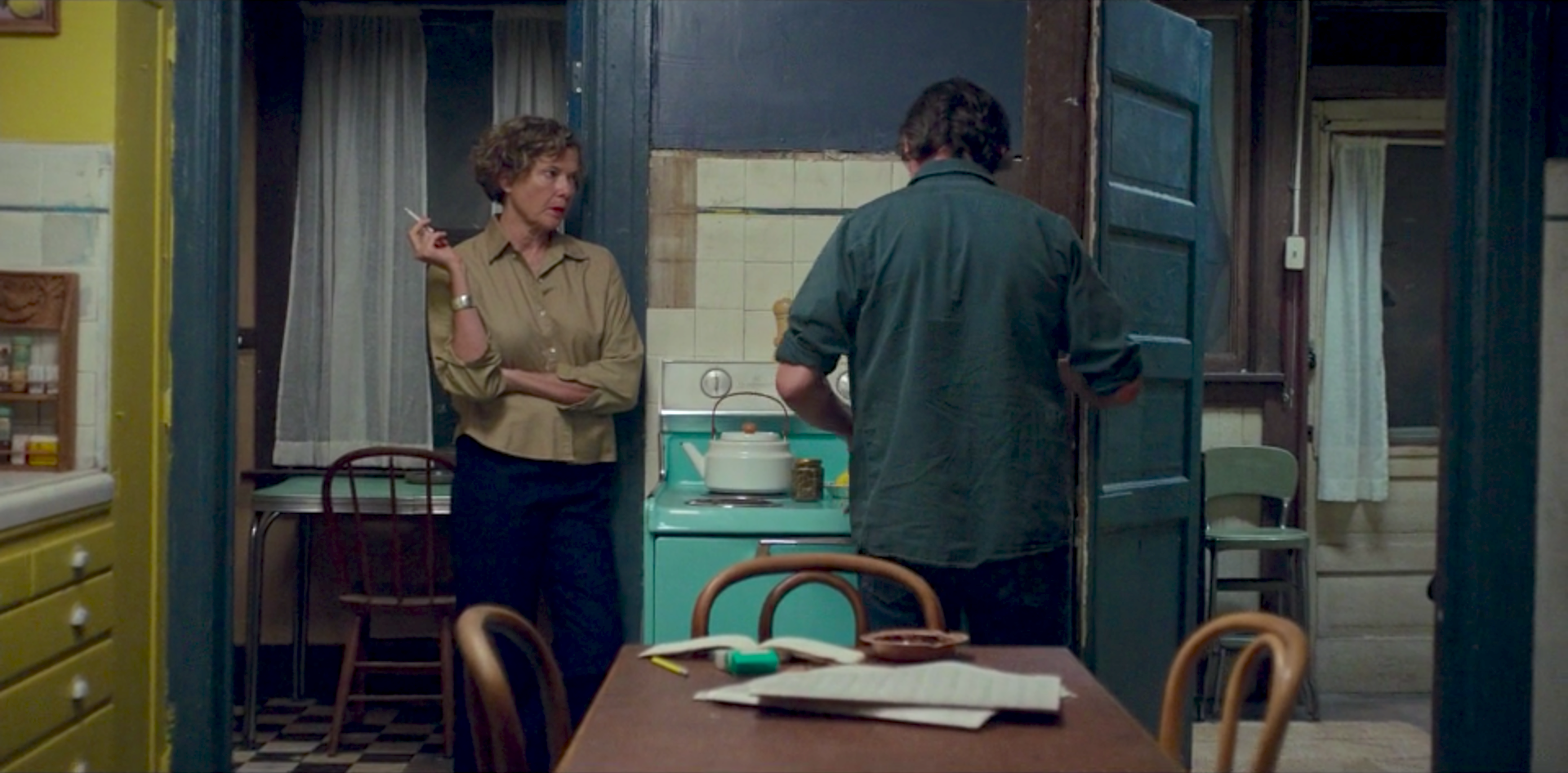
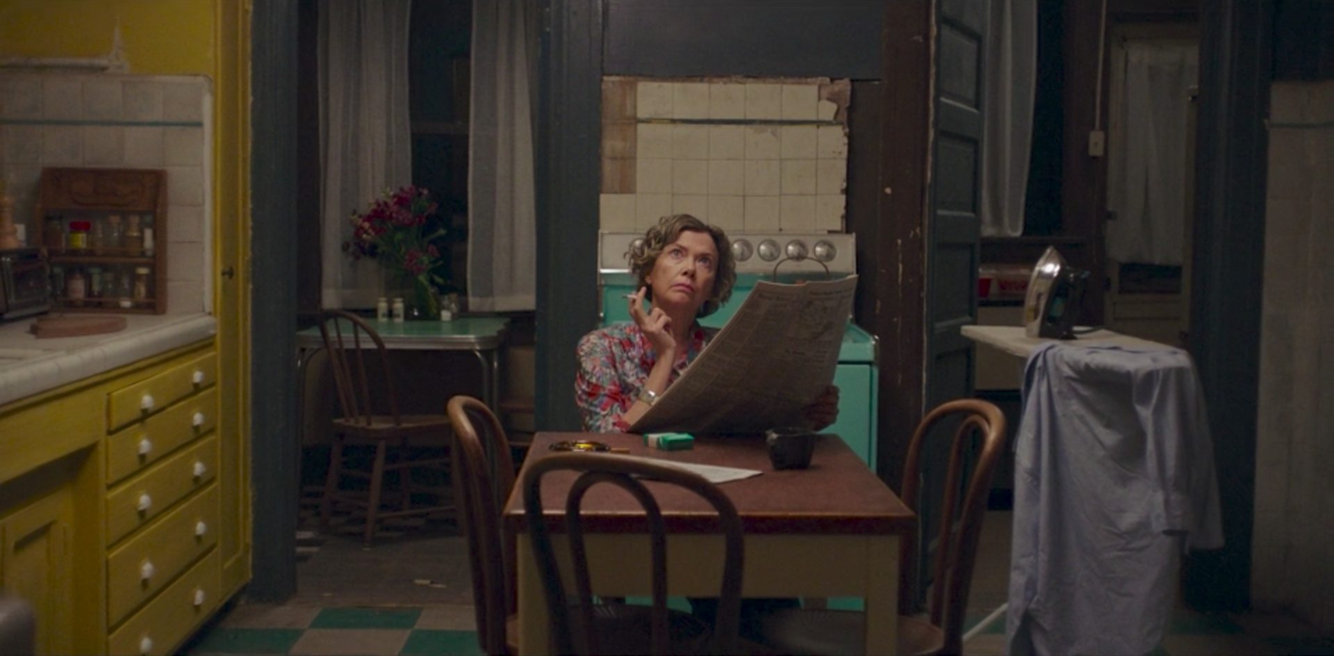
The centerpiece is the kitchen, a room cobbled together from the house’s various colors. The stove is light green. One side is bright yellow, walls and drawers alike. The other is dark, a deep shade of purple. The kitchen is collaborative by necessity, the primary meeting point for the characters and their ideas.
Mike Mills returns again and again to this room, often presenting it from very similar angles. It’s not only the heart of the house, but also the heart of the house-metaphor. This building, constructed at the beginning of the titular 20th century, frames a broadly symbolic family. Generations and cultures collide, all on a foundation laid decades before.
The kitchen underlines these historical shifts, its colors suggesting the unfinished changes initiated by each successive occupant. It’s easy to imagine Dorothea having the whole thing repainted herself, once William finishes the more essential repairs. But for the moment it feels just right, a state of transition that matches that of the family that eats there. It’s a metaphor with refreshing singularity, a house whose symbolism is not quite cliche.
