"The Furniture," by Daniel Walber, is our weekly series on Production Design. You can click on the images to see them in magnified detail.

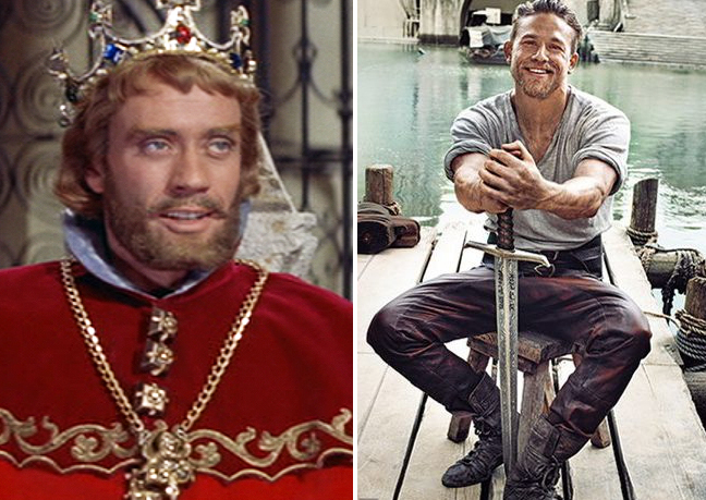
King Arthur, the character, is listed by IMDb as appearing in 149 films and TV shows. That’s more than Dracula. I’m not going to go through all of them, obviously. But circumstance has given me a good excuse to compare two examples: Knights of the Round Table (1953) and King Arthur: Legend of the Sword (2017). The latter just came out on Blu-ray. The former will serve as a bit of a tribute to Mel Ferrer, whose centennial was this past Friday.
The most obvious difference is between Ferrer’s version of Arthur, noble and even a bit meek, and the ever-hulking Charlie Hunnam. But this isn’t a physique column. Instead, I want to take a brief look at how Hollywood’s presentation of the loosely defined Arthurian Age has changed...
Knights of the Round Table hasn’t exactly stood the test of time. Sure, it made a solid chunk of money and received two Oscar nominations, including Best Art Direction/Set Decoration. But it mostly lives on through its immensely popular parody, Monty Python and the Holy Grail.
It’s remarkable how much of this spoof is directly at the expense of this one earlier film. Monty Python makes much of its comically small dimensions, knights constantly running into each other in the forest as if England were the size of Central Park. It’s hard to see an establishing shot in Knights of the Round Table and not scoff, “It’s only a model.”
It seems intentional, this reduction of space. It’s as if Arthur, Lancelot and Guinevere are moving within the pages of an illuminated manuscript. It’s as colorful and charming as it is silly. Its version of Stonehenge does have a certain grandeur, but it’s hard not to laugh when Lancelot pushes over one of the gigantic stones.
It’s worth noting that, while the “real” Arthur dates to the 6th century, the design of Knights of the Round Table quite clearly evokes a much later version of Europe. These are the tapestries and castles of the High Middle Ages.
The sculptures circling the Round Table would make much more sense in the 12th century, for example. This takes King Arthur out of the Dark Ages and into the time of the writers who popularized his legend. Geoffrey of Monmouth was the first, featuring Arthur in his History of the Kings of Britain (1138). The most famous single narrative comes a few hundred years later, with Thomas Malory’s Le Morte d’Arthur (1485).
This isn’t exactly outlandish, of course. Similar transpositions happen all the time to Shakespeare’s plays. It also fits perfectly into an old Hollywood way of presenting history as a glitzy parade of beautiful sets and costumes.
Things are different these day. Firstly, There’s been a wave of interest “historical accuracy” and “grit,” neither of which really means anything. That’s how we ended up with the dreadful 2004 King Arthur, which advertised itself as a true-to-life version of post-Roman Britain.
Mercifully, there isn’t too much of that in King Arthur: Legend of the Sword. The original tale of Arthur is, after all, just that: a legend. There’s no real reason not to take full advantage of CG, which of course wasn’t available in 1953. And it can be used to present historical landscapes with more depth than before.
Behold, the not-entirely-obvious blend of physical sets and CG enhancement. Arthur represents a similarly cobbled together identity, Ritchie’s fast-talking contemporary gangster injected into a much older London. His Englishness is opposed to the Imperial Roman, implicitly Fascist aesthetic of the wicked King Vortigern (Jude Law).
Vortigern’s power derives from this enormous tower. As Josephine Livingstone explains here, this element is ripped right from Geoffrey of Montmouth. The film’s version is constantly under construction, looming above the remains of an enormous bridge. It stands at the aesthetic intersection of Roman aqueducts and Saruman’s Isengard.
And this blend of the historical and the fantastical is what makes King Arthur: Legend of the Sword so much of an improvement. Ritchie mixes the fantasies of Geoffrey of Monmouth with his own narrative innovations. His version of a henge, for example, is somehow simultaneously more magical and less silly than the cheap replica that Robert Taylor’s Lancelot pushed over in 1953.
Ritchie knows when to toss grit aside for fantasy, learning the right lessons from Peter Jackson’s Lord of the Rings. It’s hardly a foolproof formula - a similar approach was taken by both of the blundering Snow White and the Huntsman films. But at least it’s engaging with the original poetic material and trying to craft something new. And it’s fun to look at.


