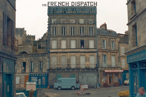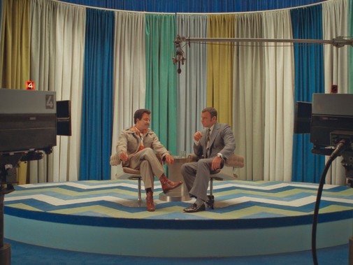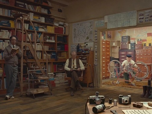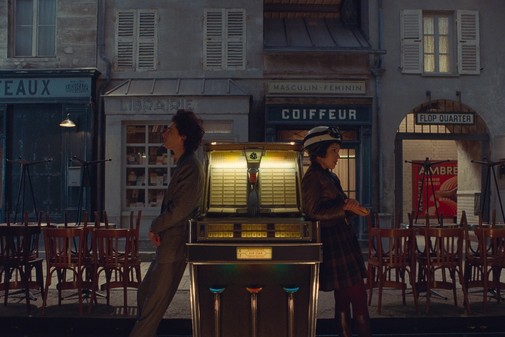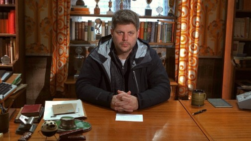
Over the past decade, Adam Stockhausen has become one of Hollywood's most formidable production designers. Working his way up as an art director, the first movies he got to design weren't the most prestigious fair. Indeed, Wes Craven's late-career horrors didn't give him much opportunity to show off. That all changed when Wes Anderson, Steve McQueen, and Steven Spielberg all started to go to him as their preferred designer, relying on Stockhausen to create whole worlds from scratch, whether within a realistic milieu or total fantasy. Back in 2014, Grand Budapest Hotel earned him an Oscar, and Stockhausen is back on the hunt for more gold. Wes Anderson's The French Dispatch just arrived in American theaters, and the new West Side Story is on the horizon. Could he even nab an elusive double nomination?
Here are some highlights from Adam Stockhausen's filmography as production designer, from Anderson's whimsy to Spielberg's glitz…
MOONRISE KINGDOM (2012)
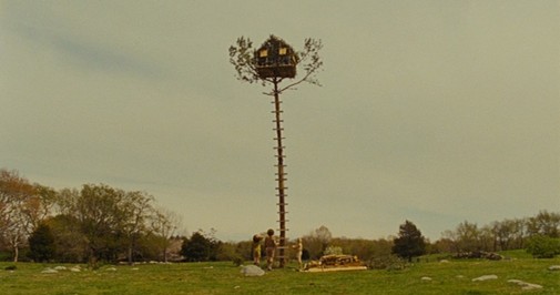
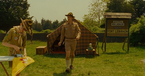
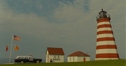
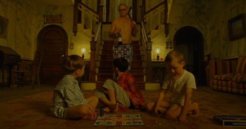
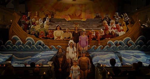
Stockhausen's professional relationship with Wes Anderson started in 2007 when he was the art director of The Darjeeling Limited's production designer Mark Friedberg. By 2012, he had graduated to production designer in charge, creating the handmade diorama-like cosmos of Moonrise Kingdom. From the proto-militarized order of the Boy Scout tents to the period specificity of the New England interiors, there's a lot to love in this movie. It looks like a picture book come to life, but the textures are tactile enough to avoid fantastic abstraction. The biblical painted set is a delightful highlight.
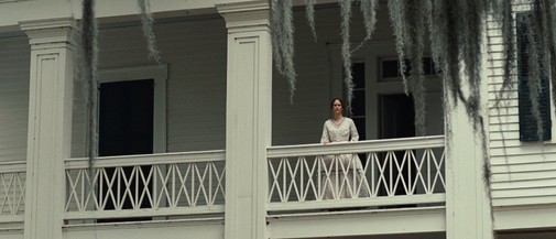
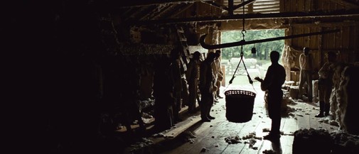
12 YEARS A SLAVE (2013)
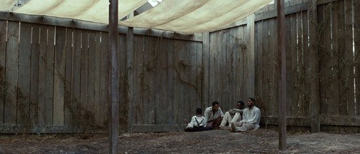
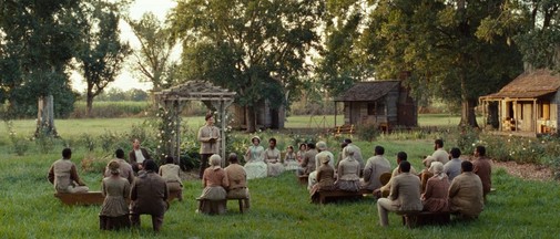
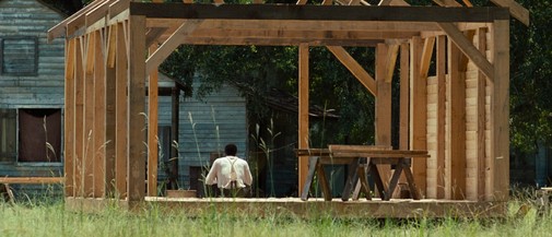
The sets match the majestic severity of Sean Bobbitt's cinematography, evoking a cruel world of 19th-century splendor built on the suffering of enslaved people. The spindly unfinished structures are memorable, but what persists is the genteel froth of Southern wealth existing in communion with hellish misery. Such dichotomies come to life in barns that look like torture chambers, shacks made of wood so rough we can practically feel the splinters stuck in our flesh. There's an evident preoccupation with historical accuracy that never gets in the way of the visceral dramaturgy.
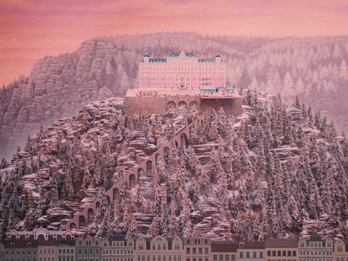
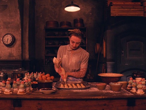
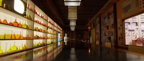
GRAND BUDAPEST HOTEL (2014)
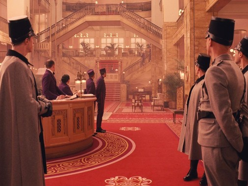
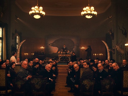
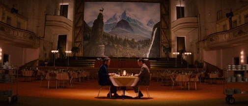
Anderson's most exuberant and acclaimed creation to date is a showcase for Stockhausen's designs. The hotel itself looks like a giant sugary confection during its interwar heyday, with pastels and lush velvety crimsons as far as the eye can see. Still, when thinking back to Grand Budapest Hotel, it's not the splendor that comes to mind, but the melancholy. There's the casket full of flowers amid a mausoleum of wood paneling, the dark museum that's a perfect setting for murder, a haunting hall full of death, or the hotel itself, aged out of its glamor living a half-life in the autumnal 70s—all that plus some nifty miniature work that further underlines the otherworldliness of this director's cinema.
BRIDGE OF SPIES (2015)
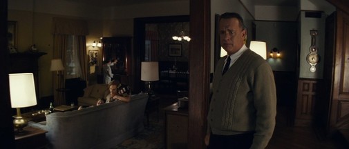
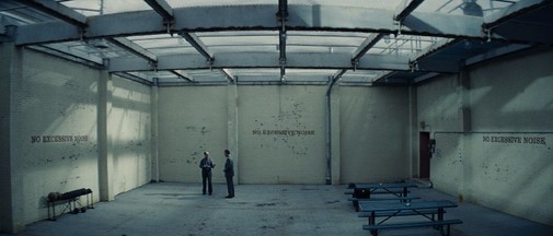
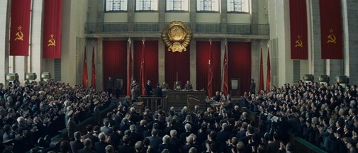
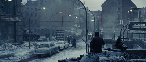
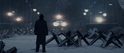
The most significant selling point of this movie's production design is the contrast between midcentury American prosperity and the coldness of divided Berlin. However, Stockhausen's craft isn't solely built on binaries, for there's a wealth of variation and architectural echoes traveling between continents. It's a miracle of historical reconstruction, bringing back a viscerally material vision of the Cold War while also emanating airs of operatic grandeur. The theatricality of judicial spaces stands out, as does the signage common to American prisons and German offices, repurposed palaces turned into inhospitable nightmares and cramped trains full of judging stares.
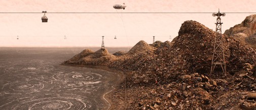
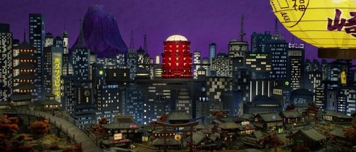
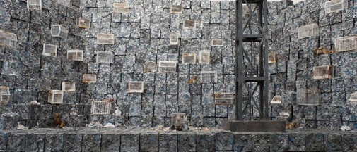
ISLE OF DOGS (2018)
For this project, Stockhausen couldn't rely on redressed locations as he had done in many of his previous movies. Instead, the entire world is a filigreed storm of Japanese iconography exaggerated to the point of splendorous dystopia. And yet, amid the oppressive design, there's warmth. It's even in the squalid landscapes of the titular isle, a prison surrounded by the sea where there's still the possibility of hope. It's impressive seeing how the designer creates the sets to befit specific compositions, imagining a reality that's so precisely calibrated one can't fathom how it could look from any other angle. It's insularly whimsical in the best way.
WIDOWS (2018)

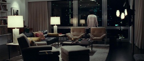
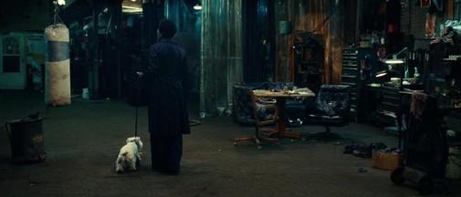
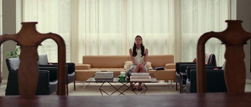
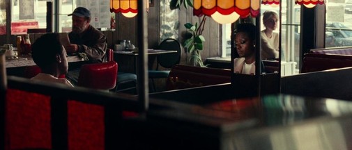
Suppose the Anderson movies are all about creating particular spaces untethered from reality, and Spielberg's pictures are about injecting dramatism into gritty stories. In that case, Stockhausen's collaborations with Steve McQueen follow a stricter line of realism and geographical specificity. In Widows, the city of Chicago is as important as any character, and the ways cultural and social hierarchies are solidified in architecture are endless. The ostentatious comfort of Viola Davis' apartment is superbly indicative of a life lived outside the narrative's confines, while the marks of dead men haunt a murky hideout. My favorite set, though, is the campaign office where light fixtures draw a cross above everyone's heads, a brutal illustration of the church's role in the political games at hand.
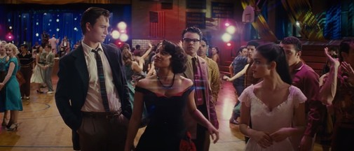
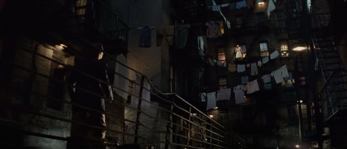
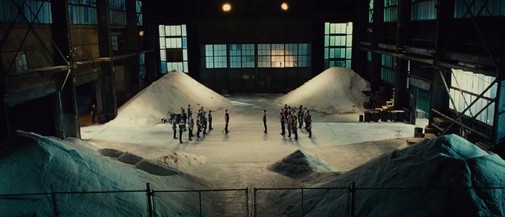
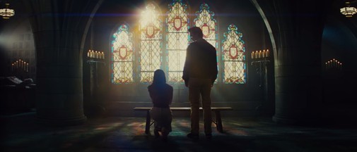
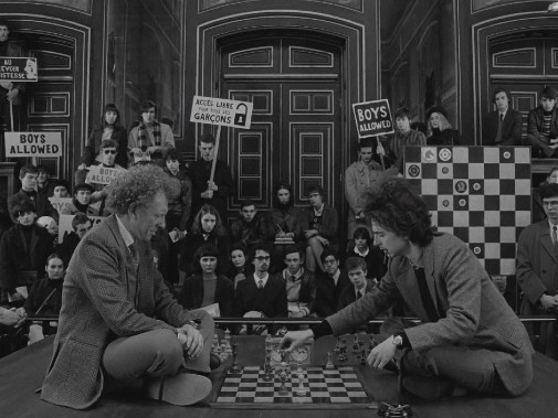
Finally, while I can't comment on movies I haven't watched, here's a sample of Stockhausen's work in Wes Anderson's The French Dispatch and Steven Spielberg's West Side Story. They certainly look gorgeous from a scenography standpoint, don't you agree?
THE FRENCH DISPATCH (2021)
WEST SIDE STORY (2021)
Can Stockhausen be double nominated this year? If not, what movie do you think gets him an Oscar nod, The French Dispatch or West Side Story?
