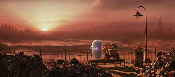
Sometimes when prepping for interviews you can jot down film titles and pick a few key bits to ask about. Every filmography will yield a few rich areas for potential questions. But what to do when the filmography is so imposing. To read Roger Deakins filmography is to become lost, not in titles and potential avenues of discussion, but in images. It's hard to concentrate when your mind's eye flies from the white snow of Fargo to the shadowy menace of A Beautiful Mind's paranoid bits, to the rich color of Kundun, to the desolate dusty beauty of both Jarhead and WALL•E and on through hi recent string of westerns. And that's just scratching the surface of the images that the filmography calls to mind. In cinematography, Roger Deakins has few peers.
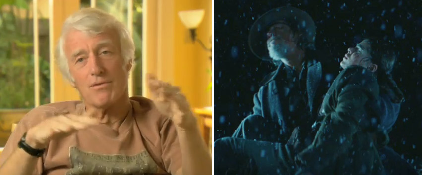
 Roger Deakins and True Grit, which won him his ninth Oscar nomination
So, if I struggled for questions, it was still a treat to talk to a living legend. We started at the most logical place, his collaborative relationship with the Coen brothers. True Grit is their tenth film together. Since they began working together Deakins has rarely been absent (Burn After Reading was shot by Emmanuel Lubezki).
Nathaniel: You've been working with the Coen brothers since Barton Fink (1991). Obviously that's been a fruitful partnership. How did it start?
Deakins: I met with them in London before Fink and their regular cinematographer Barry Sonnenfeld had gone off to directing so they were looking for somebody.
Nathaniel: What convinced them then?
Deakins: I think they'd seen Sid & Nancy and 1984. I think the variation in what I'd been doing was something they noticed, that they responded to.
[Note: Deakins career began with documentaries but by the mid 80s he was working in British features, often with the director Michael Radford. The Coen brothers weren't the first directors to monopolize his impressive visual gifts.]
Nathaniel: How early do the Coens bring you into each new project?
Deakins: Usually quite early but it depends on the project. In some cases i've been working on something else right up until they start shooting. For instance with The Big Lebowski, I didn't have much prep at all because I was off in Morocco doing [Martin Scorsese's] Kundun. Usually I like a lot of prep.

On True Grit we were scouting quite a lot before shooting. The more time you spend -- especially scouting and looking at locations and talking about the script -- it's time well spent. You get to understand what the director is really after.
Nathaniel: Obviously the relationship with the director is prime but what about the art directors. Do you have input into the sets? How much back and forth is there?
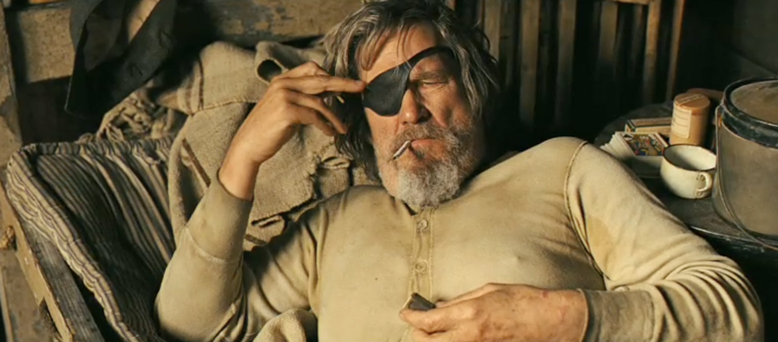
Deakins: Quite a bit, absolutely. It's a discussion really. Sometimes you need some adaption on a set. Even if it's a simple set, like where Rooster (Jeff Bridges) was bedding down in the back of the grocer's store. I just wanted a certain kind of light in that set and Jess Gonchor [nominated for Art Direction] came up with the idea of that type of window we used. It was cobbled together to facilitate the lighting that I wanted in there. It's a collaboration really to figure out how it's done. I have been on films where I've been on a set with no windows. You go well… [indicating frustration] There's no reason. It wasn't an aesthetic choice. The designer just didn't put any windows. That's restricting.
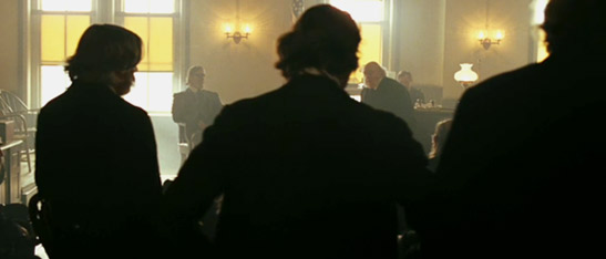
Nathaniel: One of the showiest bits in True Grit, in terms of your work is the courtroom scene early in the film. Do the Coens decide everything about camera placement and you're just working on the lighting?

Deakins: It does depend. The Coen's storyboard everything so actually the camera placement is worked out [before shooting]. But we've discussed it in prep and then they storyboard it. And we walk through the locations and talk about which angles might work and I talk about the way I can make the light feel in the room. I remember in the courtroom we had this discussion about where the witness stand would be and where the jury box would be within that space and it had a lot to do with the lighting that I could bring to it for the final image.
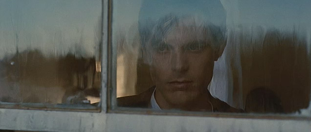
Nathaniel: You've done quite a few westerns lately: No Country For Old Men, True Grit, The Assassination of Jesse James. Was that a conscious direction? Is it a genre you respond to visually?
Deakin: [Happily] It's a lot of luck! When Joel and Ethan were saying they were writing a script for No Country 'If we like it we might direct.' I said 'You've got to, you've got to!' I just thought it was such a wonderful piece and then to get the chance to do The Assassination... after that? I was really lucky.
Nathaniel: The Assassination of Jesse James is so focused on its images, too. Far more than your average movie.
Deakins: That was much more of a poem, a meditation on the period and character. A very different kind of movie. It came from the book. It's a historical book, a piece of history, but it's done in a lyrical way.

Nathaniel: When you get a project like that as a cinematographer, do you just start salivating? [Laughter]
Deakins: Kind of, yeah. When I read the book, the original material -- Yeah absolutely, you die to do a film like that. The moods you can create, the mood it's demanding you create in the visuals. Andrew Dominick had such a firm idea of where he waned to go with that visually, how far he wanted to push it. It was quite a challenge and an exciting challenge.
Nathaniel: The movie is stunning. I'm curious about working with actors. Are they props to be lit or do they have input in how they're shot.
Deakins: Well I mean in terms of blocking and how the camera is recording what they're doing and interpreting, there is to and fro. It depends on the actor and the director and the feel of the set, the way that set works. It can be a collaboration.
Nathaniel: You read a lot of Old Hollywood stories about stars demanding to be shot in certain ways. Like they're very invested in how they're shot and from only certain angles.
Deakins: I'm afraid I'm not very tolerant of that sort of thing! [Thinking about it...] It's a matter of trust. I think a big part of the cinematographer's job is creating a space where the actor feels comfortable to do their work. I don't want an actor to think i'm filming them in a ugly way. You do the best for them, there's trust both ways. They need to be able to trust you.
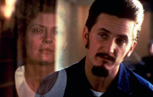
Nathaniel: How about more actor-focused films? I'm thinking of films you've shot like Passion Fish or Dead Man Walking, those are very much performance pieces. Do you have to do more tests with the actors on films that are so focused on faces? Do you have to approach that differently?

Deakins: No, not really. I seem to remember we did quite a few tests with Sean Penn on Dead Man Walking just to get his look right and stuff. But it's not different. It's always about the performance. To me that's the most important thing. You have to give the actor space to do that. If you haven't got a performance you haven't got a film. It doesn't matter how pretty the images are, they mean nothing. It's really important.
And especially on something like Dead Man Walking which is a very intense piece you do really want to be in the background, in terms of the crew and how much you impose on the scene. It's a delicate balance really. It's still a visual medium so you have to do your part.
Nathaniel: I'm wondering if you enjoy a minimalist aesthetic? To me, True Grit and Fargo both feel...
Deakins: It's interesting how minimalist True Grit is, isn't it? It was quite a complicated piece to do, really. It comes across as very simple in terms of composition and carmera movements.
Nathaniel: But do you personally like it sparse?
Deakins: I like simplicity but that whole idea comes more from Joel and Ethan than from me. It's fueled by the script and their approach to it. The nature of this piece is the idea that it's this young girl's story. That's why it's so minimalist.

[Considering...] i think in terms of the development of what Joel & Ethan havebeen doing, the films have become more minimalist camera wise. Certainly more minimalist than what we were doing on The Hudsucker Proxy. It's not immaterial but the camera was much more a character within it. Whereas … well it's the material. You don't want the camera to be a character in something like True Grit. It really is in the background.
Nathaniel: What about Fargo? Was it hard to shoot snow since it's so reflective?
Deakins: The hard thing about Fargo is we didn't have any snow! A lot of the snow had to be manufactured. It was a really cold winter but it was one of those winters that was so cold that it didn't snow. Arctic air. It was frustrating.
Nathaniel: Lately you've had this little diversion into animated films. You've been consulting...
Deakins: Yeah, it's interesting isn't it? It's becoming a bit more than a diversion, actually. It's a full time thing I do now. Between doing live action films i'm actually working at Dreamworks. It came about first -- Pixar asked me do a couple of seminars about lighting. It sort of developed. Andrew Stanton asked me to get involved in WALL•E . That was only really at the beginning just conceptually talking about it and, how to bring the feel of live action movie to the film, the way the camera moves and interprets the action. I talked to them about lighting and the mood of the thing. After that Dreamwoks, asked me to get nvolved in How To Train Your Dragon. I was involved in that all the way through for 14 months going up there regularly.
Nathaniel: I guess my choice of words was way off, then. It's not a diversion.
Deakins: It's not, really. It's a really interesting aspect of what I can do. It really is that I'm a visual consultant. They do it all but I go in and talk to them and exchange ideas. It's really fun. The two disciplines of animations and live action do seem to be colliding. You look at something like Avatar or whatever: How much is live action and how much is animation? You can't really say that's a live action film.

Nathaniel: I do wonder that about your profession. I've noticed in so many movies lately, not yours in particular, but in general that the image looks really processed.
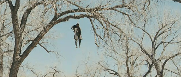
Deakins: A lot is. You'd be surprised how many shots in True Grit were actually retouched or something digitally: a road in a landscape you have to take out, when Mattie was in the tree cutting down the hanging man, there's all that wire removal. Not big things like the creation of whole cities or something but still a lot of digital tweaks.
Nathaniel: Which film would you call your most challenging job?
Deakins: I don't know. They're all challenging really. Even the simple ones you kind of want to push to some extent and it suddenly becomes challenging. You think 'Oh this will be a nice little summer shoot and suddenly you find out 'ohmygod', you know? Everyone was saying 'True Grit. Three characters on horse back riding throughout the west.' You think, well, 'oh nice summer shoot in Santa Fe' and then you realize that half of it is interiors and that half of the exteriors are at night! It's actually really complicated. And horseback -- people charging on horseback.
The hardest thing really in recent memory was doing that whole sequence with the horse Blackie galloping through the night.
Nathaniel: And that scene makes the movie.
Deakins: It's quite emotional really, isn't it? But the idea of how do you do a tracking shot of a horse at night and the horse just happens to be black [Laughter] It's kind of tricky. [Indicating directive] 'A galloping horse at night. And he's black.' And I'm kind of 'What else can you throw at me?'
Nathaniel: How about your next film? It's called Now (2011). From Andrew Niccol of Gattaca fame. That film was so interesting visually. Will this film have a similar aesthetic?
Deakins: I know Gattaca quite well. I think it's got elements of Gattaca in a way. It's sort of similar in mood and feel and being a futuristic parable.
 As we closed up our conversations I wanted to broach the topic of Oscar, which I immediately sensed was a topic he's always asked about. In truth he seems more at peace with it than his fans. His long history of nominations without wins is well known. What's less well known is that he is one of only twelve men to ever receive so many nominations in the category and he's the only living member of that frequently honored club. Only one of those men before him went Oscar-less. That was George J Folsey who shot classic musicals like Meet Me in St. Louis and Seven Brides For Seven Brothers was nominated an apparently unlucky 13 times. Folsey, like Deakins, even managed a double nomination. (Deakins double came for the 2007 duo: Jesse James and No Country, Folsey managed it twice but in the years of two separate cinematography categories for color and black and white films.) But hope springs eternal and many believe that with his gorgeous stark vision in True Grit his winning time has finally come.
Nathaniel: Are you exhausted by people wishing you well each time you're nominated. Or saying "it's your year!"?
Deakins: [Laughter] No, it's kind of all right. It's fun.
Nathaniel: Have you been to the Oscars each and every time?
Deakins: [Thinking...] Yeah, I have actually! [Laughter] So I'm quite used to sitting there. It's all right. The film is still the film. It doesn't make any difference.
Nathaniel: I'm always saying that: Great films are their own rewards.
Deakins: They absolutely are.

[want more interviews?]
 Monday, February 14, 2011 at 10:09AM
 Belle. She has few equals in the canon.
 Beauty & the Beast,
  Oscar Trivia,
  Pixar,
  animated films


