Our Favorite BAFTA Tradition
 Wednesday, February 8, 2012 at 8:00AM
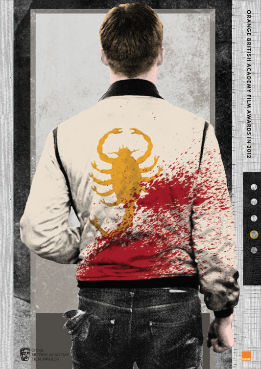
 I forgot to mention this goodie but with BAFTA hitting this weekend (we'll live blog) we're quite happy that this is an annual tradition now with BAFTA. Each year they hire illustrators to make Best Picture guides for their nominees. Look at this one for Drive.

The scorpion jacket is an obvious image to go with but where this really wins me over is the little touches like the bold red splash, the clenched fist, the faint suggestion of an elevator (that glowing button) and that tell-tale glove hanging from the back pocket. It just such an instant recall of so much of the movie's indelible moments.
The Help, Tinker Tailor Soldier Spy, The Artist and The Descendants after the jump

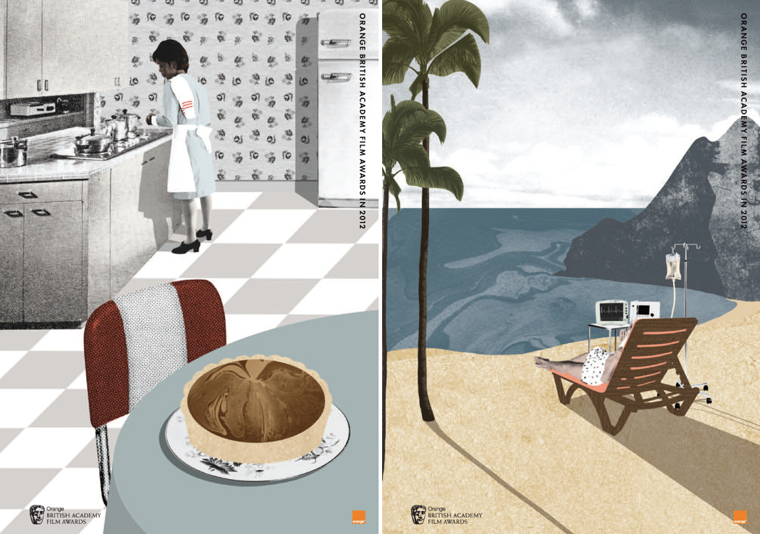
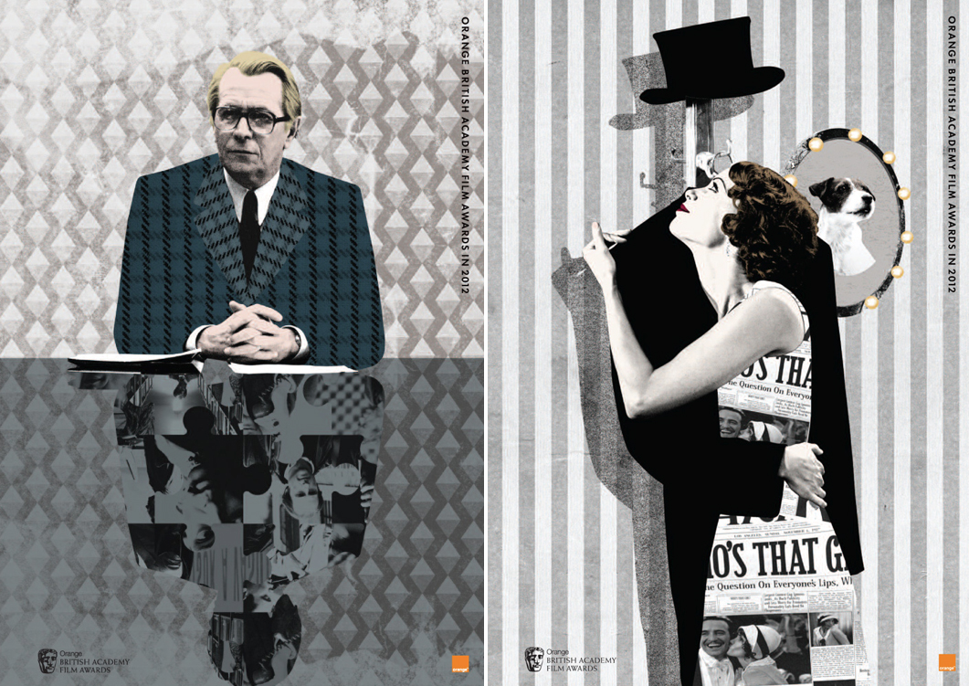
The Help is the one I find the most disappointing. The chocolate pie? Really? I like The Descendants conceptually but maybe not quite in execution but Tinker Tailor and The Artist are pretty magical takes on their movies, recalling what makes the movies great and the small details, like in Drive, that bring the whole thing back to mind.

Would you put any of these on your wall?
 BAFTA,
  Drive,
  The Artist,
  The Descendants,
  The Help


Reader Comments (12)
That Drive one is glorious, if I remember correctly these were also used as posters to advertise the BAFTA awards on the underground stations last year, will need to look out for them again this year.
I think the Drive one is the best of the lot (and I haven't seen the film so I'll take your word on the details Nat, but that splash of blood is instantly eye-catching.) The others I'm cold on (except maybe the Artist, which is cute - but they other 4 have an almost matchy-matchy quality that leaves me cold.)
That Drive poster belongs in the Criterion Collection!
I don't think the artist quite caught the essence of Ryan Gosling's butt.
Would be interested to see how Iron Lady turned out!! Drive is awesome!
Last year's posters were better but these are aight.
I'd love to own the posters for DRIVE and THE ARTIST. I can look at them all day.
The art for The Help nailed it: forget the race relations; it's all about that pie.
I agree with A.J. The only poster that appeals to me is the one for DRIVE because of its use of colour. If only I liked the movie a little more.
Before i hit the jump, the first thing I thought of was "Shit pie!" Then my dreams came true.
In retrospect how cool was it that the BAFTA actually nominated Drive in a field of 5?
DRIVE. 'Nuff said.