


New Posters (Now With Less Floating Heads)
Manuel here to whet everyone's appetites with some recently released posters.
Fall movie season can sometimes feel much more thrilling for the way it builds anticipation than for what it actually delivers. Every year we can count on plenty of films to entertain, amaze, and awe us, but I'd wager that that number is usually lower than the number of films you were looking forward to. This is partly a math game and partly an acknowledgement of how PR and marketing savvy distributors (both big and small) have become.
Take, for example these new posters for, respectively, Jason Reitman's Men, Women & Children (as divisive after its premiere in Toronto as the film's trailer proved here), Justin Simien's Sundance sensation Dear White People, and Jon Stewart's first feature film Rosewater. I have to admit I love these posters not only because they aren't full of floating heads or beautifully lit silhouettes, but because they manage to signal the film's sensibility. Arguably, this is what we expect from movie posters, but it's not often we get artistic posters like these that embrace the expressiveness of the medium without resorting to distractingly obvious photoshop.
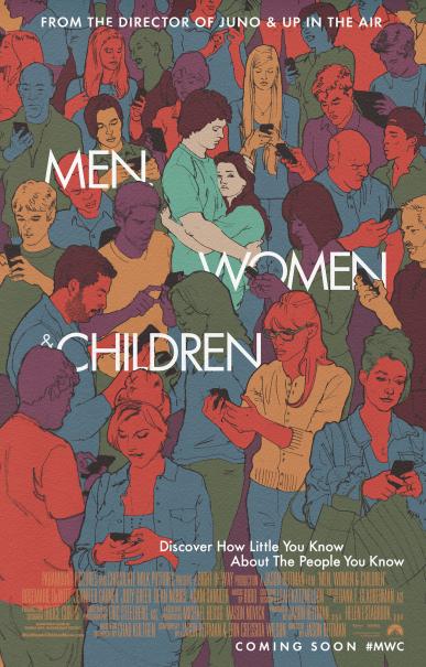
Men, Women and Children clearly works overtime to let you know that it is a Reitman joint what with the imagery evoking that opening credit sequence from Juno and placing Jennifer Garner front and center; yet it also (if a bit bluntly with that tagline) lets you know what the film's core problematic is, something the poster needs to do when the title itself, unless you know the source material, gives you little to no information. How many people do you think are reading The Film Experience on their phones in this poster?
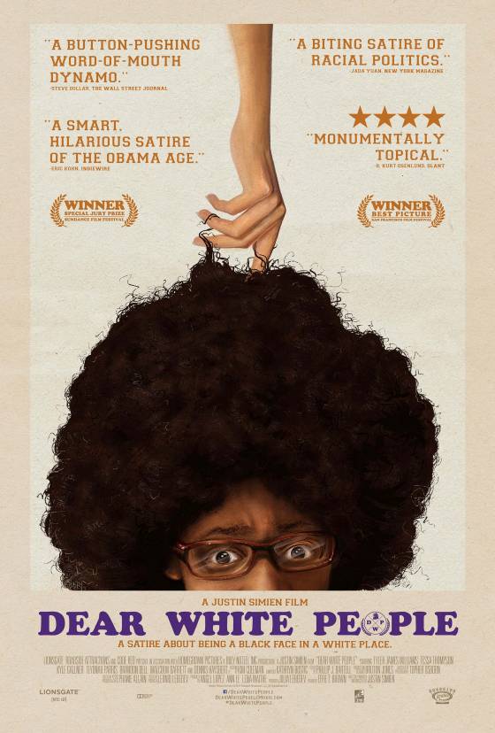
But if Reitman's poster goes for both quirky and serious, Dear White People openly goes for laughs in a way that is keenly attuned to the racial politics of the film, with Tyler James Williams' character's equally exasperated yet sardonically knowing look letting you know precisely where the film's humor lies. (You can actually read more about the poster's design over at Vulture; turns out a fan of the film went ahead and created this design only to find it becoming the film's official poster when he sent to Simien who loved it!).
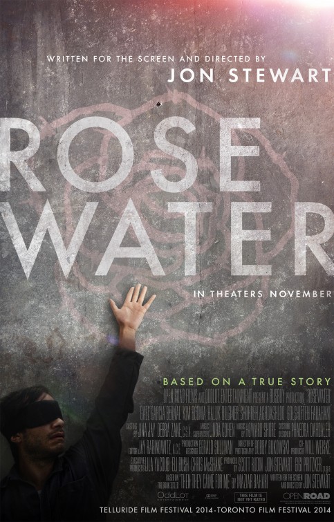
The stark color scheme, the off-center image of Gael (covering up his entrancing eyes! the horror!), the prominence of that ever ubiquitous "Based on a True Story" tagline -- or is it more a disclaimer? a promise?; the poster is clearly wanting to associate "Jon Stewart" with something other than the comedic satire he's known for, going instead for a bleak poster that nevertheless bleeds into a hopeful light in the right hand corner. I particularly love the single bullet hole above the S.
What recent posters have nabbed your attention? Has any of them already secured a spot on your movie poster wall? If you could design a poster for one of your all-time favorite films, which one would it be?
 Manuel Betancourt
Reader Comments (4)
Are there any font experts in TFE's commentariat? Can somebody tell me if the font for the Men, Women, & Children poster is the same as that of the Rosewater poster?
I confess, if only for the bright colors and lack of (now) overused floating heads, I really like the Men, Women, & Children poster. Even if the tagline is corny.
The latest poster to capture my attention is for Shelter. The vibrant red, the striking picture of the two leads, and the bold font are beautiful! I would totally hang it on my wall.
Anne Marie: I wish I were more of a font-fiend, but I think you're right in noticing the resemblance between the ROSEWATER and the MW&C fonts. Definitely both read as sparse, minimalist, modern fonts. And yes, the tag-line is so corny but damn if it's not a beautiful poster. I keep trying to find who designed it but can't for the life of me find that info!
EricG: That poster is so striking! Also, Connelly and Mackie look absolutely delicious.
Just saw some stills from Shelter: Mr. Mackie has some arms on him! MERCY!