The Furniture: Batman's Nightmare at the Museum
 Monday, March 28, 2016 at 10:15AM
 New Series. Daniel Walber talks production design in "The Furniture". Previously we looked at The Exorcist, and Carol and Brooklyn. And now...
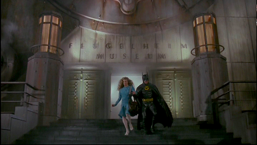
In the Oscar battle between Batman and Superman, there is no real contest. Superman’s three nominations, zero wins and one special achievement award have nothing on Batman’s fifteen nominations and three wins. And it doesn’t look as if we have to worry about the tally getting complicated by any nominations for Batman v Superman: Dawn of Justice.
However, the arrival of the newest Batman movie is an excellent excuse to discuss the oldest. Tim Burton’s 1989 Batman remains the only superhero movie to ever win the Best Production Design Oscar, an honor it certainly deserves to keep...
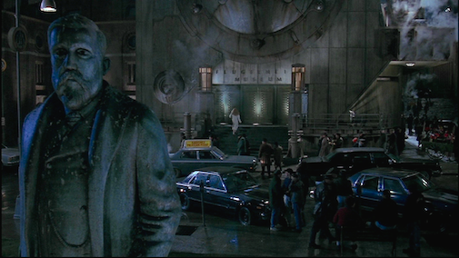
Production designer Anton Furst’s vision of Gotham is an Art Deco nightmare. He and his team, including Oscar-winning art director Peter Young, combined diverse architectural styles rather than attempting to invent something entirely fantastical. It’s a compelling, if unholy, concoction of influences that range from the Art Nouveau chairs of Rennie Mackintosh to the futuristic buildings of Shin Takamatsu. This refusal to draw from a single period is part of why it still looks so unique.
The best example of this is the ornate set at the middle of the film, the “Flugelheim Museum.” Peggy Guggenheim used to refer to the Guggenheim Museum as “my uncle’s garage,” a description even more perfect for this dystopian parody of the Manhattan landmark.
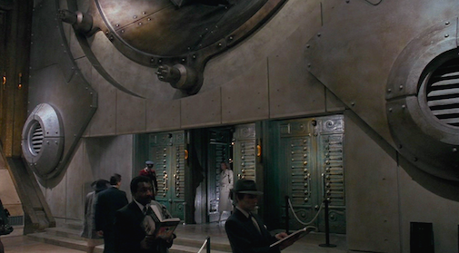
Vicki Vale (Kim Basinger) arrives to meet Bruce Wayne for dinner. As she ascends the stairs, it’s easy to miss the art hanging on the walls in the lobby. The room is dominated by exaggerated Art Deco columns and round windows that resemble the portholes of a ship. They’re a dark interpretation of Art Moderne’s nautical tendencies, which cruises both back to Disneys’s 20,000 Leagues Under the Sea and ahead to the rise of steampunk.
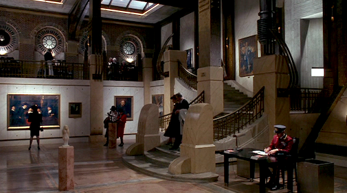
It’s no wonder that no one comes to the Flugelheim for the art. Instead, it’s basically a restaurant with very expensive decor. This being the late 1980s, it’s easy to see this as a critique of all the money that had just rushed into Manhattan, yuppies more interested in being seen in a palace of culture than actually looking at any of the cultural history hanging on the walls.
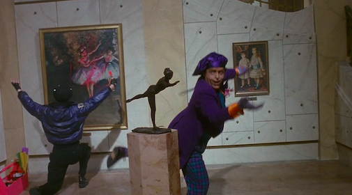
Of course, even that limited respect for Degas is more than what The Joker (Jack Nicholson) is willing to give. After gassing everyone in the room except Vicki, he bursts in to “improve” all of the art on display. He and his goons kick over statues and deface paintings with his signature neon greens and pinks.
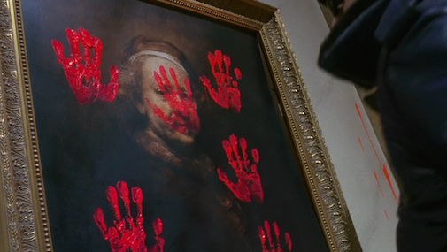
These masterworks include, among others, Vermeer’s “Woman Weighing Pearls,” Rembrandt’s "Self Portrait at the Age of 63," and Gilbert Stuart’s unfinished portrait of George Washington. They’re all quite respectable, and all quite old.
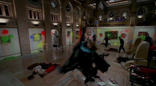
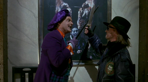
Like the Italian Futurists of a nearly a century before, The Joker is all about burning down museums to make way for new art. He tells Vicki that he’s the “first functioning homicidal artist.” His work is alive - at least until he kills it. The only work in the museum that he protects, Francis Bacon’s “Figure with Meat,” is just the sort of fleshy nightmare that The Joker is all about.
This fits into another of the 1980s cultural fixations that drive Burton’s Batman: the rise of plastic surgery. The Joker’s methods, poisoning makeup and mutilating the smiles of his victims, exaggerate and distort the human face in the same way that the production design reshapes New York City’s Art Deco skyline. The anxiety that grips Gotham City is both monumental and monstrous, and it manifests on every level of the film’s design.


Reader Comments (11)
I haven't seen this film in decades, but the fond way you write about it is making me think I should get it out for a re-watch. What I liked about those first versions of Superman and Batman was the human scale and the sense of humour. Now these comic versions are as devoid of humour as they are devoid of colour.
Thanks again Daniel, I love the series.
Batman Returns has beautiful production design too. Timeess Classics!
Batman '89 belongs in the top five Hollywood blockbusters ever.
I had such a hard time with this museum scene as a kid because it is such blasphemy to destroy beautiful art. but the production design is indeed amazing (didn't the guy who did it die shortly after this movie?)
I LOVED the whole museum sequence. I remember having the VHS (!) as a kid and rewinding and replaying that scene again and again. I was in 5th or 6th grade when Batman came out and it was my favorite movie.
Understandably not mentioned here, but the vandalism being set to original music by Prince is just the icing on a decadent cake.
I also love the design of Wayne Manor, AXIS Chemicals, and Carl Grissom's office.
Love love loving this for a series! Batman has some of the best production design. The city used to disturb me greatly as a kid, but the older I've gotten, the more I love and appreciate it's terrifying, gothic design. The museum sequence is a dream!
jakey - Every set in the movie probably deserves its own article! Carl Grissom's office is great - it's one of the first things that come up in C.S. Tashiro's book on production design, as an easy example of Fascist design but also a weirdly subversive example of Symbolist. And AXIS Chemicals is bonkers.
Nathaniel - Anton Furst only worked on one more movie, Awakenings. He committed suicide in 1991. He was only 47. He had such a brilliant career, too - Batman Returns might have been a very different movie if he'd lived.
(Not that Batman Returns isn't the best Batman movie, because it is, but its design is VERY different from Batman.)
The Burton Batman films were my favorite, and in my mind, the best of the incarnations. The production and costume design were superb, and can we talk about that score?? Elfman and Morricone's snubs that year....I mean....
This movie is porn for those who love art direction. Geometry was never so glamorous. Well-done.
Keep up the great work, Daniel!
That museum scene was definitely one of the first times as a kid I understood the impact of color in cinema - it's so outrageous and offensive. Also highlights the icky unnatural peach of the Joker's skin.
It's amazing that Furst created such a heightened, stylized world that still feels so tangible. This is one of the only Gothams that feels like it lives outside the frame.