The Furniture: Revisiting the Surreal Spaces of Toys
 Monday, December 18, 2017 at 3:30PM
 "The Furniture," by Daniel Walber, is our weekly series on Production Design. You can click on the images to see them in magnified detail.
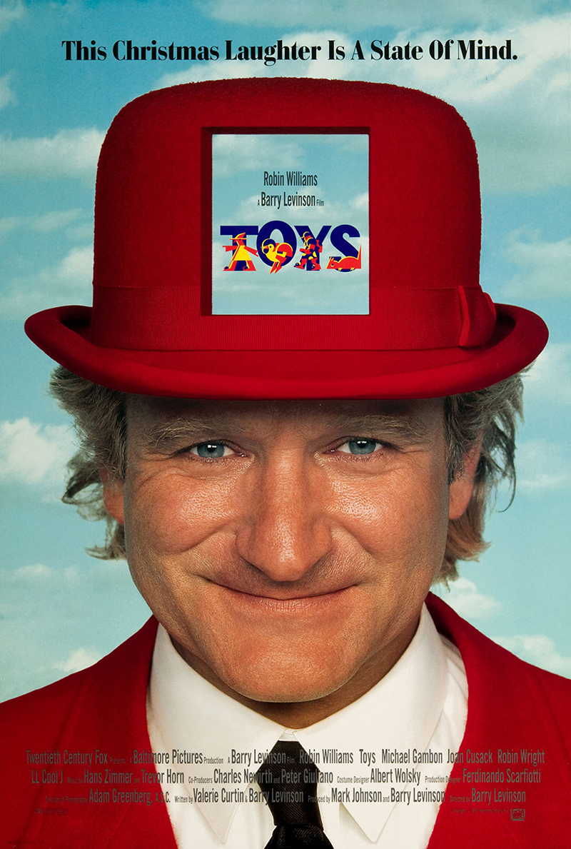 Today marks the 25th anniversary of Barry Levinson’s Toys, a film you don’t hear about very much anymore. It wasn’t exactly beloved at the time, certainly, and wound up with a Razzie nomination for Worst Director. However, it also showed up at the Oscars, receiving nominations for Best Costume Design and Best Production Design. At the very least, it remains a pleasant reminder that sometimes even flops are given a fair shake by the Academy’s craft branches.
And now, in the dramatically different context of 2017, it deserves some renewed attention. Its critique of militarism and toxic masculinity has aged surprisingly well, as have the more committed of the performances. Joan Cusack’s absurd turn as the eternally childlike Alsatia is at the top of the list.
But the best elements are still those that were recognized at the time.The work of production designer Ferdinando Scarfiotti, art director Edward Richardson and set decorator Linna DeScenna is beyond...
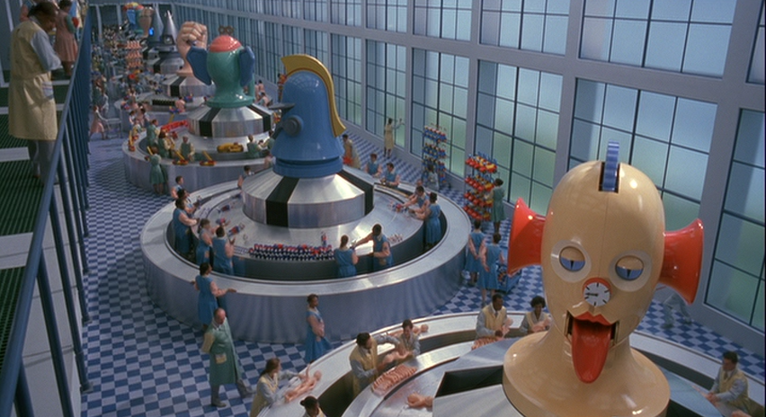
One could write an entire column about the warring armies of toys assembled at the Zevo Toys factory, from the strange classics held in the vault to the deranged military-grade novelties built under the orders of General Leland Zevo (Michael Gambon). And then there’s all the color-coding, a world of pastels.
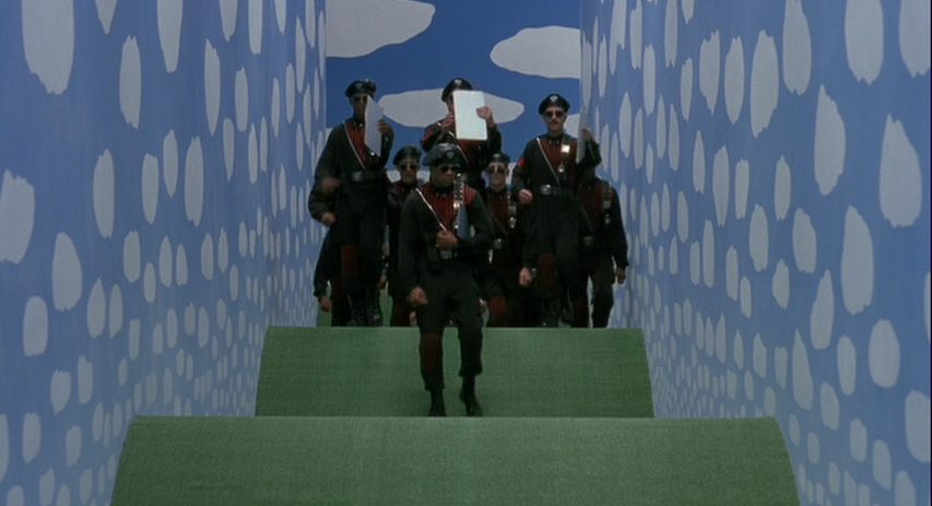
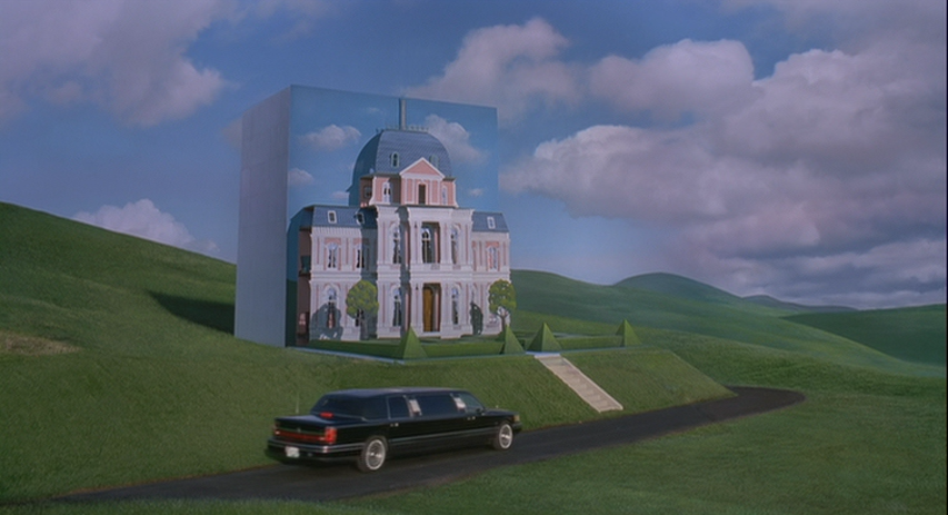
However, I’m going to narrow the topic to something a bit more structural, the utter disregard for standard spatial reasoning. Much of the film takes place in rooms that could never fit together. The factory, for example, seems to have a single doorless hallway no doors. Its floor mimics the rolling hills of the unique Palouse region of Washington and Idaho, where the film’s exteriors were shot. It appears to lead nowhere, yet somehow leads everywhere.
The Zeno family home, where Leslie (Robin Williams) and Alsatia live, is even more of a charming impossibility. It literally folds out of a hill, a French Baroque mansion cut from the Palouse landscape. It also has its own logic, borrowed quite explicitly from the surrealist paintings of Rene Magritte, whose work is the film’s principal design influence.
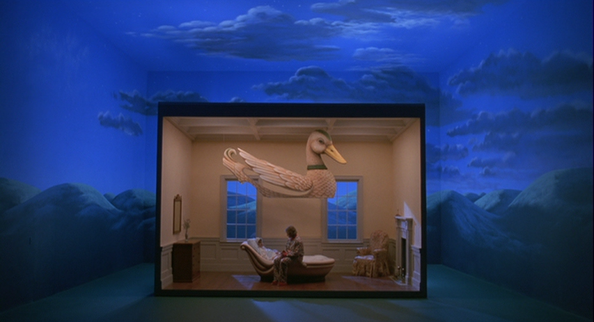
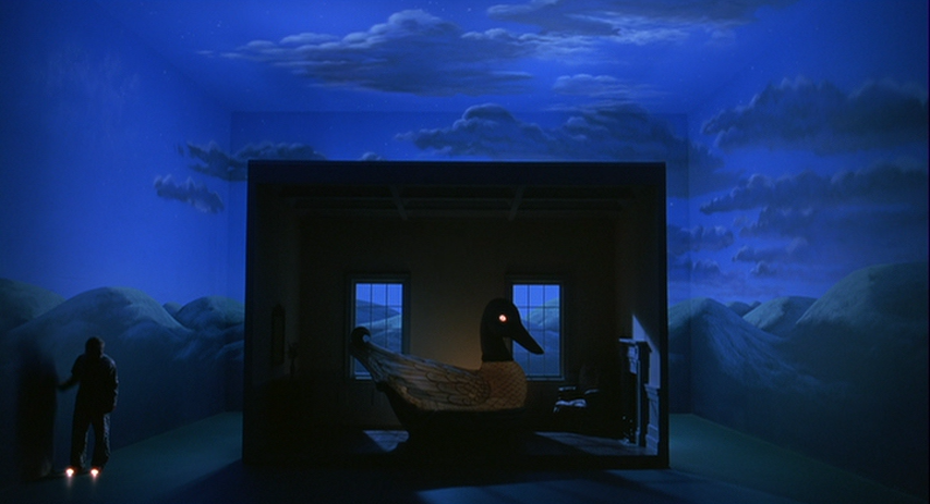
Rooms of greater impossibility can be found within, imaginative riffs on domestic life. Alsatia’s bedroom is a reasonably sized box that sits in an enormous space, painted to appear at the summit of a snow-capped mountain.
The top of the duck comes down as she falls asleep, a protective bed with a built-in nightlight.
The dining room, while much more reasonably sized, is a surreal riff on its own joke. Each of the chairs takes the shape of another architectural style, Greek columns next to a colonial church. Curtains mimic the night sky, while the walls suggest a crimson infinity.
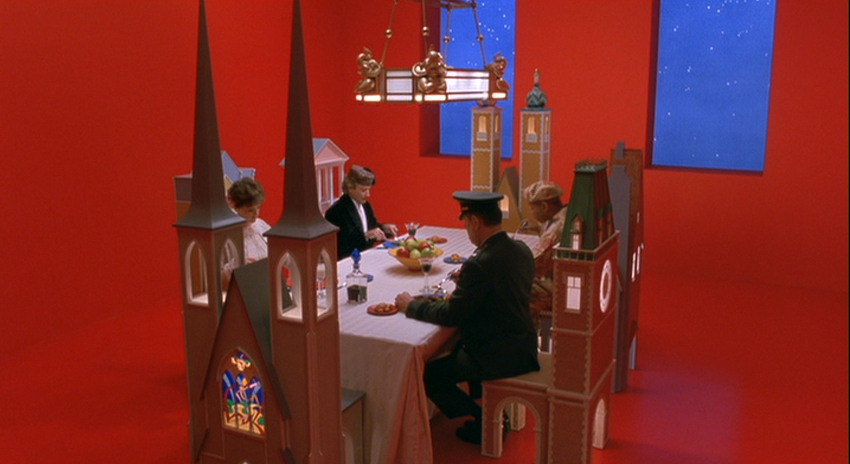
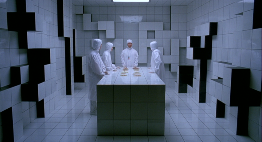
The house is a triumph of absurdity, a consistently surprising collection of equally impossible spaces. But an even more thrilling departure from the laws of physics happens back at the factory. Leland slowly takes over the building, gradually expanding his villainous secret project. But he doesn’t commandeer more space by marching into rooms, one by one. Rather, the walls do the pushing themselves, forcing factory workers to rush out of the way.
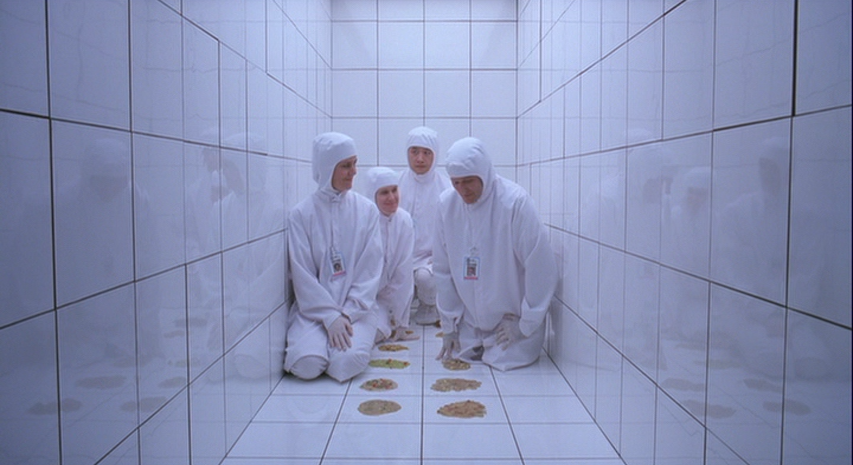
The best example is a testing room, where Leslie and his staff evaluate an array of fake vomits. Suddenly the white panels of the walls start breaking apart, Tetris-like pieces that encroach toward the center table.
It’s only a matter of seconds before the team ends up standing on the table, trapped in a fraction of the room’s former volume.
This dramatic resistance to the laws of physics is the best thing about Toys. It’s also in tune with Magritte’s work, an influence that goes deeper than direct visual references. Why should production design attempt to replicate the physical world with total accuracy, without at least engaging with its own inherent falseness? The Zevo family home is no more a house than Magritte’s famous pipe is a pipe. When the whole art form is just flickering images, surrealism is just as honest as realism, if not much more so. Ceux-ci ne sont pas des Toys.
More of the fantastical on "The Furniture"
Brazil, Camelot, Fantastic Beasts and Where to Find Them, La La Land, Sleepy Hollow, Querelle, Wonderful World of the Brothers Grimm.


Reader Comments (10)
"... and wound up with a Razzie nomination for Best Director"
You mean Worst Director
It's a terrible movie though it does have some nice set design.
thevoid99: Yeah, looking at it, I'd keep it's production design nom, but would prefer that Costume Design nomination to have gone to Batman Returns.
Horrible movie. Some diamonds aside, Robin Williams' filmography is littered with turds.
The movie is crap but I do agree with your views on the visuals
I love Magritte. The reviews scared me away from this on release but these pictures make me want to check it out. Great write-up!
YES!
I unabashedly became a fan when I rented it on a whim due to my love for Robin Williams. Gosh, that was over a decade ago, and now it’s part of my Christmas rotation (indeed, it’s the last film I watch before Christmas each year).
For my money, should have won for its production design, and should have garnered a nomination for best song, for The Closing of the Year, as lovely and unexpected a Christmas “carol” as I’ve ever heard. To not even mention the soundtrack as a whole, one of Zimmer’s finest; plus, any soundtrack that has both Enya AND Grace Jones is absolute gold.
And the cast! And the humor! It ranks as one of the funniest movies I’ve seen, and yet, 25 years in, as maligned and Blu-ray-less as ever...
Sigh. May joy and innocence prevail.
Truly one of the worst screenplays to ever grace the screen but still totally should've won the Production Design Oscar.
Remember it was called the Art Direction-Set Decoration Oscar back then...
Such an amazing article thanks for sharing wonderfull article