The Furniture: The Salesman Crafts His Own Stage
 Monday, May 8, 2017 at 10:12PM
"The Furniture" is our weekly series on Production Design. You can click on the images to see them in magnified detail. Here's Daniel Walber...
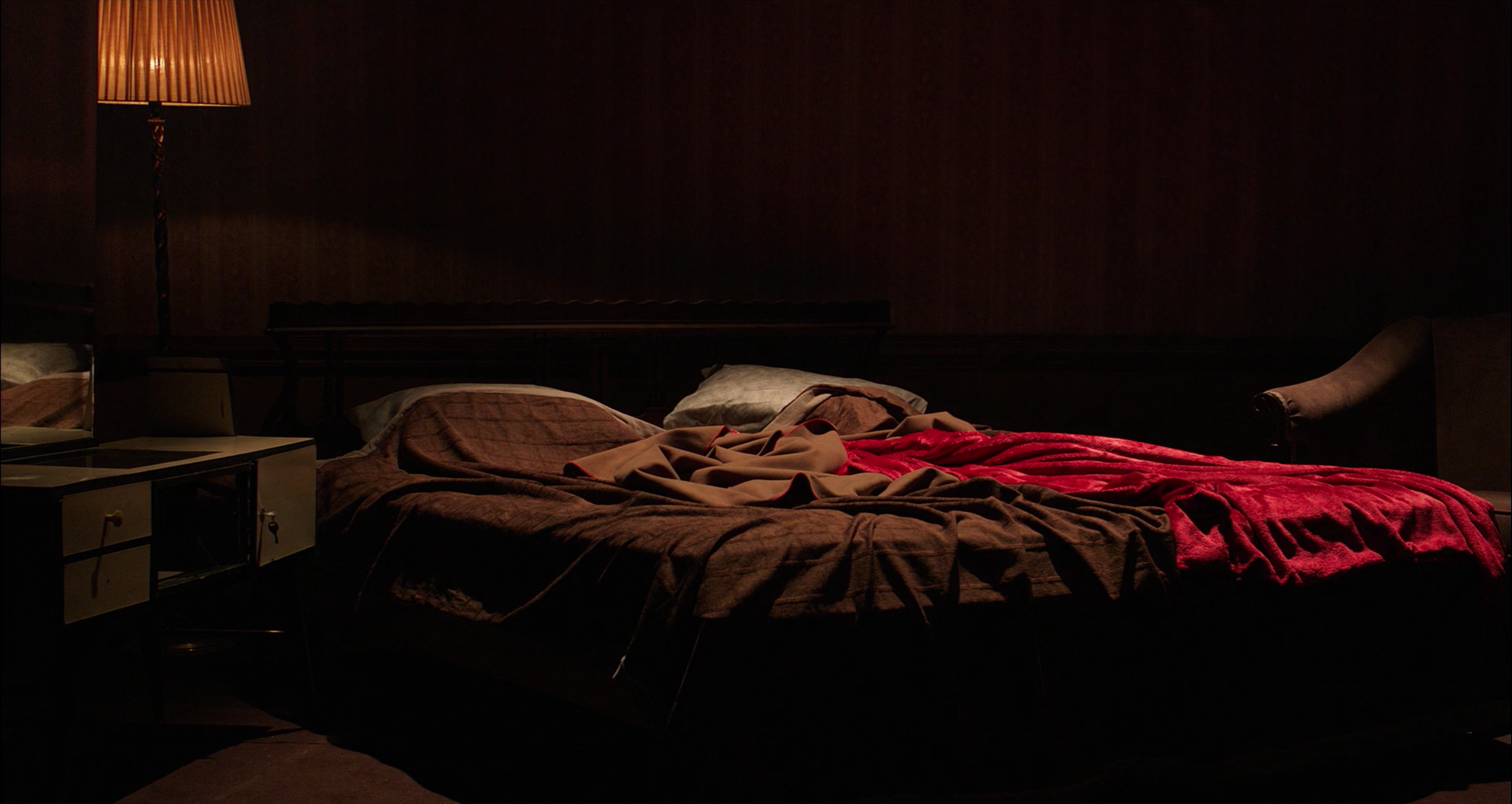
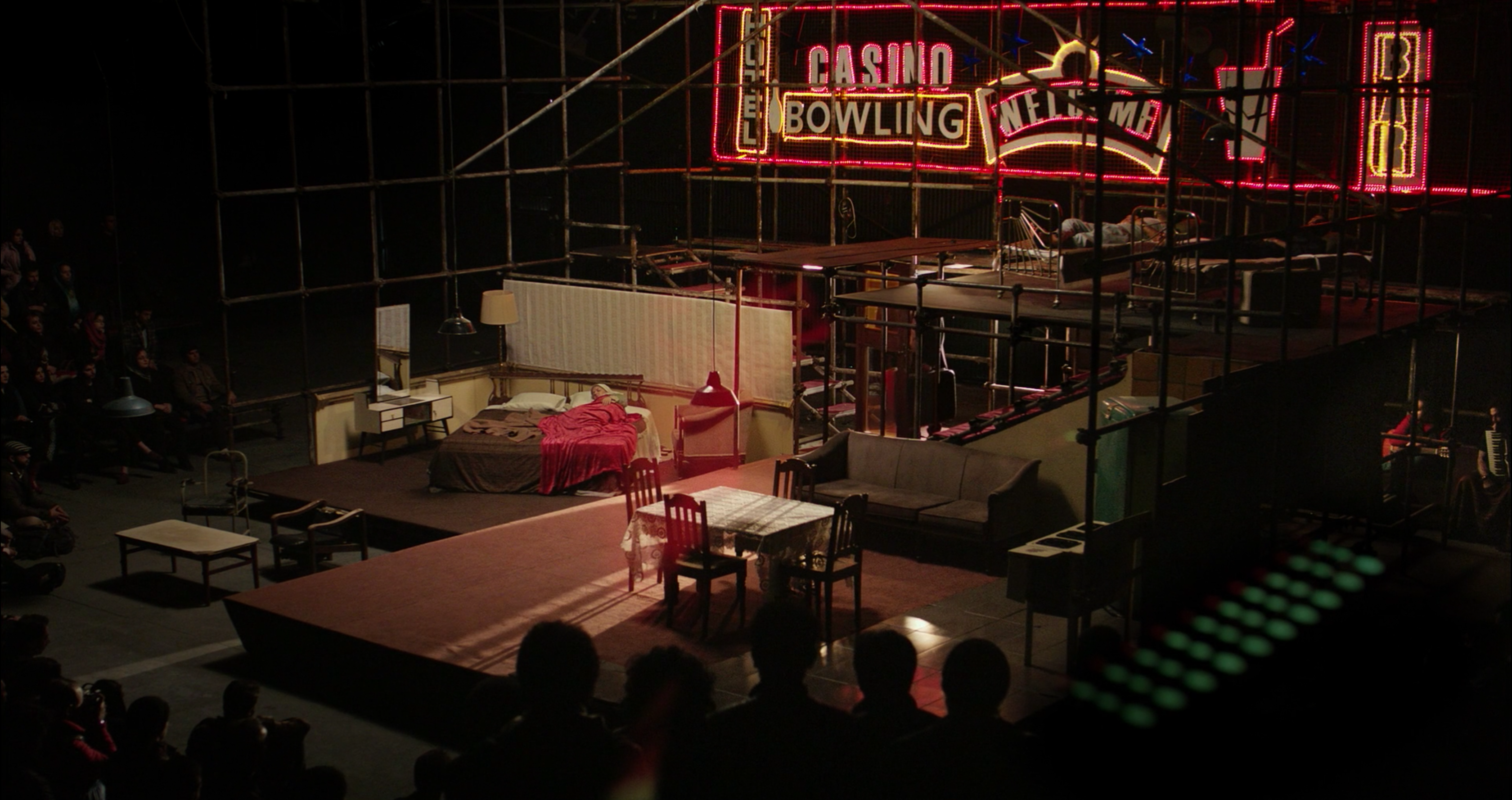
Asghar Farhadi's Oscar winning The Salesman begins with a set. The opening credits appear over the quiet stage of a small Tehran theater, nearly ready to debut a new production of Arthur Miller’s Death of a Salesman. We see the bed before the actors who will lie in it, neon lights illuminated for an empty house. It is a quite literal setting of the stage before the drama begins.
It’s not a play adaptation, but it often feels like one. There are few locations and the cast is small. And, as in many play adaptations, the production design does a lot of heavy lifting...
Art director Keyvan Moghaddam may not have gotten much attention in last year’s awards season, but this column exists to rectify that sort of oversight.
The set distills a house into a single space. The different rooms are easily identifiable, but there are no walls or doors. The neon lights evoke a bizarre version of American economic life. They also suggest something a bit lurid about the world outside, a tone oddly reminiscent of All About My Mother and its vision of A Streetcar Named Desire.
Willy and Linda Loman are played by a real-life couple, Emad Etesami (Shahab Hosseini) and his wife, Rana (Taraneh Alidoosti). But nothing that Miller puts them through on stage can compete with the crisis that Farhadi drops into their home.
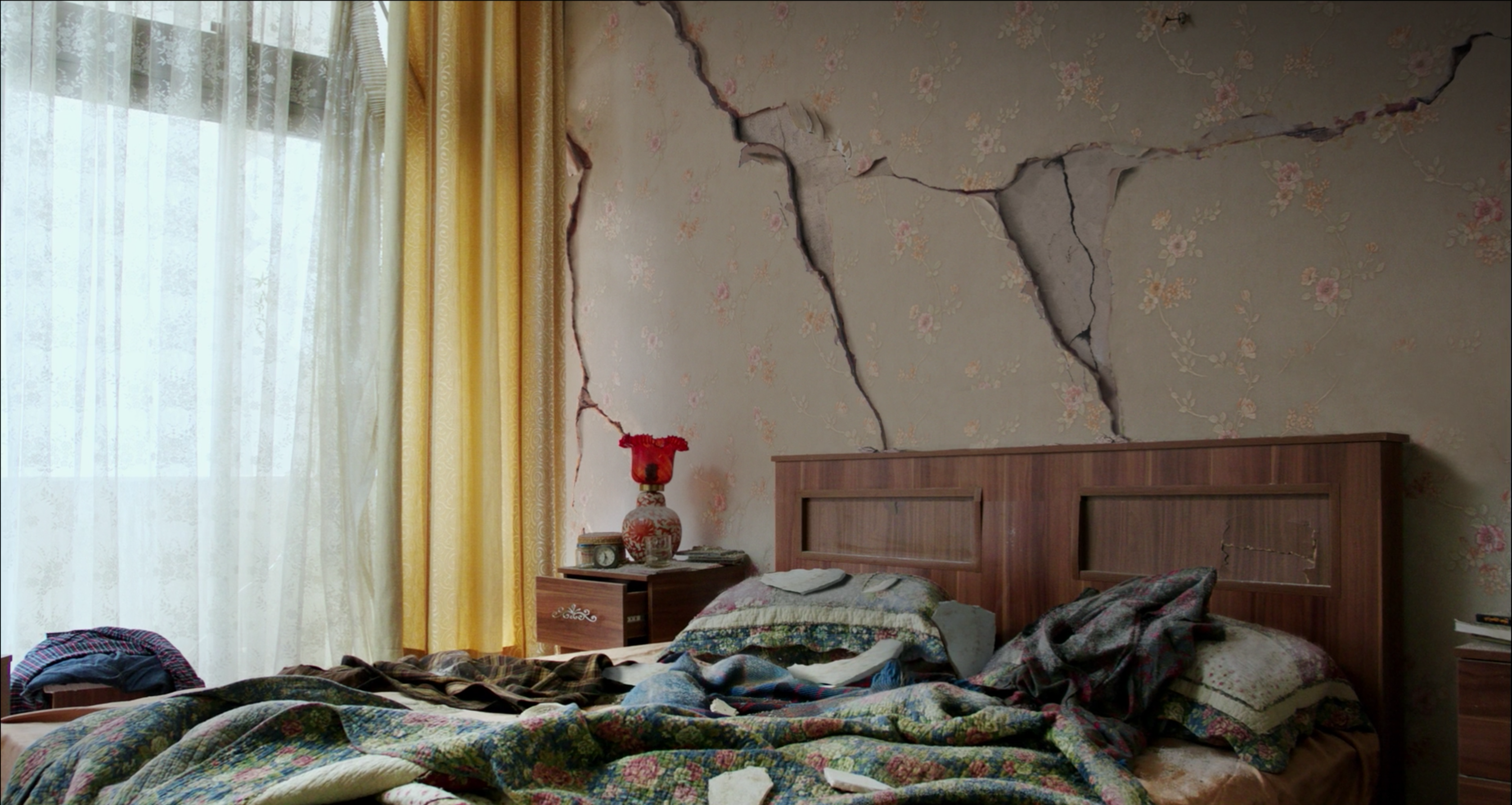
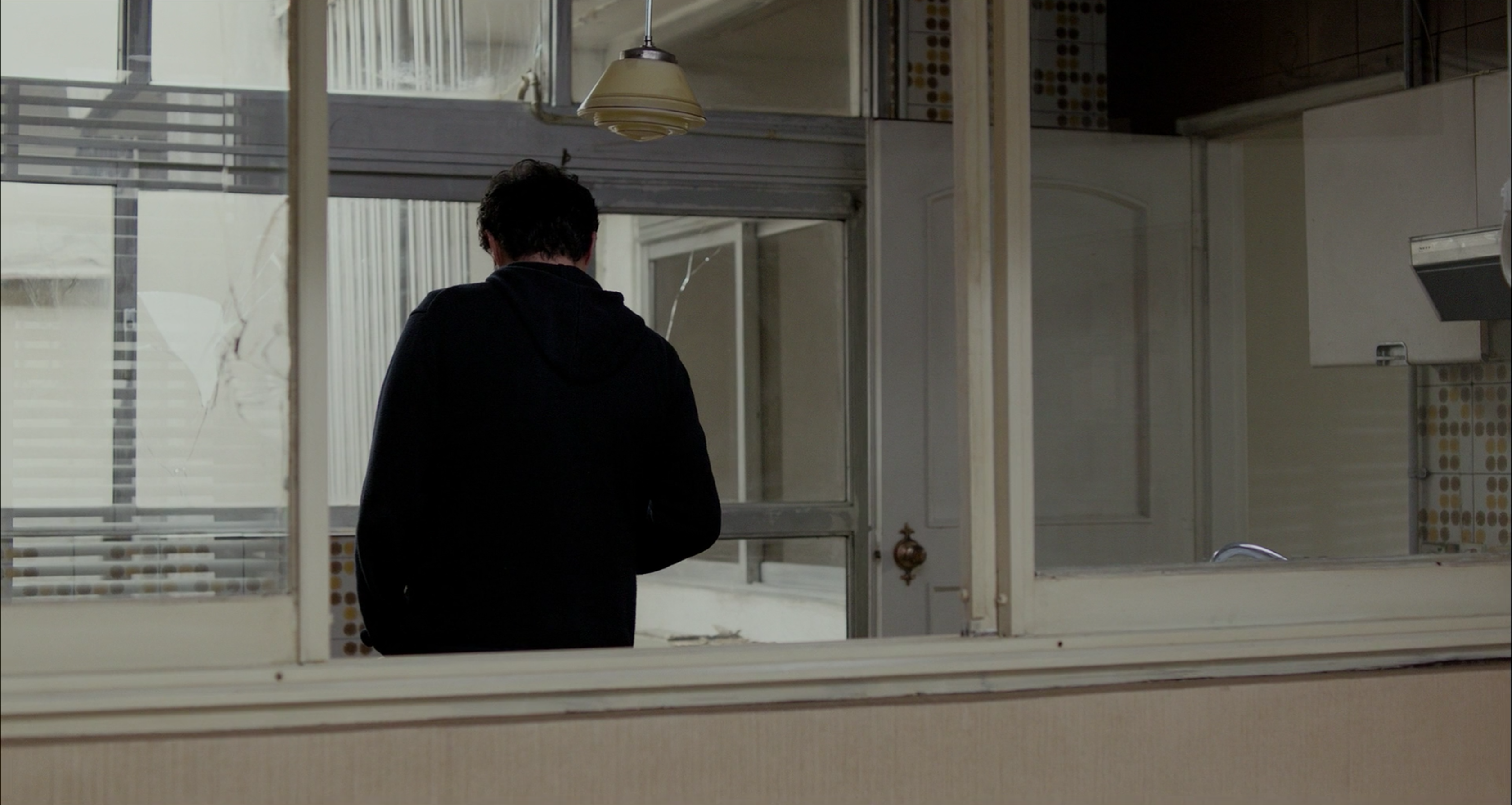
The narrative begins with the near-collapse of their apartment building, in the middle of the night. When they return in daylight, the building is heavily damaged but still standing. What wasn’t broken was left askew, as if an enormous metaphor has risen up from the earth to crash into Emad and Rana’s lives.
If that’s not obvious enough for you, here’s a shot of the especially deep rupture above their bed.
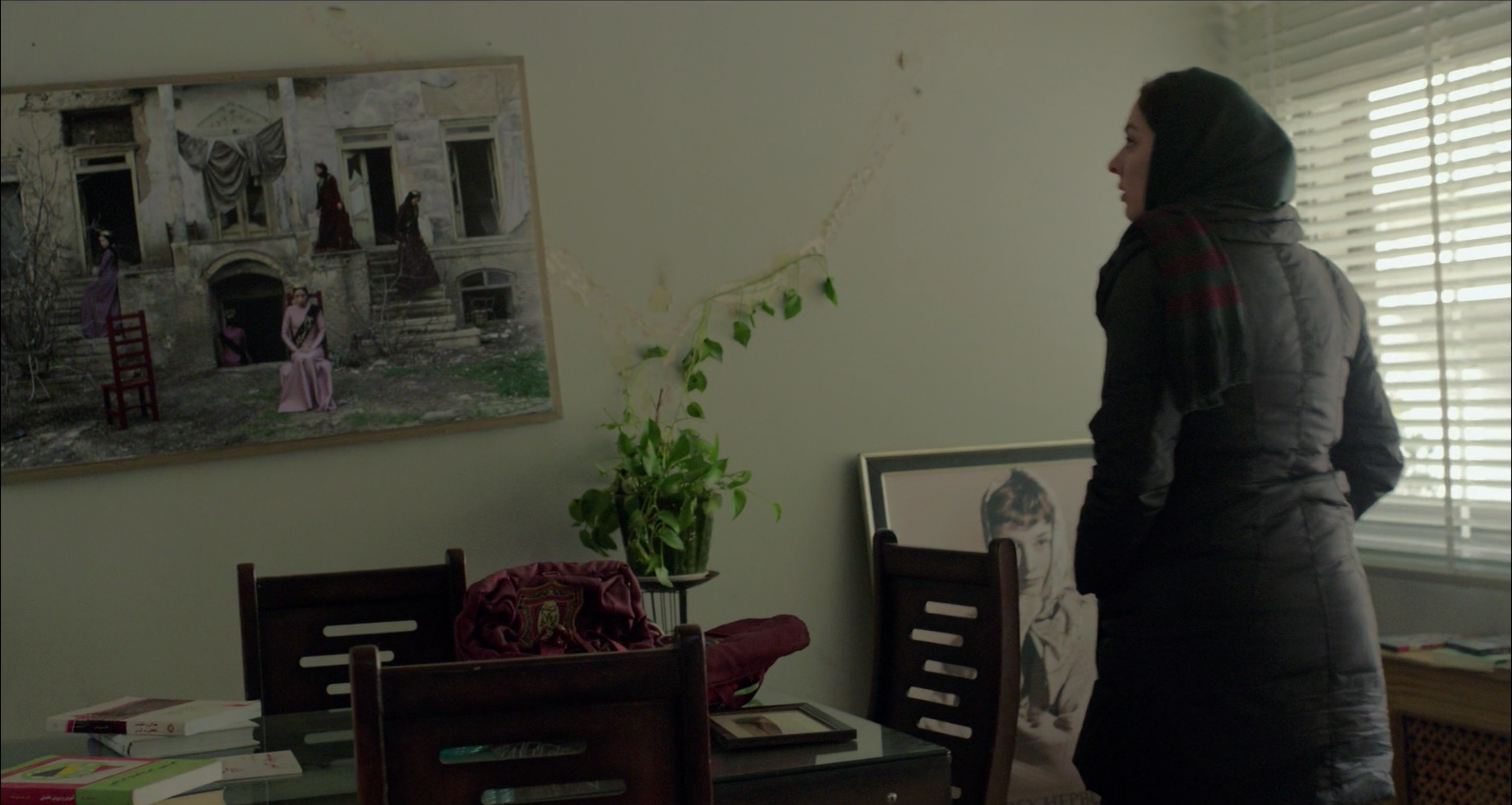
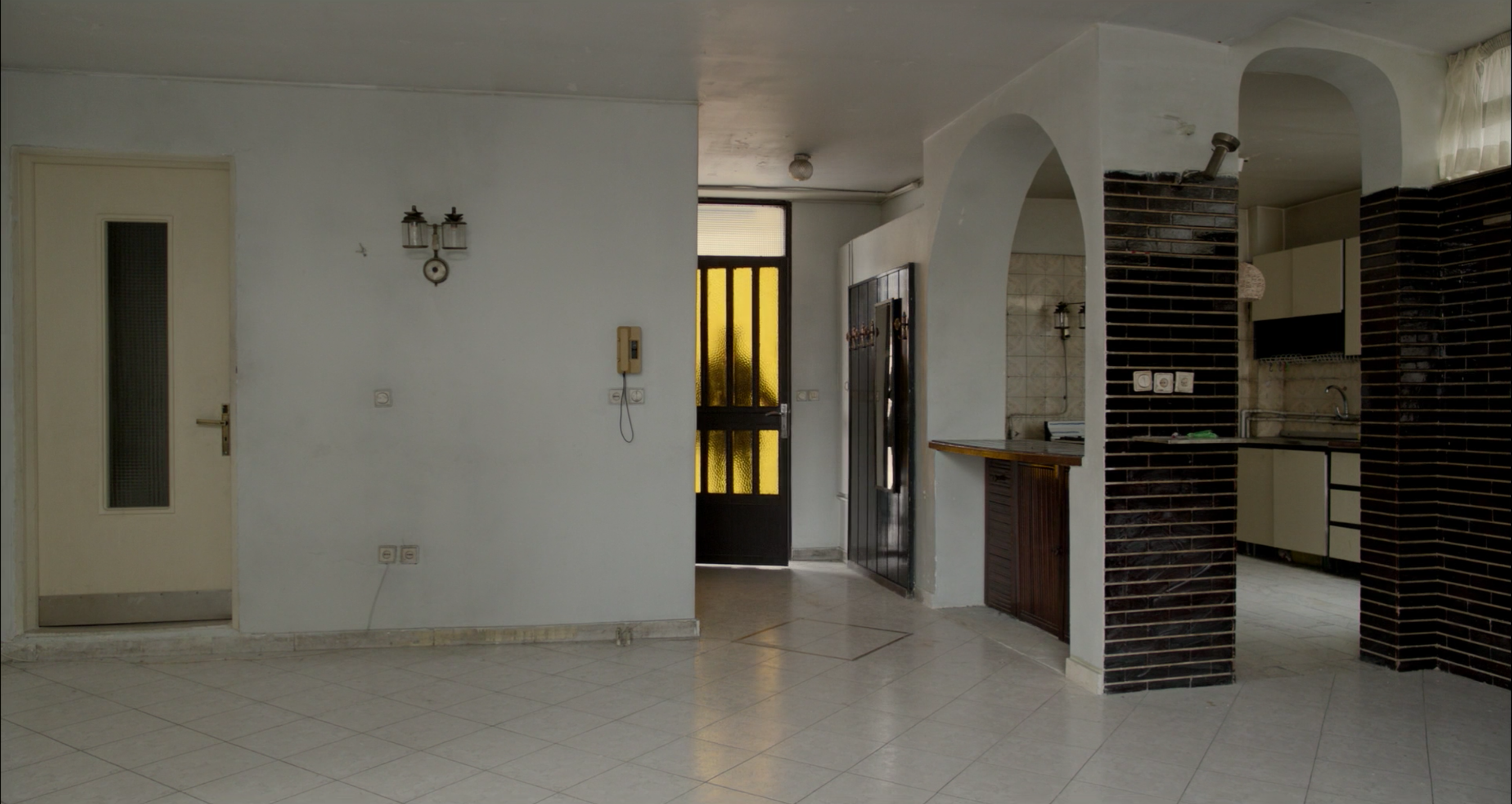
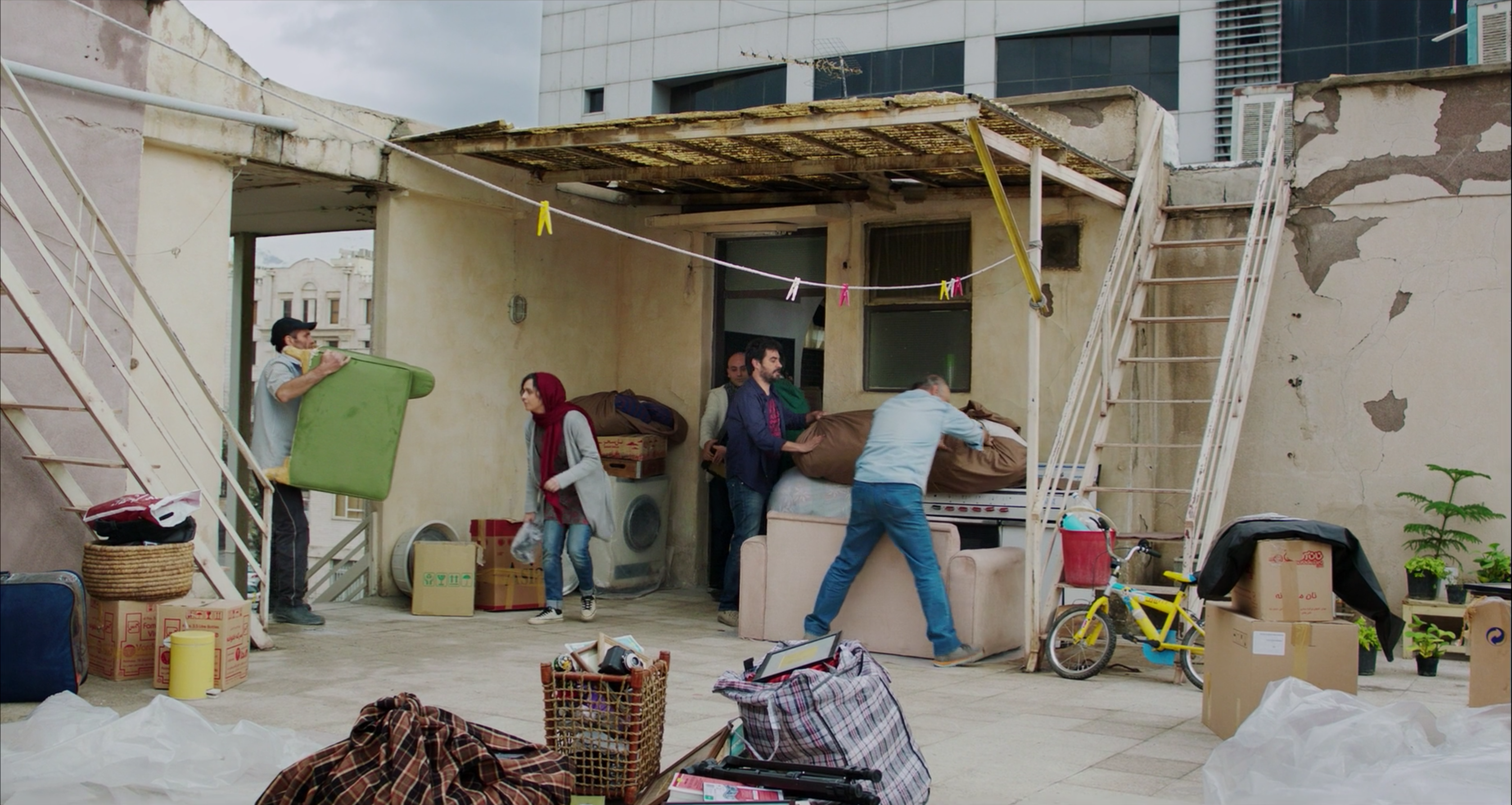
They find a new apartment with the help of a friend. It sits on the top floor and opens onto an enormous rooftop patio. It’s spacious, but unfinished.
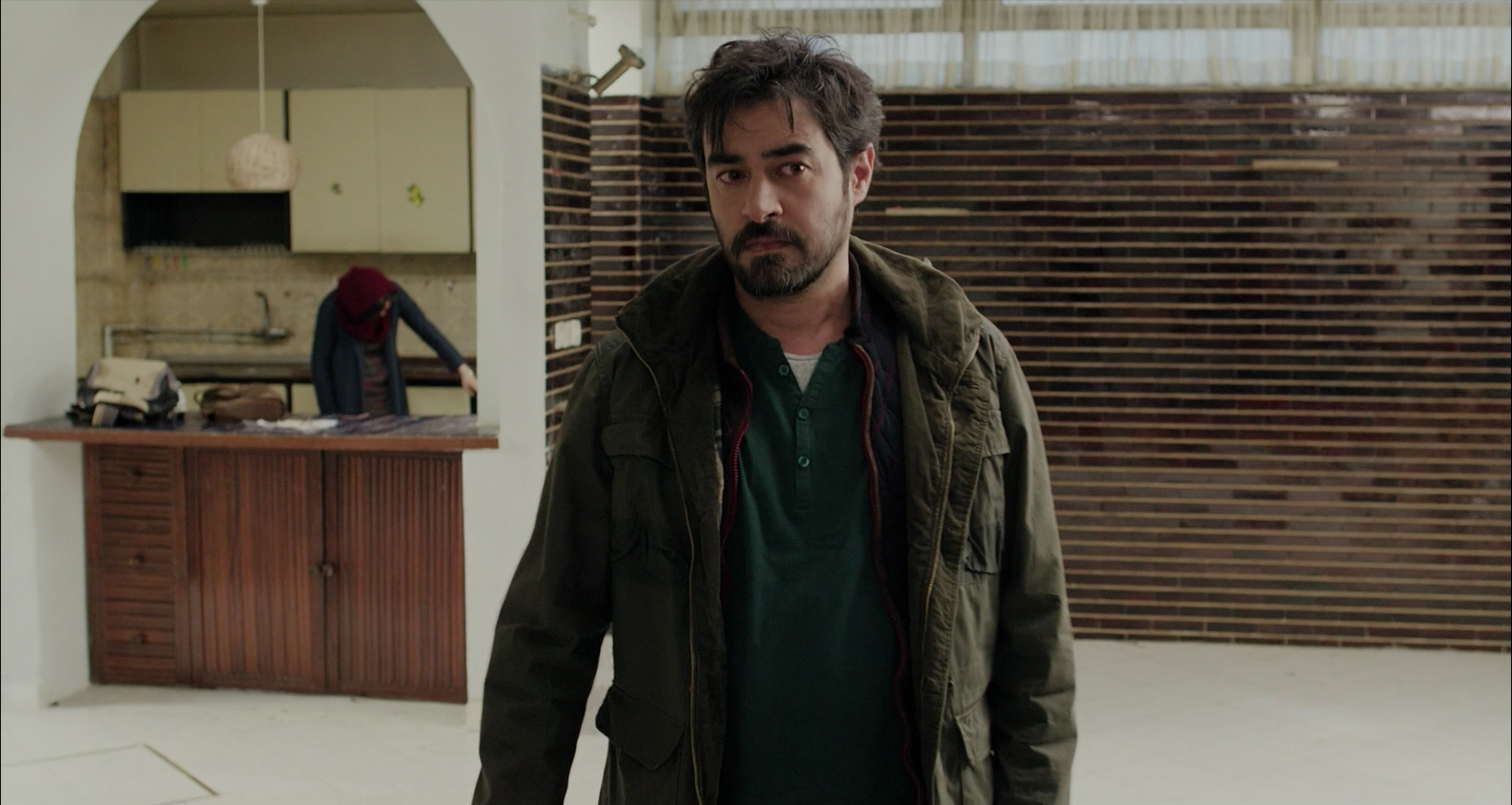
It looks like a clean slate. Emad and Rana move their stuff in slowly, inconvenienced by the former tenant’s refusal to move all of her things out. As a result, the new place never quite feels lived in.
The film’s central trauma occurs in this new apartment, when Rana accidentally lets a stranger into the building. But it also feels like the manifestation of the design narrative that began much earlier, with the cracks in the original home.
Soon, the new apartment doesn’t feel like a clean slate at all. Rather, it takes on the minimalist theatricality of the Death of a Salesman set. It is another dramatic space, in which Emad can create his own scenes of conflict and catharsis.
Emad’s refusal to involve the police, his capture of a truck and his pursuit of a bread delivery man are all parts of this theatrical drive. At the exclusion of Rana, he obsessively casts a final scene with an unknown villain. On the one hand, this is a determined attempt to avoid the fate of the salesman he portrays. On the other, it seems like the result of a life sublimated to theater, where resolution is the result of timing and staging.
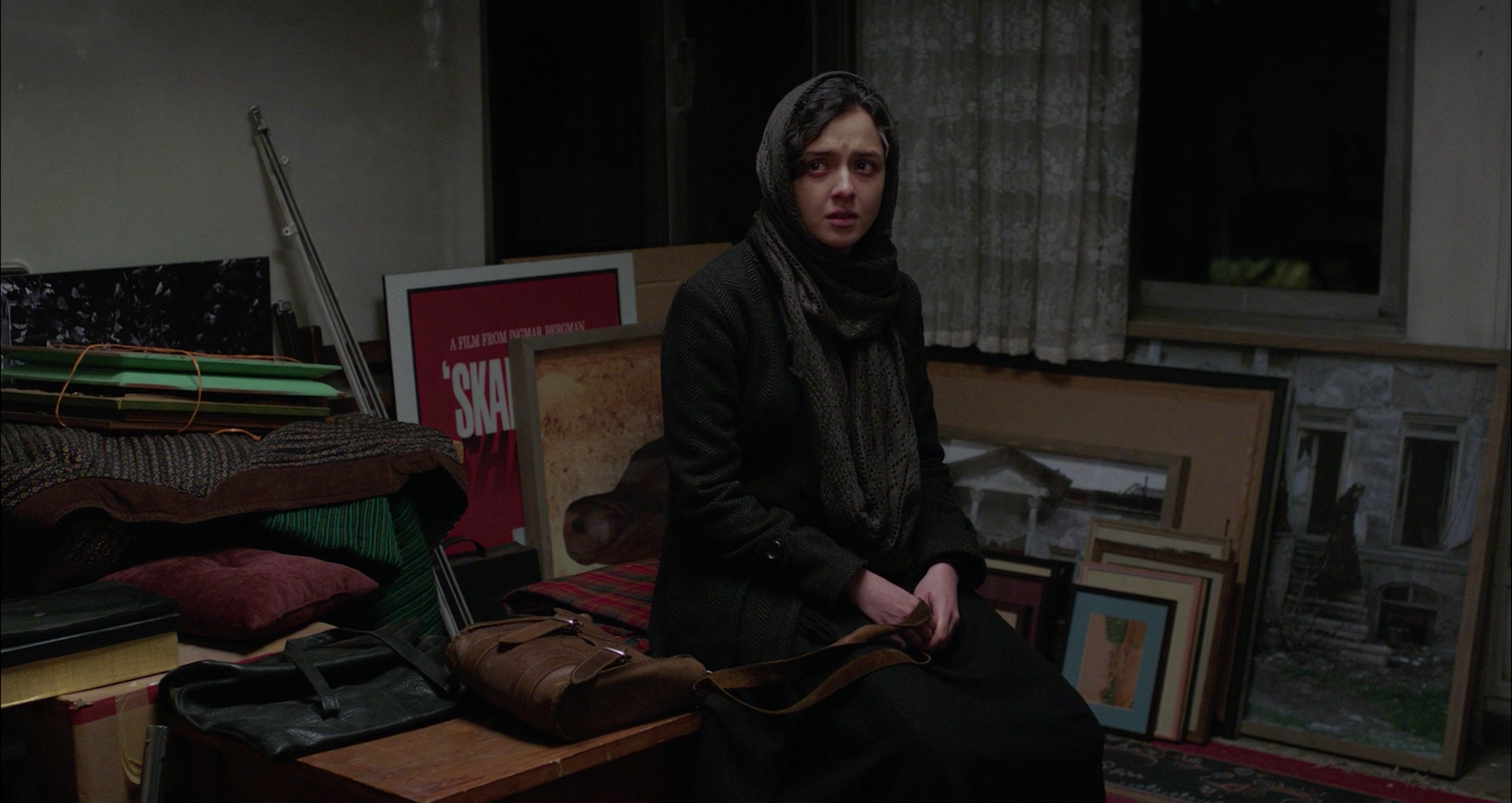
It is, therefore, appropriate that this ultimate confrontation takes place in the original apartment, still full of home decor and other chosen representations of taste or identity.
Emad has lured his suspect on the pretense of a moving job. He insists on a confrontation that involves no change of location, no intermission. It is perhaps too simple a metaphor, particularly given what happens to the aging salesman he meets in the last act. But the design gives it a clear narrative arc. The cracks in the windows and walls, the trauma that lurks in the corners and the expert use of space are all hallmarks of the work that so frequently goes unnoticed in films about theater.
previously on The Furniture



Reader Comments (1)
I am glad I have found your post while reading Continuity Plan online. I would love to hear more from you. Please keep sharing useful information with us. Thanks for sharing this useful information with us and also it is very well written.