The Furniture: Visual Rhyming in Babyteeth
 Wednesday, August 5, 2020 at 12:02PM
 Daniel Walber's series on Production Design. Click on the images to see them in magnified detail.
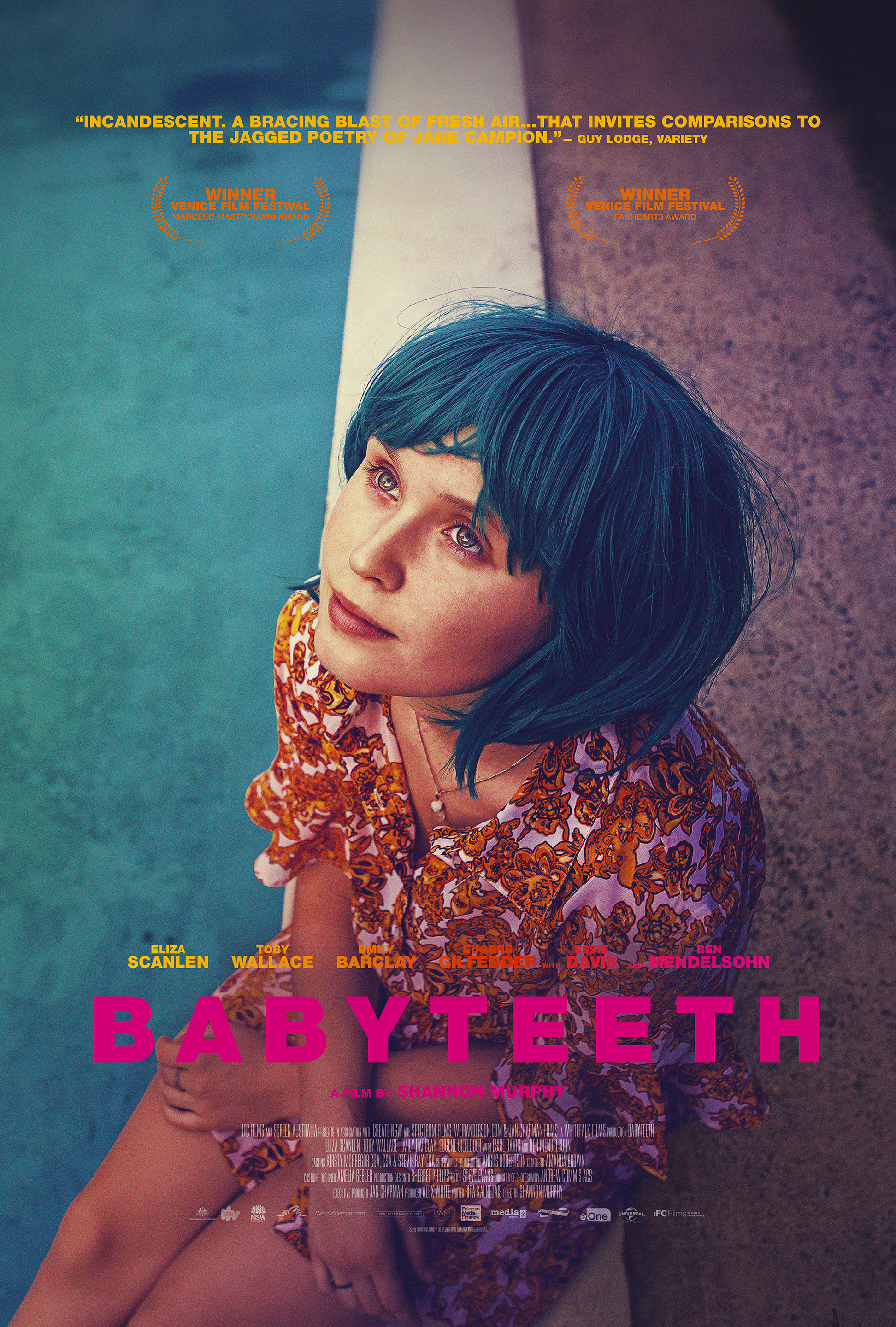 This week we’re keeping it brief. Is it because I’m tired? Is it because this year isn’t the best so far in terms of production design? Is it because Hurricane Isaias is really dampening the mood? Who can say?
It’s also because Babyteeth is a movie with admirable graphic simplicity. Director Shannon Murphy and her design team (Sherree Philips, Bil Goodes, Ishtar Cavagnino and costume designer Amelia Gebler) use a limited color palette to express their themes, a concise visual language built upon the clashing personalities of their characters. It speaks for itself.
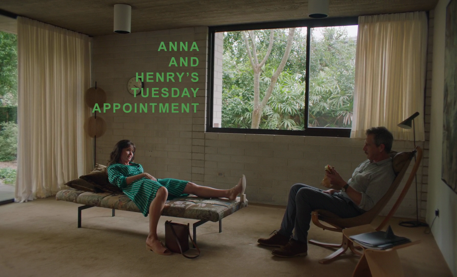
The frequent textual incursions, for example, might become grating in another film. Here, they fit in among the other accents. This one rhymes with Anna’s (Essie Davis) dress, which then underlines the fact that she sticks out like a sore thumb against Henry’s (Ben Mendelsohn) dull office - and his dull clothes.
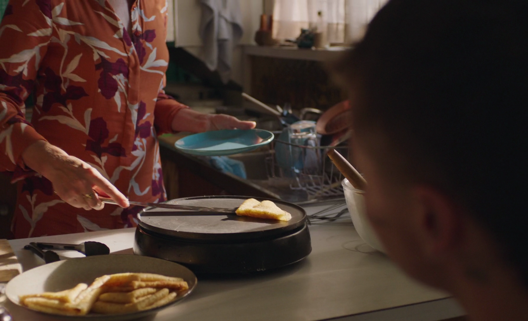
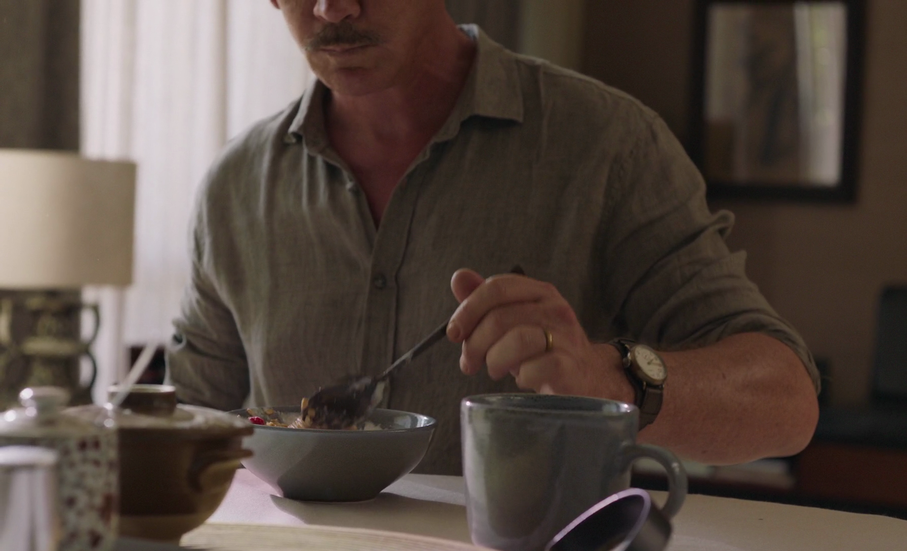
Breakfast makes for another excellent moment of economical set decorating. Pro tip: sometimes the easiest way to point out the alienating wealth of a family is to highlight one of their single-use kitchen appliances. A crepe griddle? Come on.
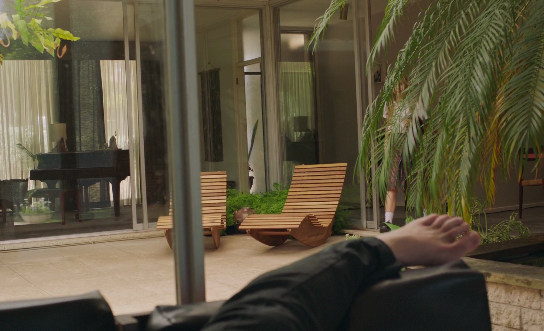
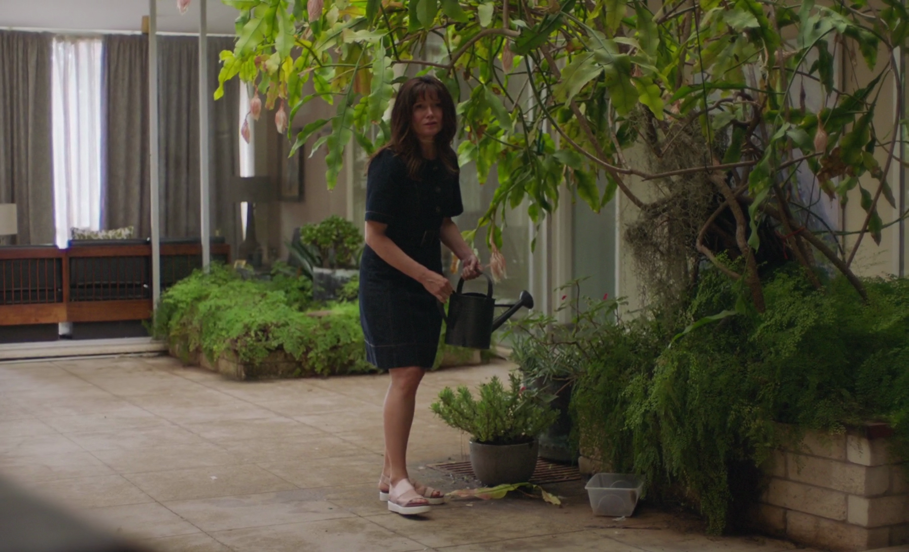
I am also obsessed with the tropical atrium in the middle of this single-story suburban Australian home. Why put your fancy, wooden outdoor furniture in the front yard when you have giant plants inside? (I do not know how common this is in Australia, I have not been.)
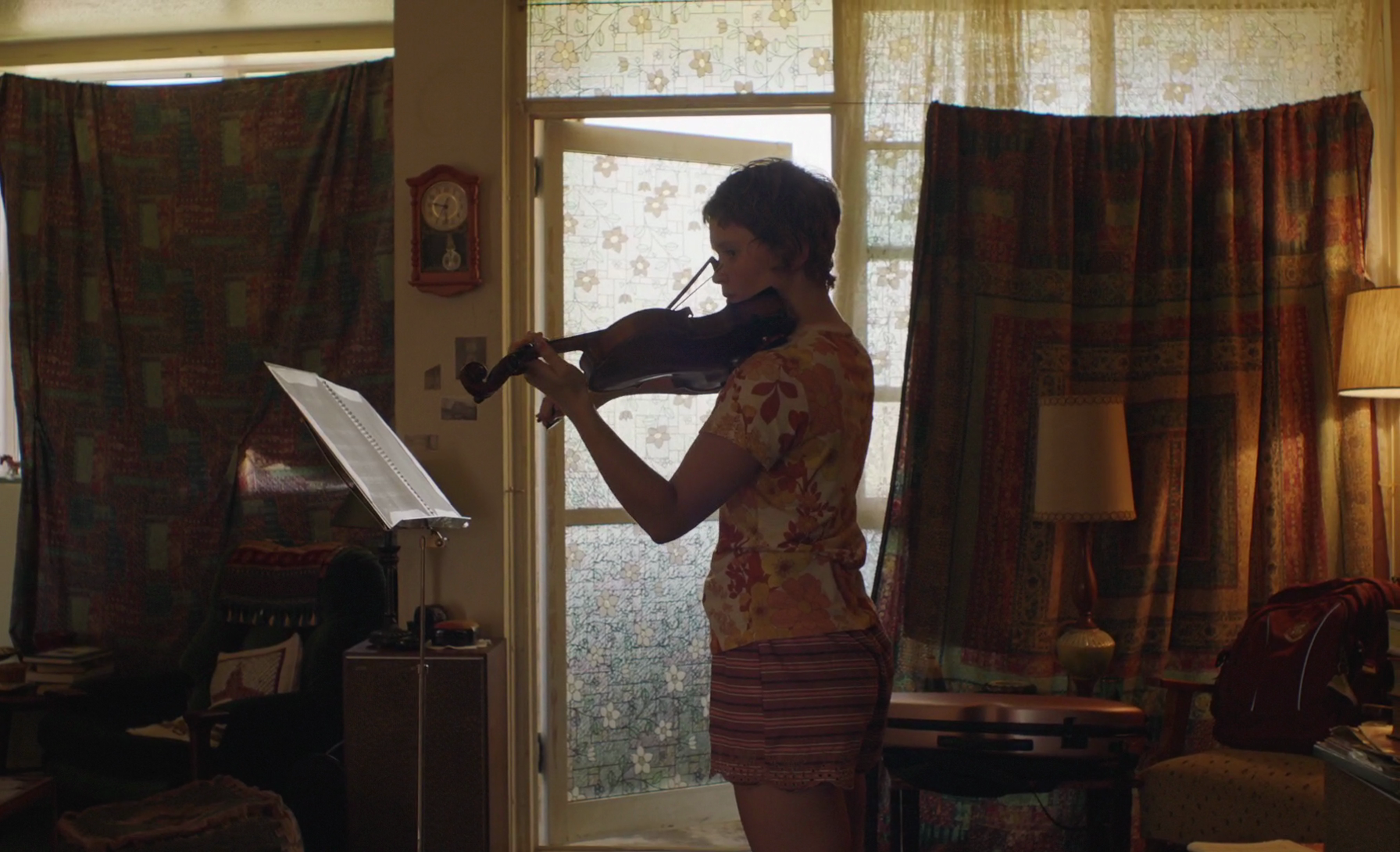
But the best moments are those in which objects and decor match costumes. Milla (Eliza Scanlen) seems most at home at her violin lessons because she’s practically wearing the curtains.
Henry is as gray as his breakfast.
When Anna waters the fancy plants, she finds a dress to nearly match the watering can.
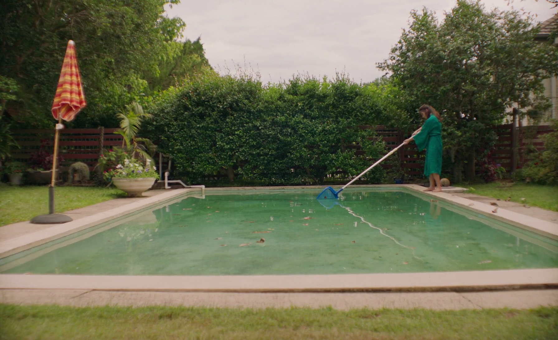
When cleaning the pool, meanwhile, she opts for a more marine shade.
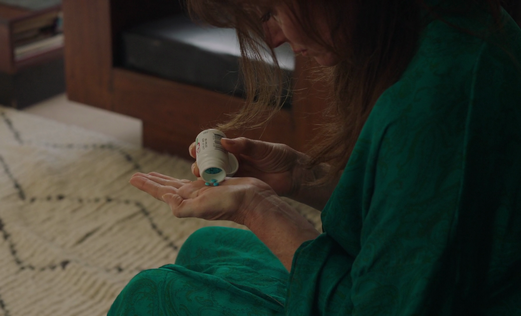
Of course, that outfit doesn’t just match the pool. The piece de resistance in this striking film about addiction is the revelation that Anna’s caftan matches her pills.
I am sure there are those who find this approach to be facile and lazy. And I get that. But this is a film about characters who often say exactly what they mean, even if they have no clear idea why they’re saying it. It’s a blunt representation of blunt problems, addiction and cancer and death. There isn’t time for too much futzing around with furniture.


Reader Comments (3)
I haven't seen "Babyteeth" yet, but I am adding it to my list because of Essie Davis. Her elegance matching the surroundings is part of what makes a lot of productions interesting to watch. Thanks for the article.
I'm actually not entirely sure if that house is particularly Australian. It's certainly nothing like the classic 'look' of an Aussie suburban home, but probably closer to what people of certain wealth—wealthy but not *super wealthy* and who probably overspent because the bank let them—are building these days. I think the film balanced well the elements that would normally suffocate a film like this in quirk (the wigs, the alcoholic mum, that house).
I just love this film too much. Could anyone recommend anything similar?