


FB Awards: Movie Posters of the Year
by Nathaniel R
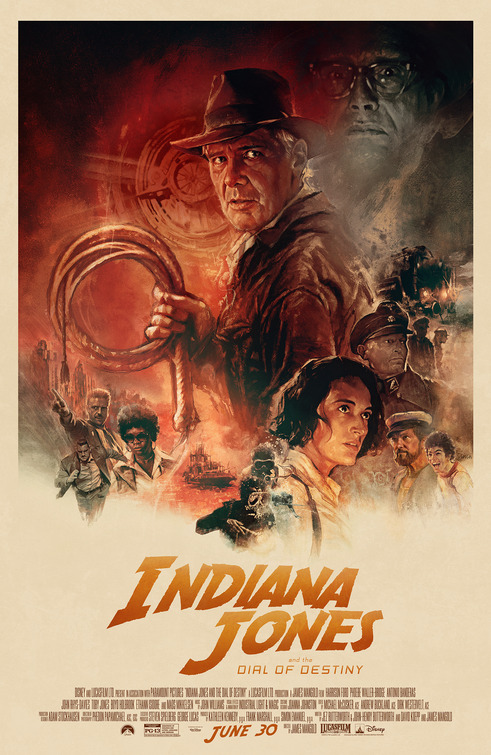
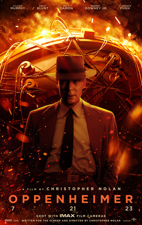
It's that time again! I'm going to do the Film Bitch Awards a little differently this year and give them each their own article... all 40ish categories. At least that's the plan over the next month but we'll see. First up, movie posters of the year. The state of movie posters in general is dire, many often looking more like an AI generated collage of faces with sizes proportioned by legal contracts and no consideration of visual appeal. But, gripes aside, there are always bright spots. Honorable mentions to this list include the upside down "don't get lost" teaser for Saltburn, the retro-painted poster of Indiana Jones and the Dial of Destiny, and Oppenheimer 's literally explosive biography.
Herewith 12 favourite movie posters of the year in not very particular order...
SPIDER-MAN: ACROSS THE SPIDER-VERSE
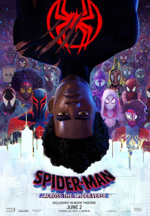
Spider-Man: Across the Spider-Verse -- very much like the honorable mentions Dial of Destiny and Oppenheimer) is doing big mainstream flashy advertising in traditional ways but that's not an insult. Doing that work well isn't easy as tens of thousands of movie posters can attest. These posters totally work from their color choices, to their presentational force, through their nostalgic call-outs, or inclusion of clever details. In the case of Spider-Verse, all of those things are true with the added correct spin of Miles Morales being upside down, while the teeming supporting cast bleeds into the supporting character of New York City.
The next grouping is six posters selling singular movies from distinct genres.
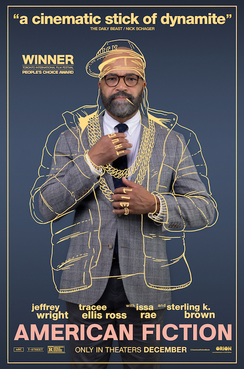
AMERICAN FICTION
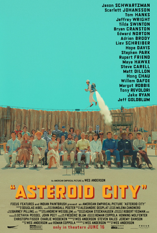
ASTEROID CITY
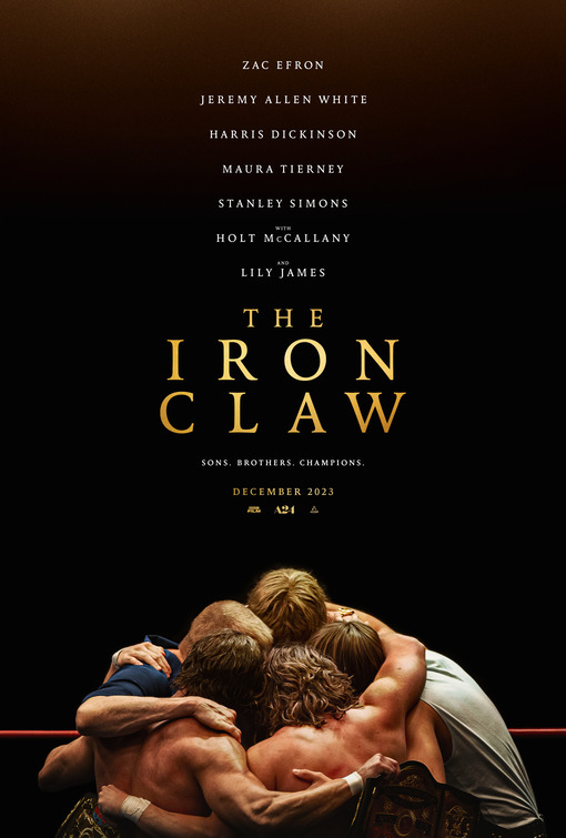
THE IRON CLAW
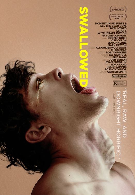
SWALLOWED
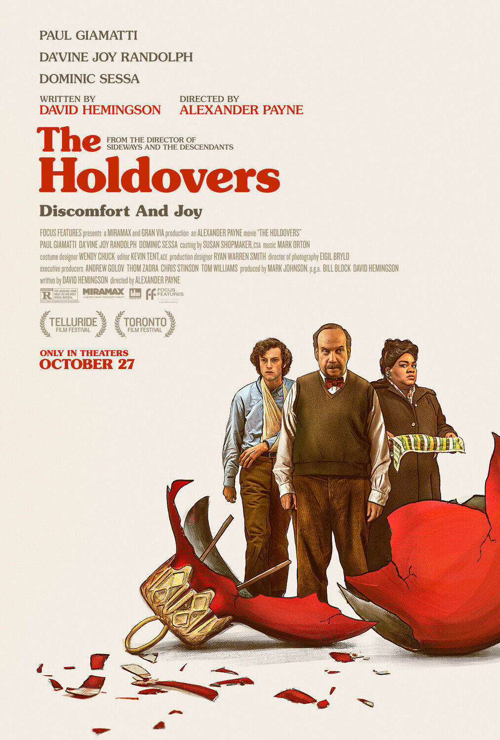
THE HOLDOVERS
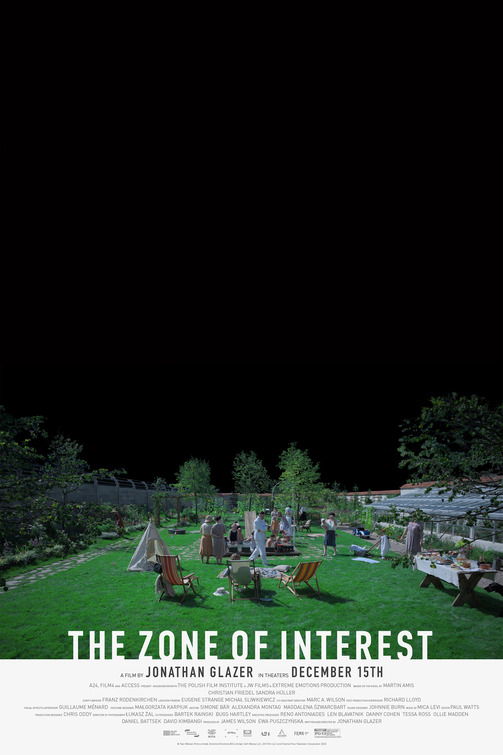
THE ZONE OF INTEREST
The marketing teams behind American Fiction, Asteroid City, The Iron Claw, Swallowed, The Holdovers, The Zone of Interest were are all tasked with selling highly specific movies from six very different genres. Each do the work memorably without betraying the movie or feeling like every other movie poster out there. It's also a case of true 'what you see is what you get' advertising: American Fiction's satire's book within the movie is suggested by a scratchy overlay; the presentational nature of Wes Anderson's ensemble comedy Asteroid City is a desert confection; The Iron Claw conveys the insularity of a family-only sports drama; There's the queer body horror of the underseen but worth-your-time Swallowed (if you're into that genre); and The Holdovers is giving period piece holiday comedy with an illustrative flair and an ace tagline "Discomfort and Joy".
Finally, though some people don't respond well to movie posters with a lot of empty space, we love this poster for the difficult-to-sell Holocaust picture The Zone of Interest. Though Jonathan Glazer's Oscar nominated pastoral nightmare is often brightly lit (in contrast to expectations), this black void nighttime conveys the nightmare abyss of a movie that subverts expectations by ignoring the atrocities that allow for its garden party splendor.
And the nominees (in alpha order)...
'MOVIE POSTER OF THE YEAR'
ANATOMY OF A FALL
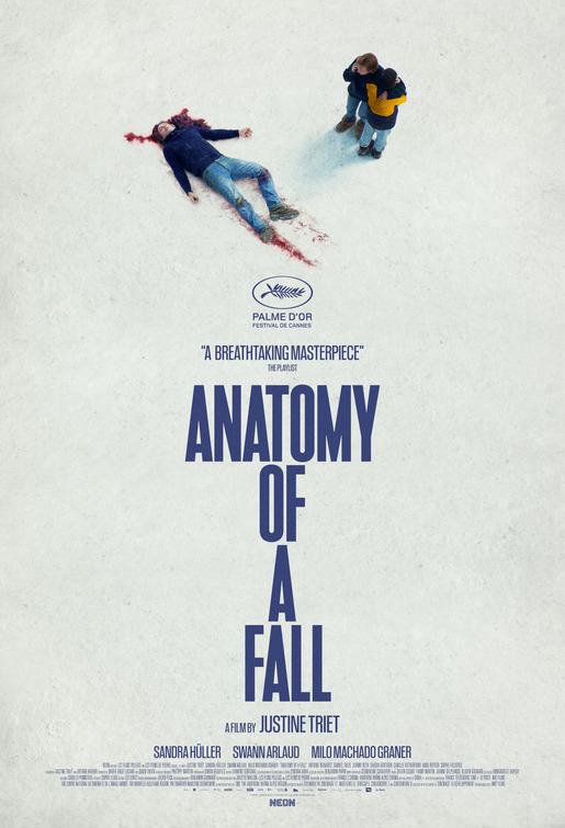
There are times where intricate overstuffing is the way movie posters should go (see last year's nominees in this category Everything Everywhere All At Once or Decision to Leave), but most of the time, precise reduction will point you closer to the end goal of all movie posters: becoming an iconic mnemonic for the film. This icy overhead shot is brutal and memorable. It's also what the entire film will be about as we dissect this death (and the family dynamic surrounding it) with chilly remove.
BARBIE
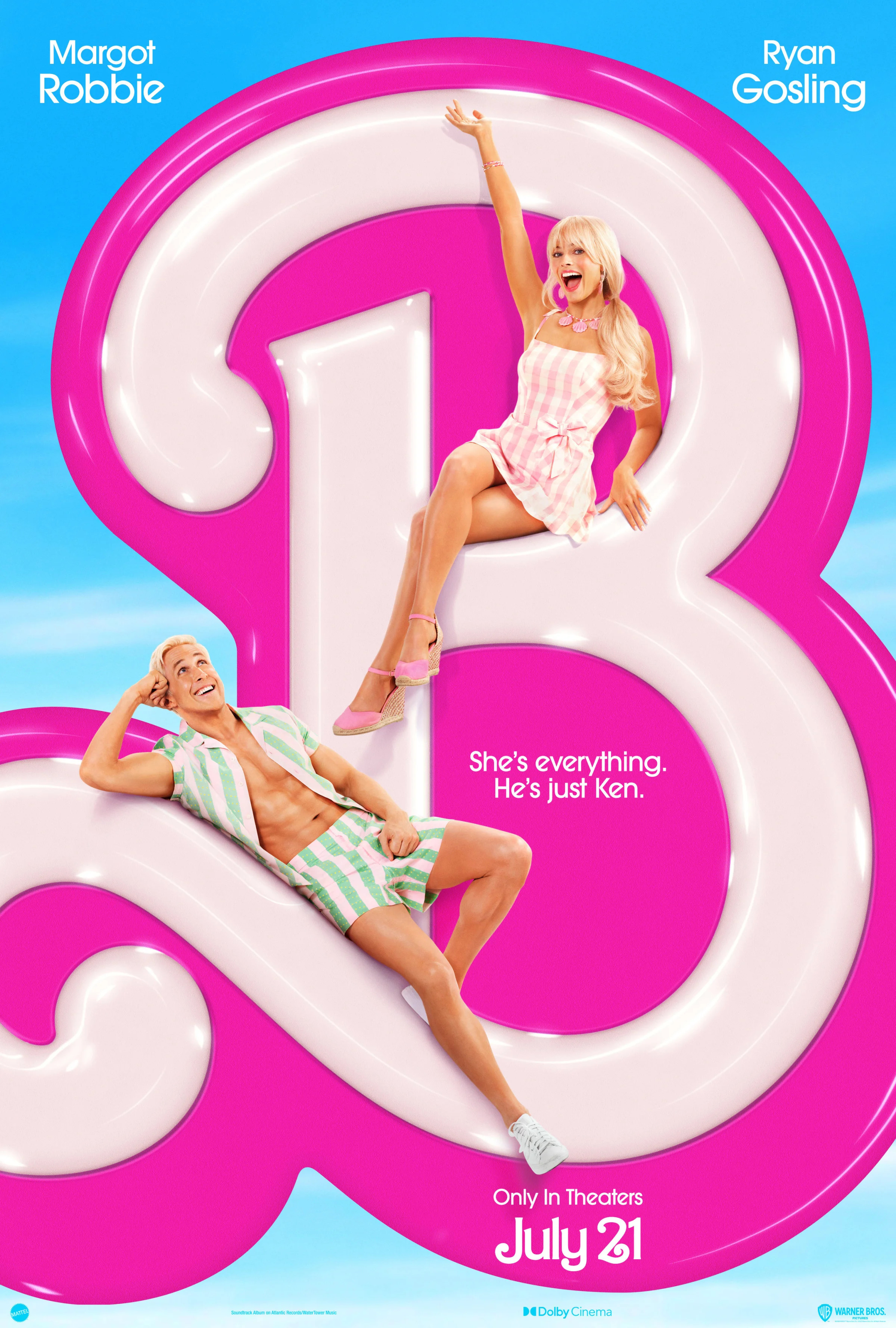
Here we have a case of advertising exactly what you're delivering. More importantly the poster design is doing that ticket-selling work joyfully -- it's colorful perfection. The Barbie teaser poster is giving amusement park fun with its slide-like curlicue directional sight lines. The plastic pink aesthetic is selling vibrant mainstream comedy. The title design is all bravado and famililar confidence (no need to spell out the title when you know that we know). Finally, while never feeling overworked as a piece of advertising it's also delivering gender dynamics and storytelling with Barbie up top welcoming us to her party. Meanwhile, Ken lovingly gazes up at her, oblivious to all else. The tagline agrees.
KILLERS OF THE FLOWER MOON
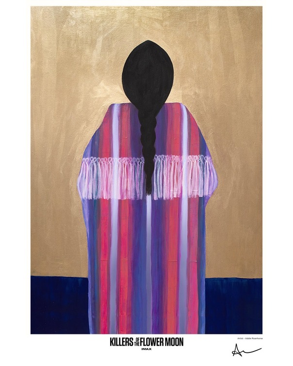
A disclaimer first: Nearly all of the posters for Killers of the Flower Moon were disasters of photoshopped genericism, selling only the seriousness of the film's intent and the bankable mug of Leonardo Dicaprio. So we thought about ditching this as a viable nominee. But on the other hand why penalize this particular beauty for the company it keeps? This alternative poster, for its brief IMAX run, was designed by the film's Osage Nation Ambassador Addie Roanhoarse and focuses solly on Mollie (Lily Gladstone) where the focus should always have been. It's a true beauty. If only they had had the confidence to fully advertise the film this way.
POOR THINGS
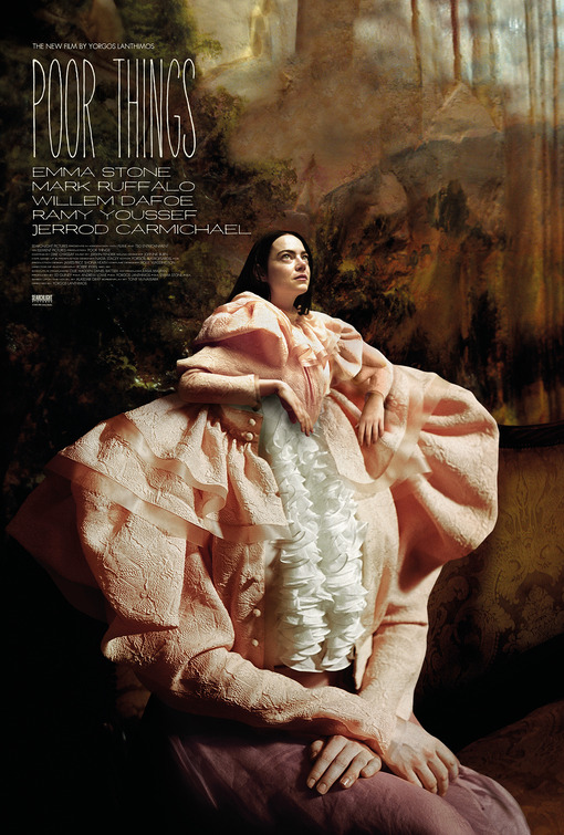
Poor Things is Killers polar opposite in that all of the marketing materials are beauties. So file this one under 'embarrassment of riches'. Any of the three main posters for Poor Things would have made a worthy "best of year" list, from the messily made-up tight close up of Bella's face to the expressionistic take of Bella with the rest of the cast spilling out of her like discarded organs. This is the best of the lot, maintaining the same absurdist throughline while keying directly into the film's central character arc. Making the figurative literal, here Bella becomes her true self, emerging from her own body.
ROTTING IN THE SUN
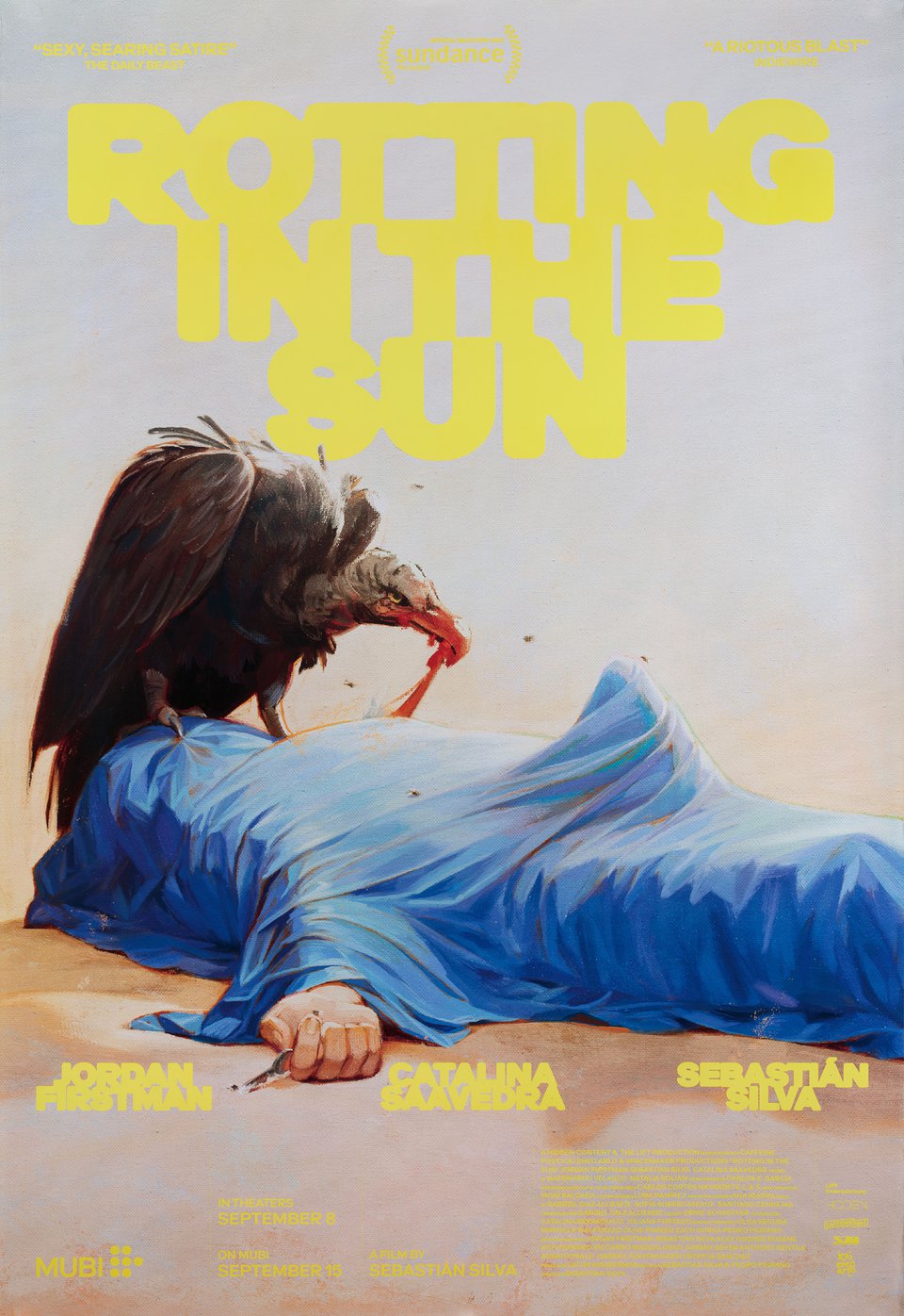
We end (if only due to alphabetical order) with this in-your-face provocation. You could dismiss this painted portrait for Sebastian Silva's comedy Rotting in the Sun as a dirty joke. But if you did you'd be foolishly ignoring how cleverly it sums up the film's energies, plotlines, character details, and overall vibe. It is, after all, a sexually explicit movie about a gay filmmaker who would rather be a painter, and the vulture-like vibes of people feeding off of other people's success. What's more the plot does indeed revolve around a dead body doing its titular thing!
Yes, that means the annual Film Bitch Awards have begun. More categories to follow!
 NATHANIEL R
Reader Comments (17)
Hooray! My favorite time of the year has arrived. I love to seeing where our personal lists overlap. Your voice has been missed and am excited for this new format to unfold.
And a giant YES to everything you said about the Rotting in the Sun poster.
That Zone of Interest poster is ingenious, and the Saltburn upside-down poster you mention is quite special.
I remember movie posters being so special when I was growing up; walking around the lobby was a big part of the movie experience. Now the poster's primary objective is to shout the title so loud that you pay attention as you rush out.
Thanks for reminding that poster art still exists.
Yaass to the Film Bitch Awards kickoff! And I love that you do a shout out to posters, truly an increasingly undersung art form. (Like opening titles for TV shows.) Excellent choices, even if a couple of them make me a bit squirmy.
All great picks! For the ones you already cited, my alternate pick for OPPENHEIMER is its first teaser poster with just the small silhouette of Murphy engulfed by the fire/smoke.
For a couple of other posters that I would've probably included would be the main poster for THE KILLER if only for the year's best title treatment and the first teaser poster for TALK TO ME because the terrifying simplicity of the cursed hand works so effectively.
Ryan: good call on The Killer - that horizontal i is brilliant
My choice is the poster for the documentary Little Richard: I Am Everything.
The design is a hand drawn mouth emerging from what appears to be a pool of molten gold. With his name printed on the lips of an open mouth and piano keys for teeth, the complete image is memorable and a tad distasteful, much like the public reaction to the queer sensibilities the charismatic musician brought to the early days of rock ‘n’ roll.
Of the nominees - Anatomy of a Fall! Great poster. The American Fiction one is very good too, as is the Saltburn upside down one. Love posts like this one.
Swallowed and Rotting in the Sun are my favorites among these, and I have to agree with you about the whole collection from Poor Things, they really exceeded the quality of this particular art.
Outside this list, I love the pink version poster of Sick of Myself: simple, horribly funny and perfectly resumes the movie’s plot.
Is this your last FB awards? Is that why the special post for each category? Or am I reading too much into it
lemonzestysour1 -- well... I really wanted to make it to 25 years but i'm not sure. we'll see.
I love the inclusion of Rotting in the Sun, but my favorite poster is the bat/hat from El Conde
It fits with the ambient of the picture but also is a great resume of the plot
Been following TFE for so long and FB awards is such a highlight, so good to have Nathaniel’s content here. As for the posters, poor things team did so great, such intricate work, visually appealing, but also mysterious, provocative, and among them you chose the best one: the birth of Bella sums up the plot in such a witty way, love it. I’m not a barbie fan, film or poster (Greta did so much better before), but agree on the appealing and fun style. Shout-out to anatomy of a fall too! I’ll be waiting for the next posts!
I'm obviously hoping and crossing my fingers that the Film Bitch Awards make it to their 25th year. Love your ROTTING IN THE SUN inclusion. It's one of those cases where I think the poster's better than the movie.
I'm not into these "nominees".
"Anatomy of a Fall" is the best, by far.
"Barbie" would be the second, if it has a name. I don't know a movie named "B". (Yes, I believe you should to spell out the title even when you know that we know).
The others, no comments.
"May December" 's poster is simply divine. Probably, the best of the year.
"The Zone of Interest" and "The Holdovers" also have great posters.
PS: What "Swallowed" is about? Gay porn? Deep throat?
I love the inclusion of Rotting in the Sun custom 3d video animation company, but my favorite poster is the bat/hat from El Conde
this is awsom christopher nolan always makes movie like this and you know what Helena rojo is my favorite actress after him Helena Rojo is a timeless actress whose performances have left an indelible mark on the world of cinema. Her captivating presence on screen and impeccable portrayal of characters have earned her a well-deserved place among the finest talents in the industry. With her remarkable range and depth, Helena Rojo
continues to inspire audiences and fellow actors alike, cementing her legacy as a true icon of the silver screen.
Love all these. But where’s A Thousand and One? Such a distinctive poster nailing the vibes of the film.