The Furniture: Stark Contrast in "The Eyes of My Mother"
 Monday, March 13, 2017 at 10:27AM
 "The Furniture" is our weekly series on Production Design. (Click on the images to see them in their more detailed large glory.) Here's Daniel Walber...
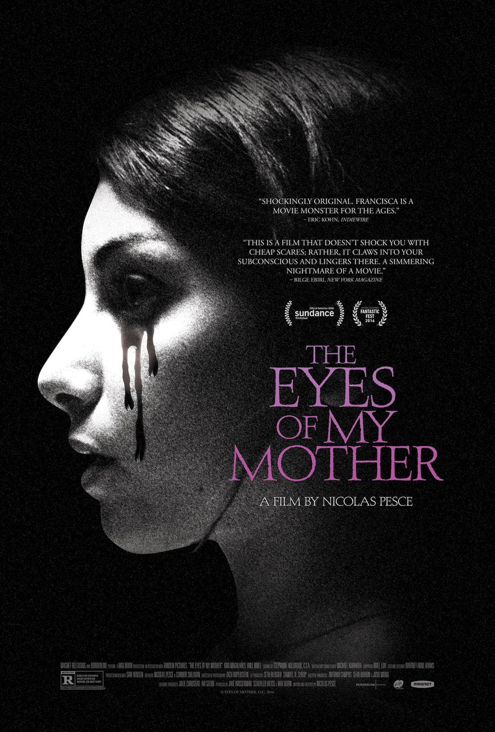
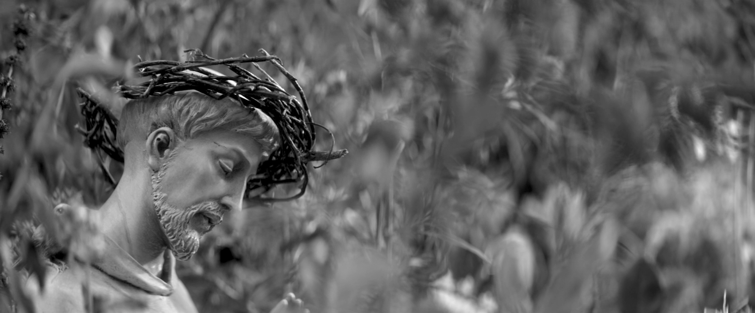
 The Eyes of My Mother, one of the best horror films of 2016, stands in a grand tradition of scary iconography. Which is, of course, also a polite way of saying that Nicolas Pesce’s debut feature is not much of a departure. Francisca (Kika Magalhães), the film’s murderous anti-heroine, grows up surrounded by anatomical grotesquery and Catholic devotional objects. As is often the case in the genre, she is gradually driven to violence by the meticulously-crafted environment in which she lives.
But what makes The Eyes of My Mother different is the way these otherwise familiar tropes are woven together. The unsettling sets and weird props aren’t simply tossed in for dramatic impact, but arranged to unite the darkness of the setting with the psychology of the protagonist. This is why production designer Sam Hensen so richly deserved his American Independent Film Award last month, winning over some much more colorful and outrageous competition.
The two most prominent design themes are announced out very beginning, each with a single, striking object...


