


The Furniture: The Shrieking Color Scheme of Ghostbusters
"The Furniture" is our weekly series on Production Design. Here's Daniel Walber on Ghostbusters, just out on DVD and Blu-Ray
Paul Feig movies tend to be about comic excess. There’s always a nearly too much humor jammed in, not infrequently with the side effect of a bloated running time. To be fair, there would be more time for Melissa McCarthy and Leslie Jones to adlib about dancing if Ghostbusters weren’t also required to have a number of standard narrative beats, but that’s Hollywood.
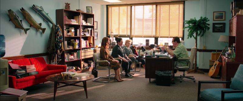
Sometimes their work simply adds an extra joke. Take the dean of the Kenneth P. Higgins Institute of Science. Obviously much of his insufferability comes from Steve Higgins’s performance, but he’s also instantly recognizable as a pompous idiot from the three enormous fish mounted on his wall.
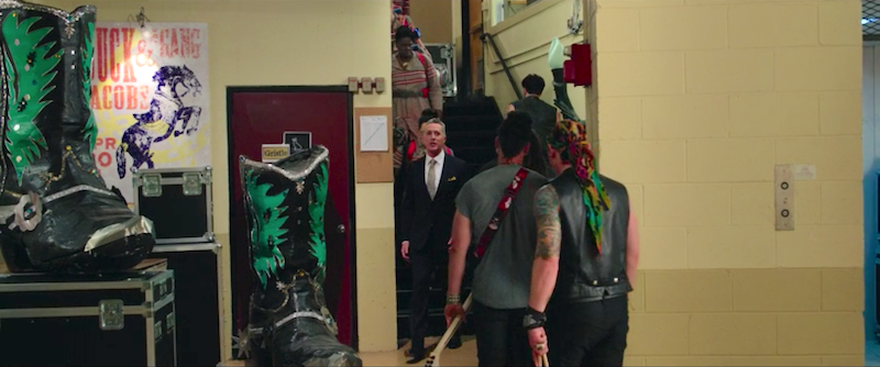
Other gags are utterly random, like these enormous boots hanging out backstage at the metal show.
The design team also takes expert advantage of the property’s potential for ridiculous props. Abby (Melissa McCarthy) and Holtzmann (Kate McKinnon) are real scientists, but their equipment is made on the cheap. The movie is full of scrappy, cheap-looking gadgets that seem on the verge of falling apart, like this grenade-like thingamabob.
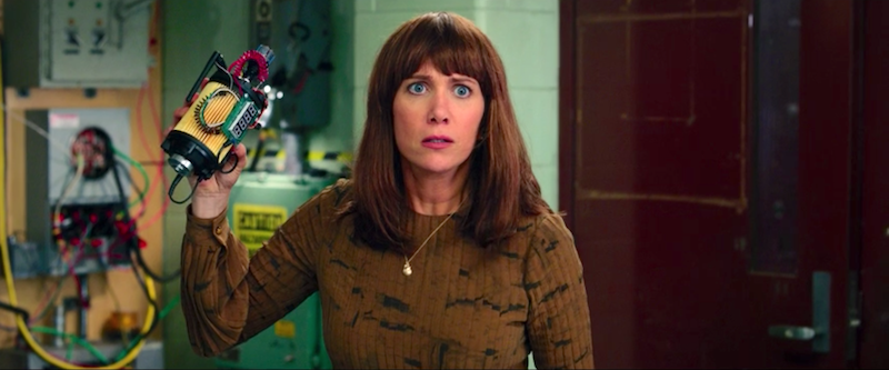
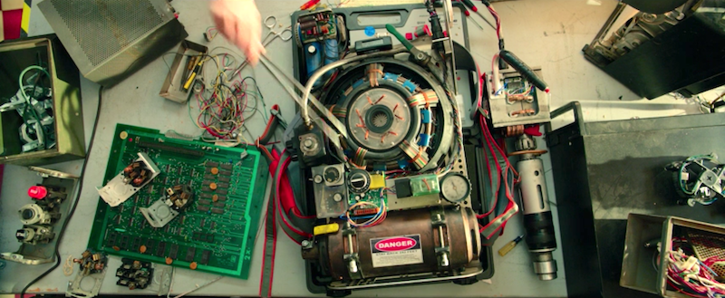
All of the equipment appears to be cobbled together from old computer carcasses and the contents of an abandoned tool shed.
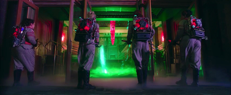
The paranormal targets of these devices are even weirder. Obviously the ghosts themselves are entirely the work of CG animation, but they nonetheless influence the film’s physical design. In fact, the sets so rigidly follow the color scheme of the ghosts that the very walls can almost be considered foreshadowing. (This palette is exactly the same color dichotomy of Beaches, presumably a coincidence.)
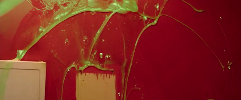
The paranormal element is always green and slimy. Here’s the cracked floor of the Aldridge Mansion right after the first ghost makes her appearance.

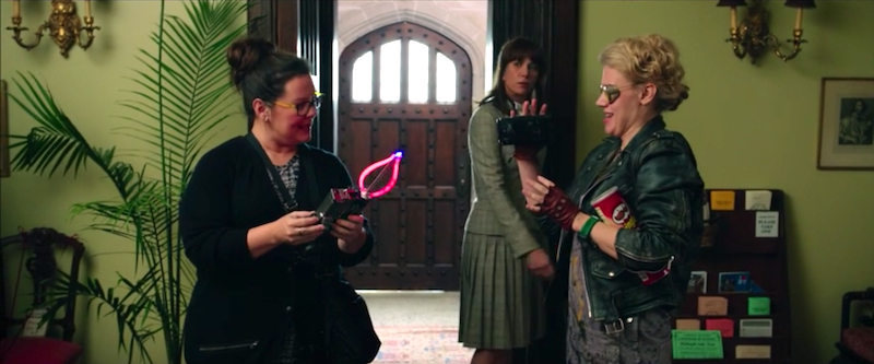
The anti-ghost energy, meanwhile, is bright pink and red. It’s not as exact an association as that of ghosts and green, but when the team finally blasts the spirits back into the other realm, the screen is overwhelmed by pink. Abby’s ghost-detection device is also pink. Here she is holding it in the Aldridge Mansion, where it stands out against the haunted house’s green wallpaper.
Granted, this isn’t Beaches. The production design of Ghostbusters is neither subtle nor emotionally complex. Instead, it’s abrasive and ridiculous, in tune with the exaggerated comedy of the actresses it frames. The team’s lab and office, above a Chinese restaurant, is overwhelmed by a loud version of the color dichotomy. It’s effective because it’s brash.
When Abby is possessed by the avenging ghost of Rowan (Neil Casey), she vomits slime all over the bathroom. It results in quite a dramatic tableau, almost abstract expressionist.
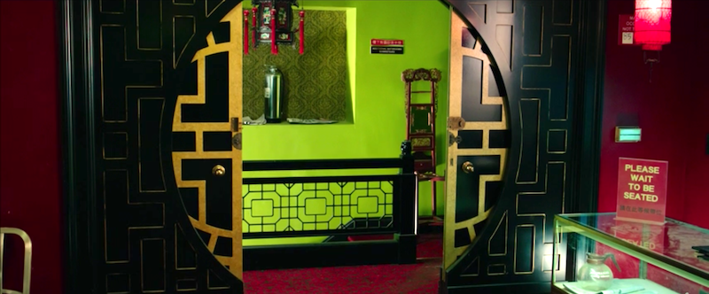
The greens and reds of the Mercado Hotel are a bit less violent, but that’s because the hotel has been hiding its supernatural position in plain sight.
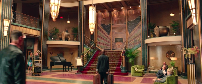
When it finally lights up with Rowan’s rending of the border between the worlds, suddenly the entire lobby only possesses two shrieking colors.
Now, this monomaniacal approach to design isn’t exactly laugh-out-loud funny. It simply alters the film’s mood, aligning the background with the over-the-top performances of the foreground, setting the stage for comedy.
When it works, it works brilliantly, getting an already giddy audience drunk on color. When it doesn’t work, it’s usually the result of the cooling blue that dulls every Hollywood blockbuster. The comedy has the same problem. The film's best moments are the ones of the purest, strangest humor. Ghostbusters only feels long and dull when we’re watching the plot. The jokes, like the color palette, work when they're allowed moments of real excess. Fencing them in just puts people to sleep.

 Daniel Walber
Reader Comments (2)
This was very cool. I really, really liked the movie (and its crazily rewatchable, too, like the original, as I have found out). The colour palate was quite something, very gharish in a way, but as you've pointed out mostly deliberate and actually rather effective when you really look at it.
I really think the winner within the films look this time around is the props department so i'm happy to hear them get a shoutout. The gadgets are so fun insanely DIY.
LOL on the Beaches comparison