The Furniture: Joy's Emerald City of Home Shopping
 Monday, May 9, 2016 at 10:30AM
 "The Furniture" is our weekly series on Production Design. Here's Daniel Walber on Joy, now available on DVD and Bluray

It seems impossible that production designer Judy Becker has only received a single Oscar nomination, if not supremely unfair as well. At the very least, she should have snagged a second nomination for Carol. Her resume includes such diverse triumphs as We Need to Talk About Kevin, Brokeback Mountain, Shame and I’m Not There, as well as a neat early credit as a set dresser on Spike Lee’s Malcolm X. And so it seems totally appropriate that Becker is the first production designer to merit a repeat appearance in 'The Furniture'.
Becker’s most fruitful collaboration has been with David O. Russell. She's worked on every one of his features since The Fighter and she earned her lone Oscar nomination for American Hustle. Her sets for Joy, particularly the charismatic QVC studio at the film’s core, are among the best design work of last year. They also make quite a one-two punch with Carol, Becker showing a remarkable affinity for the stylistic underpinnings of American shopping. [More...]
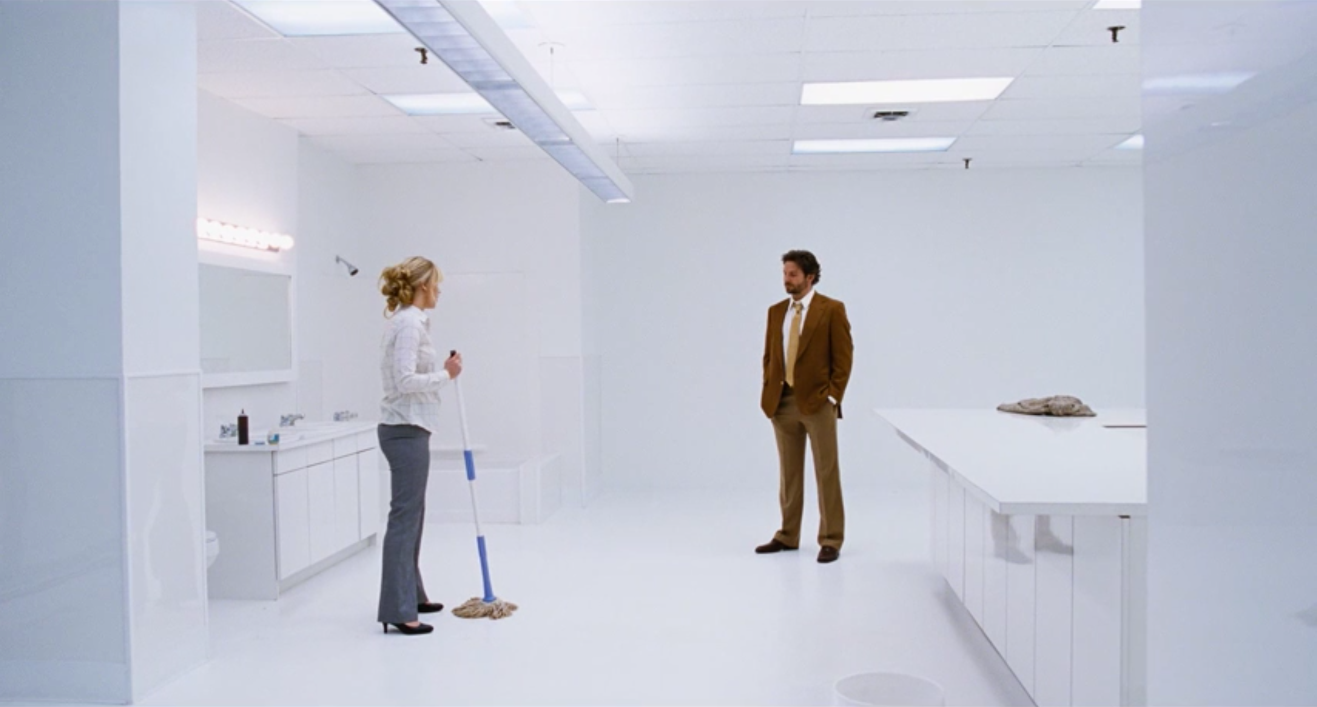
In interviews, Becker has compared her version of QVC to The Wizard of Oz, with its bright colors and idealized spaces. But this fantasy is preceded by science fiction. Once Neil (Bradley Cooper) has been convinced by Joy (Jennifer Lawrence) to take a closer look at the Miracle Mop, he takes her to a test room. It's a disorienting room with no obvious purpose, containing both the furniture of a bathroom and of a kitchen. Its design, meanwhile, suggests something out of 2001: A Space Odyssey. QVC is a brave new world of shopping, as well as a potentially earth-shattering change for Joy herself.

Yet, almost immediately, the mood changes to one of chaotic fabrication. Joy gets a tour of QVC’s backstage, a constant whir of clothing racks, makeup artists and needy celebrity hosts with sensitive egos. The backdrops are still monochromatic and clean, but here they underline how slapdash this operation might be.

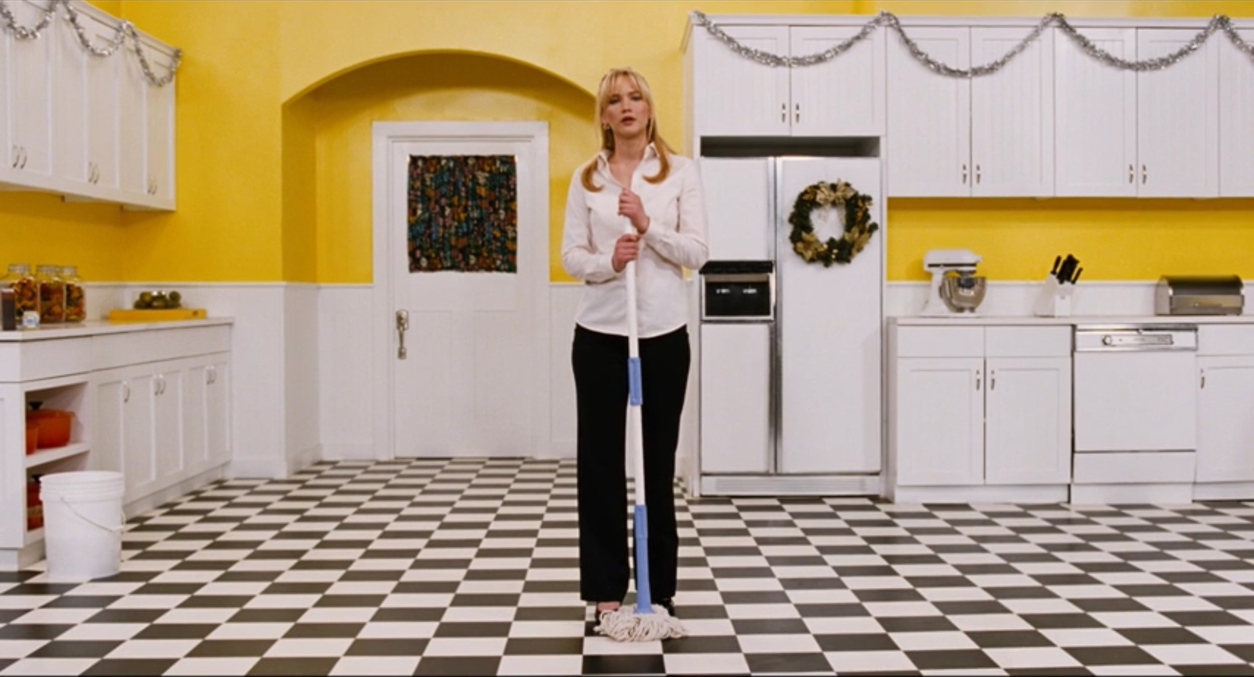
The central set, from which QVC's salespeople hock their countless wares, only furthers this teetering dichotomy between the crazed beauty of the future and the tenuous reality of the present. This garden stage looks especially like Oz, the yellow brick road morphed into the bright yellow walls of a too-charming house that doesn't actually exist.

The bizarre decor continues around the corner, where Joan Rivers sells jewelry to legions of fans. Notice not only the light blue chairs, but also the flashy array of faux-antiques objets d’art sitting on the shelves and mounted to the animal print wallpaper.

As if that isn't enough, the entire set rotates, like the Emerald City in The Wiz. And while Joy doesn't share that film's sense of style, it certainly shares its level of commitment. The yellow kitchen where Joy first markets the mop is as yellow as it can be, down to the big glass jar of lemons. This is the Oz of the 1980s, a flashy fantasy land where everything costs $19.99.

Yet even as Joy gets up on the set herself and hits the jackpot, selling 50,000 mops all at once, one still wonders about a man behind the curtain. All of the purchase calls are taken by QVC sales representatives in the same cavernous room as the set. They sit at their computers in the dark, arranged as if at a telethon taking place in an anonymous warehouse. One wonders if the monitors are even plugged into anything.
The whole operation looks like it could be packed up and sold off at a moment's notice. Neil’s manic thrill, his arms flailing excitedly at the rising numbers on the wall, could tumble just as quickly as it rose. Fortune in this world of domestic invention and magic hands spins like the QVC Prize Wheel that lurks off to the side of the frame. Joy's eventual success in no way brings a sense of solidity to this world. If anything, it only casts her as even more of an outlier, a financial miracle worker in a world of brightly-colored but flimsy optimism.
Related Reading
Nathaniel interviews Production Design Judy Becker
Jose on Jennifer Lawrence in Joy
Past Episodes of The Furniture


Reader Comments (11)
Thank you for this article--wonderful writing. David O. Russell has had many fascinating examples of exceptional production design in his films. Ironically, this has only served to highlight the vacuous quality of his films--giving us something pretty to look at to distract from the fact that his films are increasingly about nothing.
I'm not the biggest Jennifer Lawrence fan or the biggest David O. Russell fan. But Joy is a female-led non-franchise picture (and barely even a biopic) that got a Christmas release and cracked $100 million at the box office. The cinema would be a much richer place if we had a dozen more talky middlebrow studio films for adults each year...and if when they came out, we supported and rallied around them rather than dismissing or cannibalizing them.
Joy's story didn't totally add-up or satisfy, but so many parts of it worked so well, and this great write-up reminds me why. There was a lot of attention to detail everywhere. The props alone -- all those mop prototypes and crowded warehouses and yes, this brilliant QVC set. Thanks for this post!
Great piece! Becker works wonders in this undervalued film.
I really really liked Joy.
Well said, Hayden W
Though I gotta say, I'm a bit surprised at all the bitching and sniping this movie endured. It's no better or worse than DOR's last two films - both of which were also interesting yet flawed. But they evaded the almost universal vitriol aimed at Joy.
goran -- i'd attribute that to when it's time it's time. we see this so often when a filmmaker has a few big critical and awards hits in a row people turn on them no matter what the next film is like. It's going to happen to Inarritu any moment, whether it's the next film or the film after that, it'll happen.
daniel -- another great piece. you're really amazing. I love the comparison to Oz and if i had spent more time with the movie (December, I loathe thee!) i would have thought harder about this sequence because it's so obviously the scene wherein the movie is firing on all cylinders and feeling like a great movie even though it's not all around this scene.
This movie also cost $60 million to make. If the (ahem) silver lining of these pictures is that they stand to earn a huge profit, running up costs doesn't help clear a path for more. Joy should have made its budget back opening weekend. One Game of Thrones episode looks more expensive than this movie.
The best scene in the movie and obviously the best visually, too. Loved this piece (as usual).
Fantastic piece. The aesthetic of the production design really contributes to the heightened, fairy-tale quality of the movie. In a good way.
And yes, this was a really underrated film. Also happens to be the only DOR role I really liked Jennifer Lawrence in.
Great post and totally on point. Unfortunately, Joy was a total dud for me. O'Russel needs to get back to his emotional core like he did in Silver Linings.