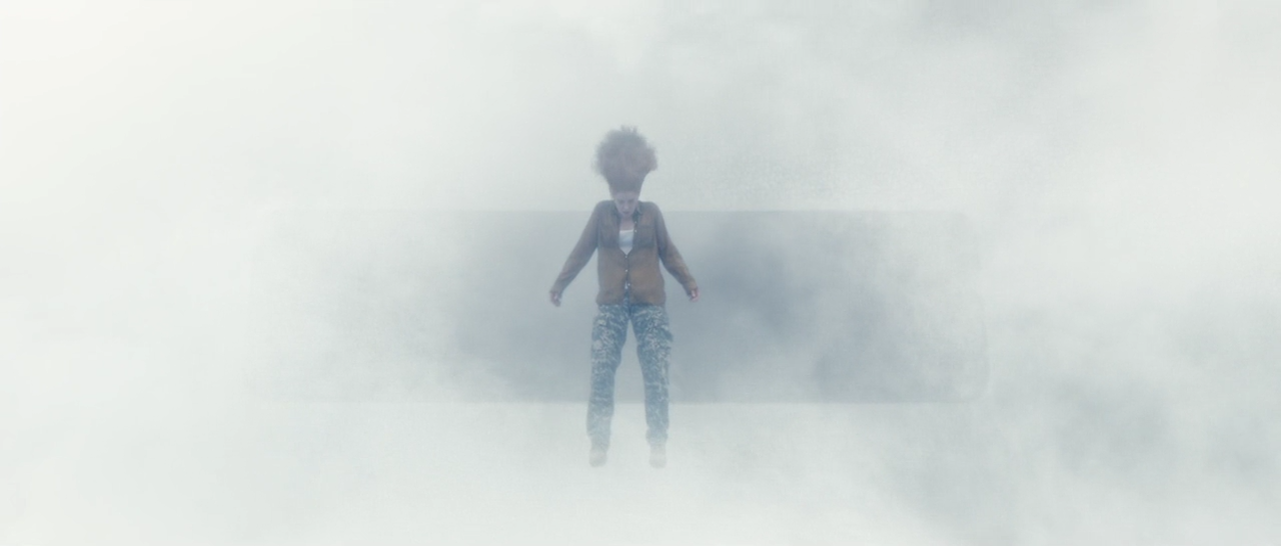
The Furniture: Lost in Space and Time with "Passengers" and "Arrival"
 Monday, February 13, 2017 at 10:07AM
 "The Furniture" is our weekly series on Production Design. This is the second of two columns discussing this year's Oscar nominees. Here's Daniel Walber...

On the surface, Arrival and Passengers appear to be the most similar of this year’s Best Production Design nominees. They’re both science fiction films set in the near future. Yet the similarities end there. Passengers is set entirely on an extravagant, colorful spaceship. Arrival splits its scenes between the interior of a minimalist UFO and densely packed military tents.
There is also one more essential difference...
Passengers is a remarkable achievement of design for its own sake. The starship Avalon is a feat of tremendous inspiration, a richly detailed vessel that would enliven the futuristic drama of any similar film. Arrival’s design, meanwhile, starkly enforces a very specific mood and intimately participates in the film’s narrative and themes.

The Avalon is convincingly enormous and detailed, a testament to the skill of production designer Guy Hendrix Dyas and set decorator Gene Sardena. It’s built for a population of 5,000, with enough amenities to keep them occupied for the four months after their planned awakening. It’s spacious and engaging, welcoming the eye with soothing curves and repeating patterns.
That said, its internal logic is a bit haphazard. One luxury apartment mimics the pattern of the lobby, but its doors are oddly proportioned and the railing-less stairs are an odd choice for a moving vehicle.

Some spaces borrow tropes from other science fiction films. One restaurant falls into the frustrating design tendency to view the future as nebulously Pan-Asian.

The various screens, meanwhile, are a familiar array of blue lights and vaguely significant flashing reds and greens. Their displays look ripped out of the Batman: Arkham video game series.

While frequently quite attractive, the design never builds up to anything thematic. It flirts with, but then abandons class commentary. The final message of planting trees on the Avalon is interesting, but nothing about the ship’s prior design suggests that it suffers the absence of nature. And the few, disastrous ideas that are presented by the screenplay and direction do not find affinity in the sets.

Conversely, the design of Arrival, by production designer Patrice Vermette and set decorator Paul Hotte, is laden with meaning. Its geometric rigidity is obvious from the first shot Louise Bank’s (Amy Adams) house. This recurring image suggests everything from the coming UFOs to individual letters of the alphabet.

The heptapod spaceships give the same portentous impression. They also diverge from the usual appearance of a spaceship. Their entrances are obscured, both by their design and by Bradford Young’s framing. They are simultaneously enigmatic and blunt.

The interior is like a coalmine, a reference made more obvious by the presence of a precautionary canary. Unadorned and narrow, it is dominated by the bright white smoke behind the transparent wall.

The space mimics the mission itself, a nitty-gritty process of language acquisition that has been complicated by both the weighty circumstances and the literal alien-ness of the foreign speakers. It also visually clarifies the distance between these scientists and the political world below, even in the muffled context of raging gunfire.

Dr. Banks’s cracking of heptapod language dramatically accelerates both the plot and the production design. The aliens do not use an alphabet, nor do they use single-word pictograms in the human sense. Rather, they communicate with round characters that signify multiple ideas and have no temporal specificity.

The characters, designed by artist Martine Bertrand, echo the shape of the heptapods. It's only natural, given the aliens create these symbols by secreting airborne ink from their own limbs. The shapes are eerie and evocative, suggesting a series of Rorschach tests.

Dr. Banks and her team surround themselves with pieces of paper and computer screens that display these signs. They seem to proliferate on their own, spreading throughout the tents with the same subconscious insistence by which they overrun the linguist’s mind.

This, of course, is also the key to the film’s plot. The act of speaking and living the heptapod language alters Dr. Banks’s perception. She becomes uniquely capable of resolving the impending crisis of international and interplanetary communication.
The following shot, therefore, is perhaps a bit on the nose. It’s also beautifully precise. The headset mimics the shape of the language, which in turn is derived from the shape of the heptapods. It’s a moment of troubling possibility and gorgeous synchronicity. Dr. Banks has been fully integrated into heptapod thought. Arrival's various design elements have been integrated into each other. Suddenly, everything makes both visual and emotional sense. What else could you need?

Previous episodes on the Oscar nominees:
• Fantastic Beasts and La La Land worlds of unreality
• Hail, Caesar! merrily we dance!


Reader Comments (2)
Passengers is like a tacky version of Gattaca. Arrival is visually mesmerizing. I could stare at those eggs for hours.
What a great and interesting read! Made me look at things through a different perspective. I'm probably in the minority but i think Passengers could have been a contender if the story was tweaked. I thought that the loss of gravity and the terror that came from it with Aurora/Jennnifer in the pool was a well-thought out scene. Plus the spaceship looked homely and inviting with the curves but the metallics gave it a cold and imprisoning vibe.