The Furniture: Toni Erdmann and the Dangers of Corporate Upholstery
 Monday, April 17, 2017 at 5:15PM
 "The Furniture" by Daniel Walber
 [You can click on the images to see them in much more magnified detail.]
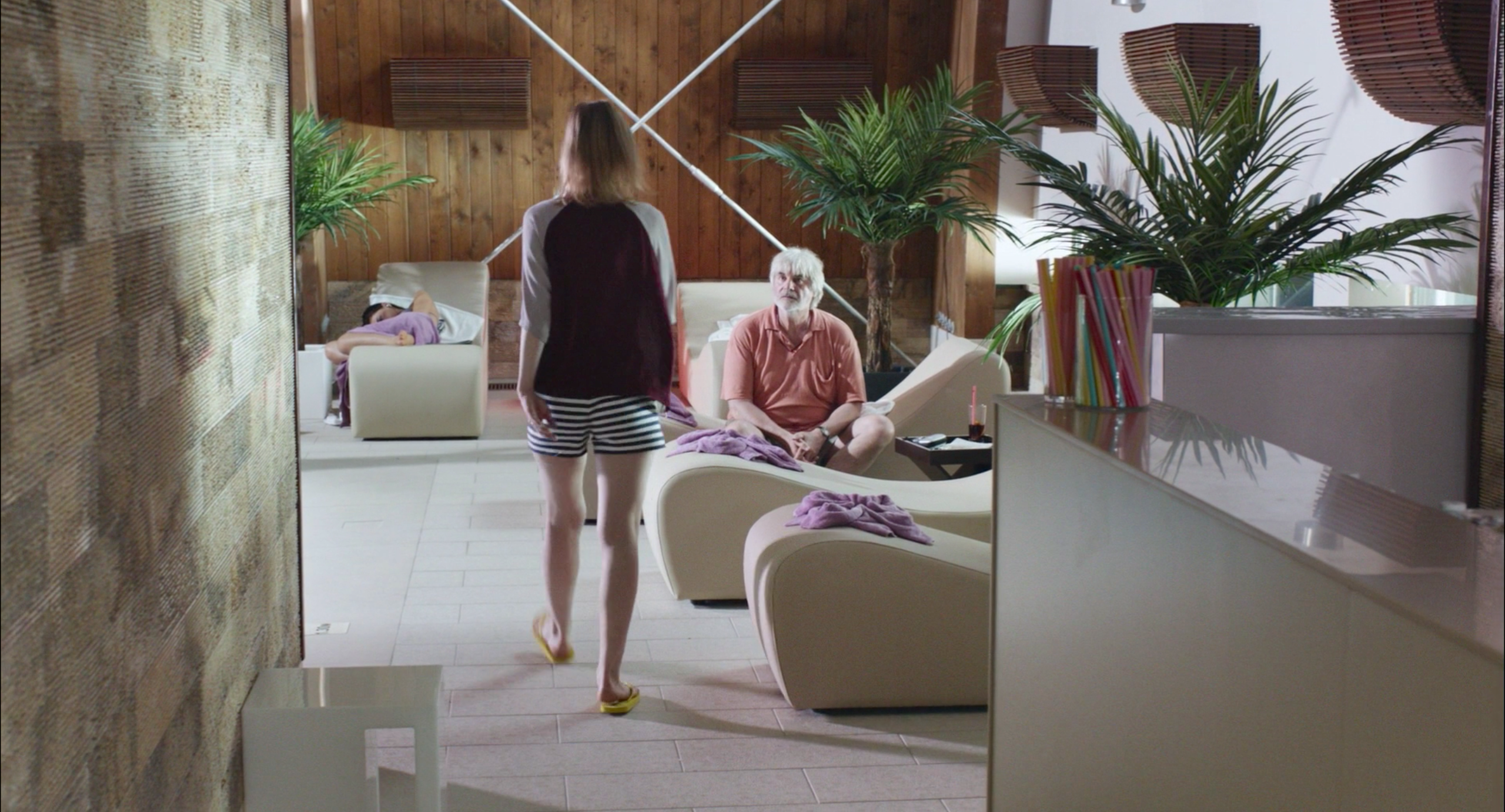
Toni Erdmann is a film about chairs. It is also a film about couches, though less so. Its grander themes, the culture of global capitalism and the relationship between parents and adult children, are excellent stuffing for oddly shaped poolside chaises and hideous hotel sofas. The milieu is convincingly skin-deep, punctuated by passionless objects that look blankly up at the uproarious behavior of the characters.
This satirical furniture represents some of the best production design of 2016, though Toni Erdmann may not be the first film to come to mind.
It plays a supporting role, commenting in muted colors. Yet Maren Ade’s comedy of personal and professional tension has a thoughtful design sensibility, perfectly attuned to the non-places that have been projected across the globe by transnational corporations...
Ines (Sandra Huller) has chosen to spend her life in these impersonal spaces. Her father, Winfried (Peter Simonischek), has not. She has been assigned by her consulting firm to Bucharest, where she is evaluating the finances of an oil company. He lives in Aachen, surrounded by the beauty of nature and the personal trappings of an aging hippie schoolteacher.
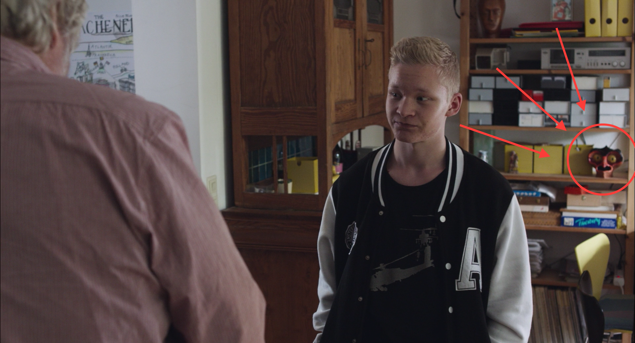
Production designer Silke Fischer, art director Malina Ionescu and set decorator Katja Schlomer draw contrasts between these two worlds with cleverness and humor. For example, check out the terribly surprised mask that Winfried keeps on this shelf at home.
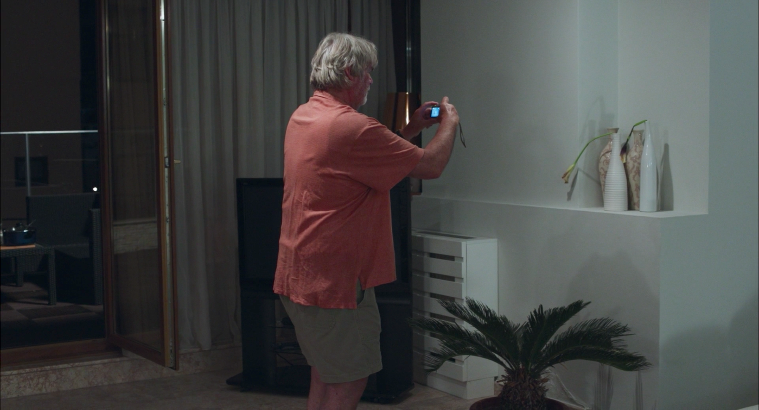
Ines’s Bucharest apartment, meanwhile, is not so much minimalist as haphazardly empty: “minimalism” implies intent, which is clearly absent. Two of her houseplants are huddled together in a corner, dead, as if she had no idea where to put them and then forgot them entirely.
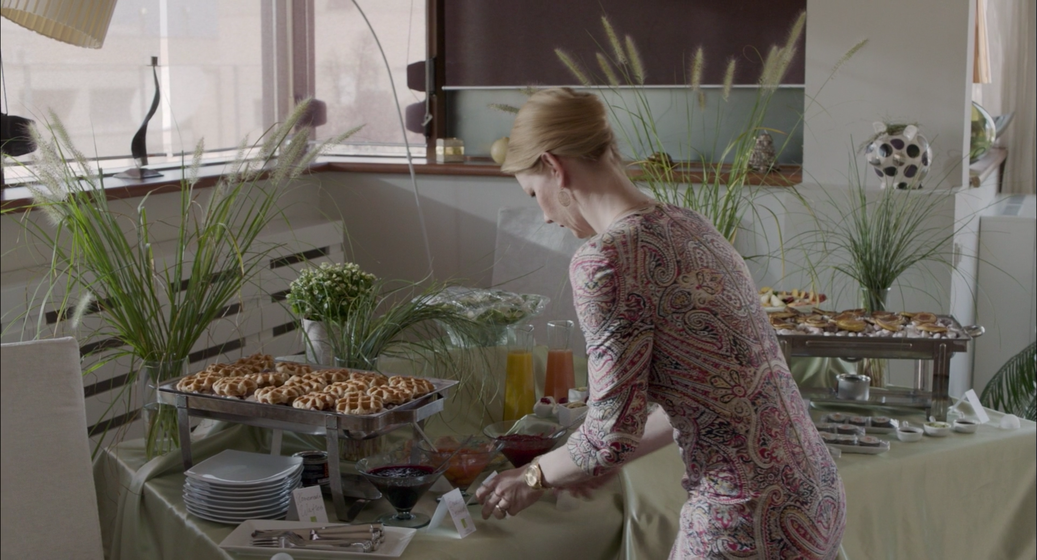
For her birthday party, which is really just another work function, she rents plants to hover over the food. These simple vases of tall grass are essentially monochromatic accents, as if flowers would be far too committed a statement. They would fit perfectly behind an omelette station at any hotel brunch in the world.
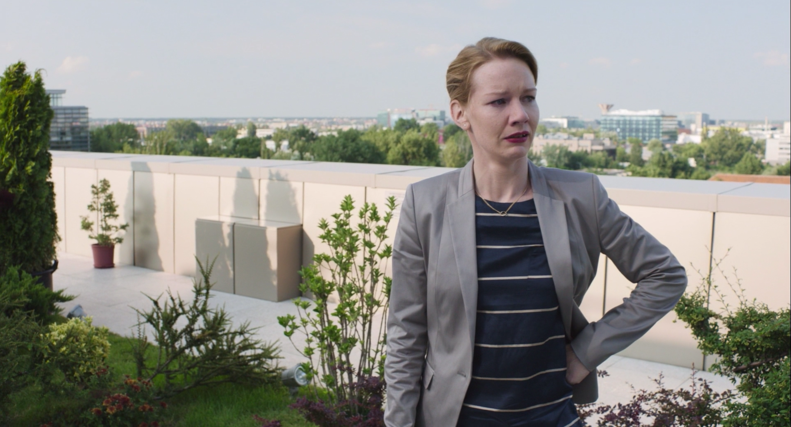
Ines is perhaps especially bad at decorating, but her style is hardly a divergence from that of her community. The office building where she works has an outdoor garden on one of its upper floors. Here, nature has been tamed and made manageable, like the employees. Yet it is also a bit confused. Notice the potted plant in the back, inexplicably separate from the lawn. Who thought to put it there? Its strange loneliness exposes the balcony as a corporate afterthought and serves as a microcosm for the entire garden.
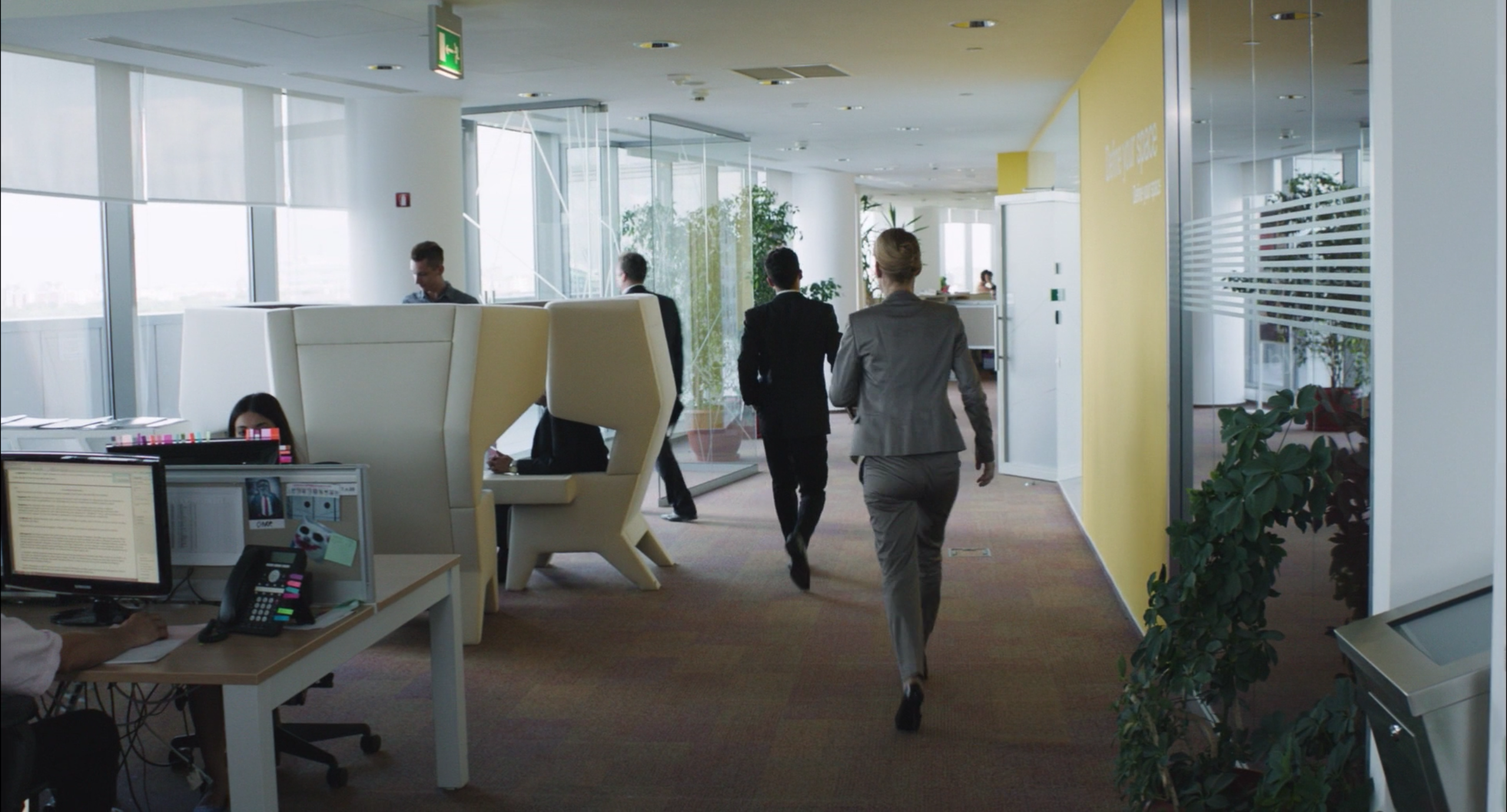
Slight effort without real human purpose is the governing principle of this economy, in which ostensibly high-powered consultants traverse the world in order to serve as PR fig leaves for companies that wish to kill jobs. The results is a surreal array of meandering inspiration, impractical exertions of design like these absurd office chairs.
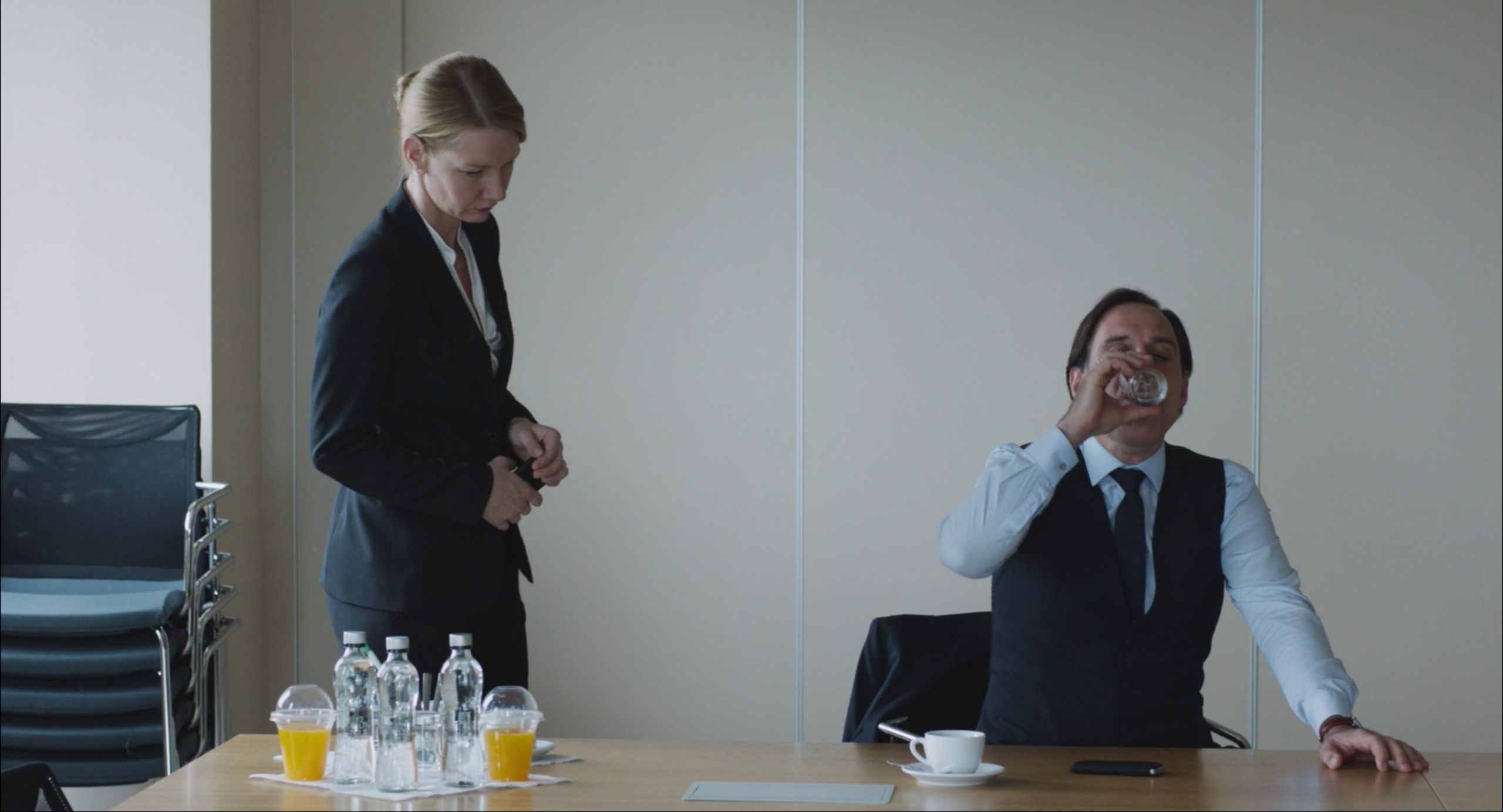
Rooms feel aggressively designed but their walls display no art. Conference rooms feel as if they could be torn up for scrap at a moment’s notice. There are chairs in abundance and more bottles of water than anyone ever needs. It is the veneer of some very busy person’s idea of professional style.
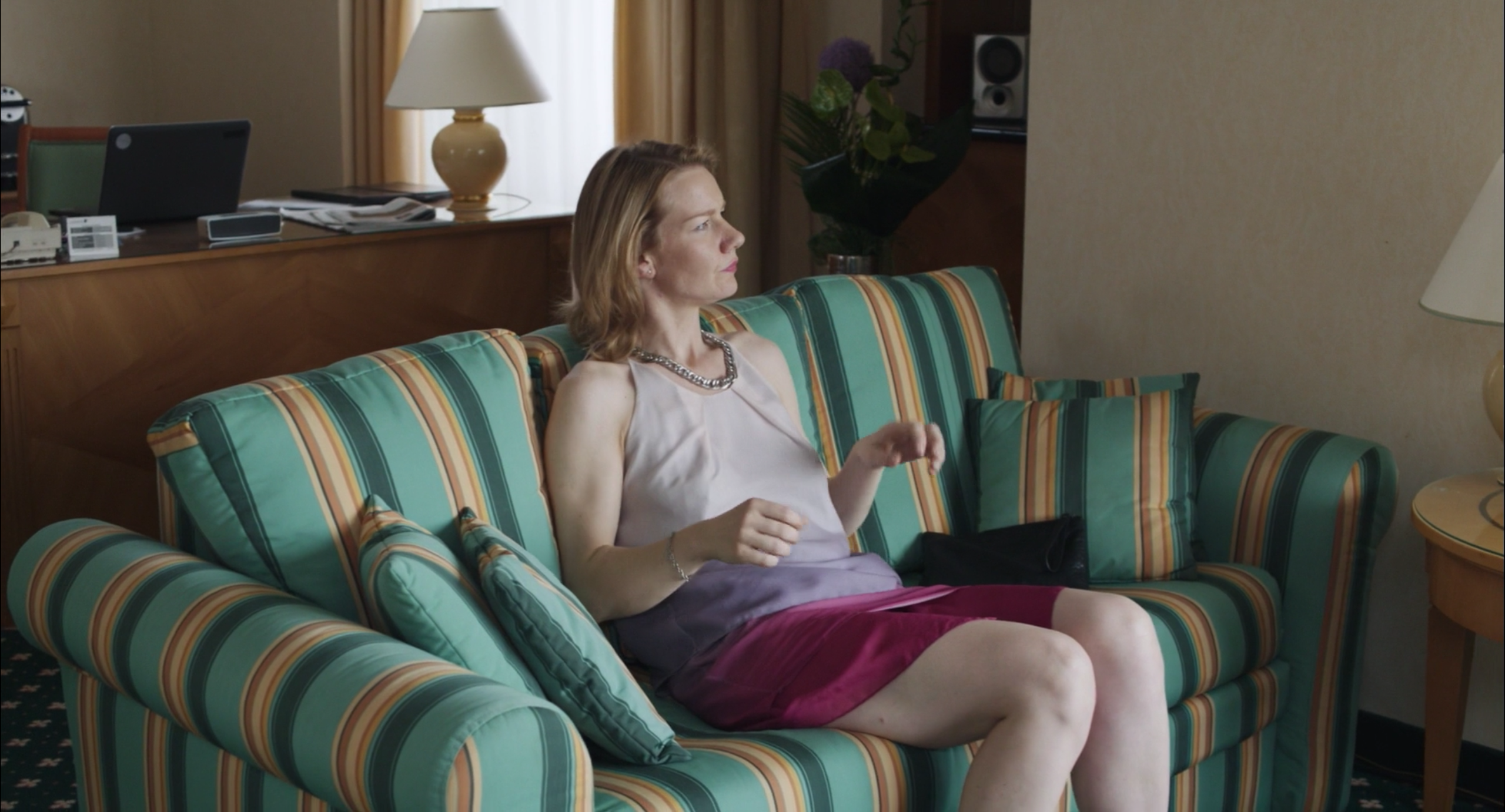
There is an even more insidious sameness in the places where these people drink and sleep. The blandness of the office seems tasteful and warm when compared with the familiarly hideous upholstery of a high-end hotel chain.
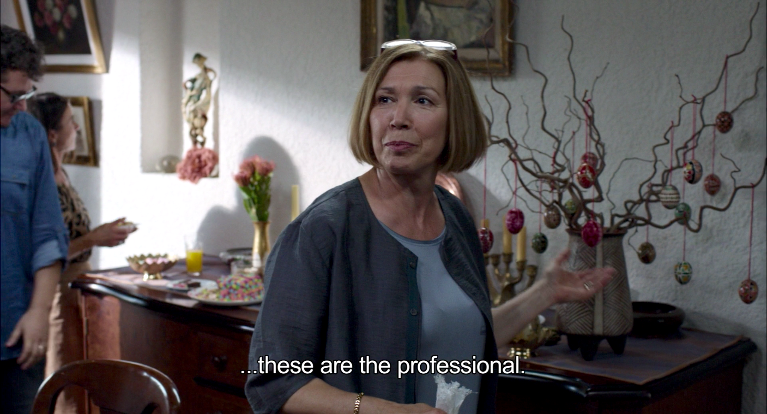
It is then a relief when Winfried invades Ines’s territory with some improvised, disorganized energy. He brings Ines to an Easter party, complete with painted eggs in a charming little tree. It’s not a living plant, of course, and the eggs themselves aren’t home-painted. Nature, in a city, is always mediated by people. But even this homey little apartment seems like a shock to Ines.
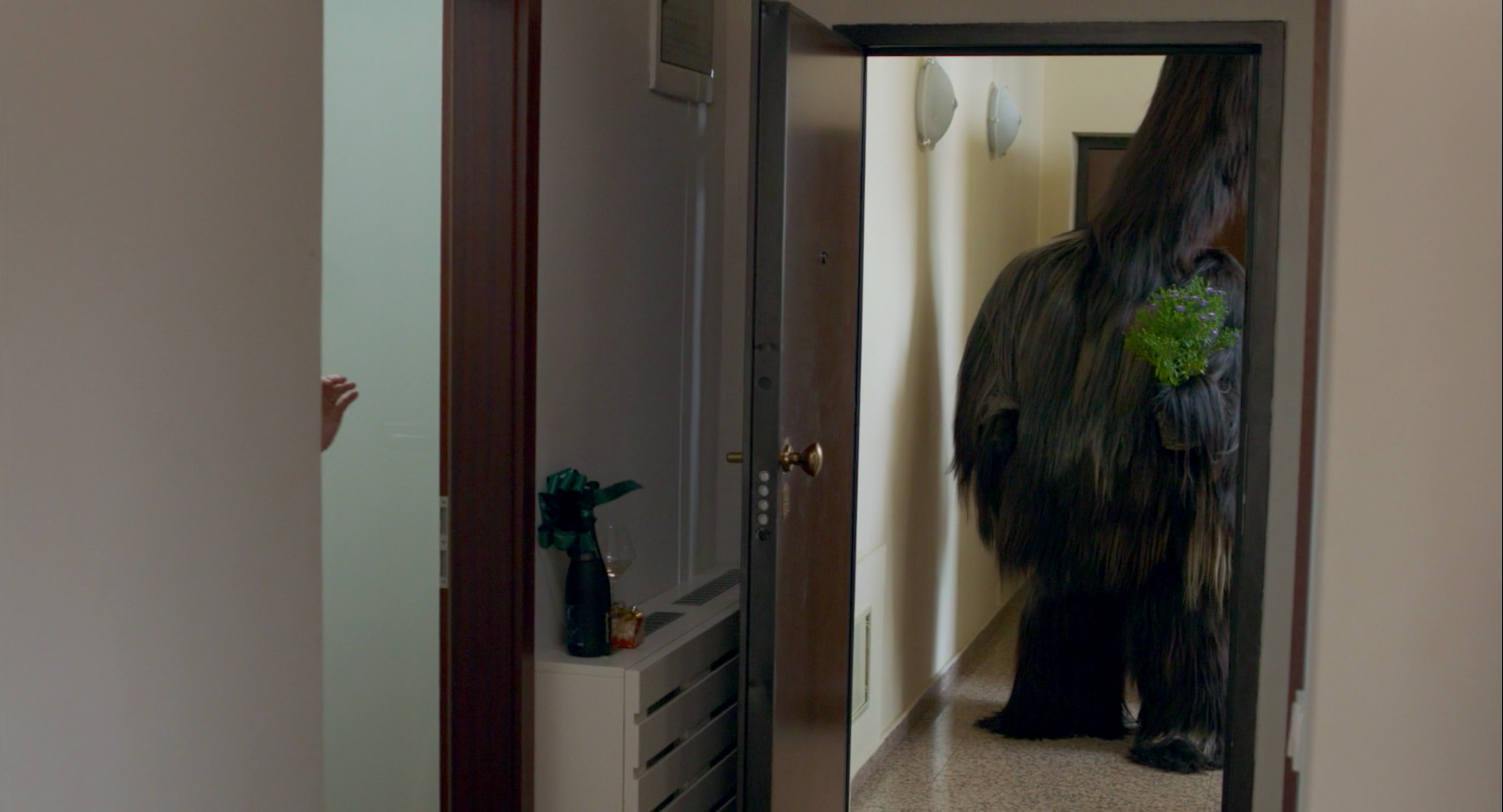
After all, design is not without psychological impact. Ines is forever in spaces that project no human identity, setting her adrift. Neither her job nor her chair offers any real inspiration. There is no sense of purpose in her work or in her apartment. It takes Winfried's tremendous creativity to even begin to dislodge her character from its socket, and even then it doesn't quite fix things. We are, perhaps, where we sit. It takes something as visually opposite as a Bulgarian exorcism costume to break through.


Reader Comments (7)
Brilliant as always, Daniel.
even though i'm not a huge fan of this movie every thoughtful piece on it (like this one) makes me think i need to rewatch it.
Doesn't the sizing of the fonts on the DVD cover make it look a tiny bit like it was nominated for the ACADEMY AWARD for BEST PICTURE? If you squint your eyes, you can believe. (Though I honestly wonder if design tricks like that actually throw off the ill-informed awards-illiterate all the time.)
One of your best pieces.
'Toni Erdmann is a film about chairs. It is also a film about couches, though less so.'
I love this series.
I've been hot and cold about the buzz on this film since Cannes last year but I am now keen to see it when it finally comes to home viewing in Australia.
Best entry in a great series! And I love this movie! It's about trying to keep our humanity despite late capitalism/management consulting, and the soulless furniture is part of how this film gets at that theme so brilliantly!
LOVE this film and LOVE this piece possibly even more! Although is it just me or do those office chairs look kinda comfortable?
My absolute favorite thing in this movie (other than the hair monster costume, obviously) is the "decorating" Ines did for her party. So absolutely typical that not only would she have it catered, but that it would be styled just so, exactly like a corporate event. I laughed so inappropriately at those damn vases of grass.