


The Furniture: Rejecting a Neon Green Future in The Shape of Water
"The Furniture," by Daniel Walber, is our weekly series on Production Design. You can click on the images to see them in magnified detail.
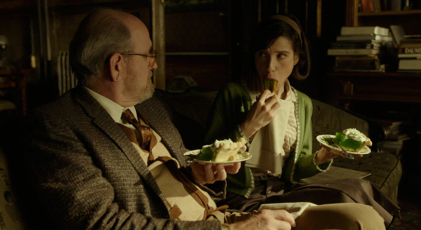
“That’s the future,” the ad man says, “Green.” It’s a ridiculous observation, but it’s also a cruel way to tell Giles (Richard Jenkins) he should find somewhere else to pitch his illustrations. The future, the ad man means, is the replacement of Norman Rockwell with cartoon children selling neon, gelatinous green pie.
The Shape of Water isn’t really about pie. But this comment on 1950s advertising is a helpful key to understanding the rest of this aqueous fantasy...
Guillermo del Toro films sink or swim on their design. He relies on the physical charm of his sets and the visual charisma of his monsters to do much of the work that other filmmakers reserve for the script.
It doesn’t work for everyone, particularly when it comes to something as subjective as romance. But It’s worth noting that the old monster movies Del Toro cites as his inspiration tend to work the same way. Dialogue and duration can be entirely irrelevant in movies that foreground makeup, iconography and screaming. But the design needs to be utterly convincing to work.
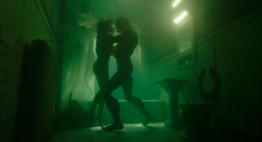
Luckily, the Oscar-nominated work of production designer Paul Austerberry, art director Nigel Churcher, and set decorators Jeffrey Melvin and Shane Vieau is ever-present and deeply meaningful. Elisa lives in gorgeous, almost Art Nouveau apartment, perched in the attic of a movie theater. Her oceanic wallpaper, icy windows and metallic chairs suggest a submarine, Elisa playing a Captain Nemo of aquatic desire.
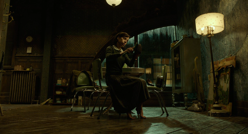
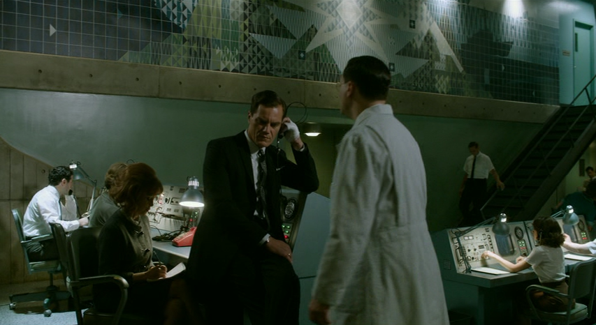
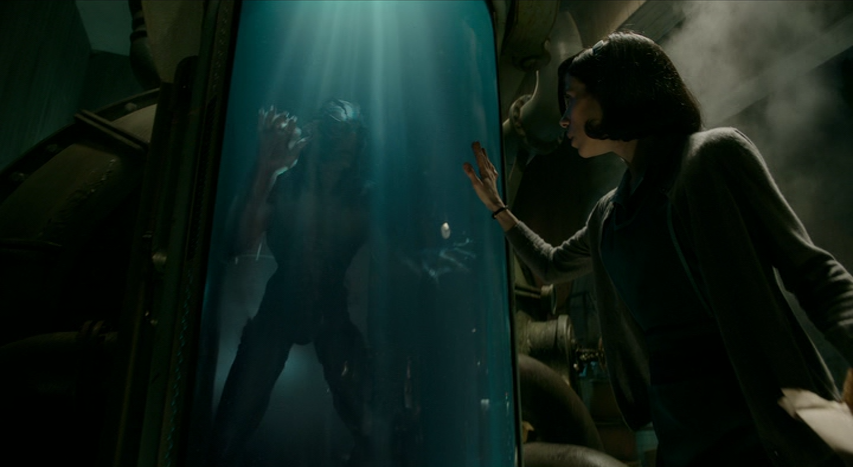
The colors set the mood for the rest of the film, a palette of greenish-blues and bluish-greens that lend every space a nocturnal, fluvial cool. Similar tones appear on the walls of the Occam Aerospace Research Center, where Elisa and Zelda (Octavia Spencer) work. The mosaic above the command center suggests Elisa’s wallpaper, but pushed into rigid geometry.
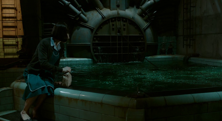
Elisa, more than anyone else, feels comfortable in these watery, subterranean spaces. For her, a dank, dark room may only be a camera obscura, possessing all the Old Hollywood magic of the cinema beneath her floor. She follows this curious spirit up to the glass tank, where she begins the romance that will change her life. The water is luminescent.
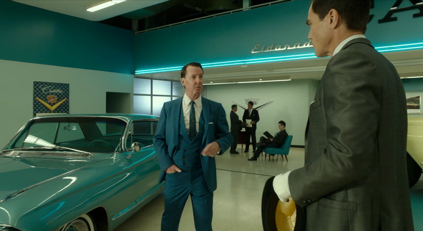
The Shape of Water doesn’t really have a defined color hierarchy, in which blues stand for good and the greens are wicked. Nearly every space shares a similar spectrum. What Del Toro seems to be opposing is opacity, a future in which colors have neither depth nor mystery. The green pies are one example, the Cadillac dealership another. In this light, rigidity of the Cold War and the madness of mid-century commercial advertising seem like two sides of the same coin.
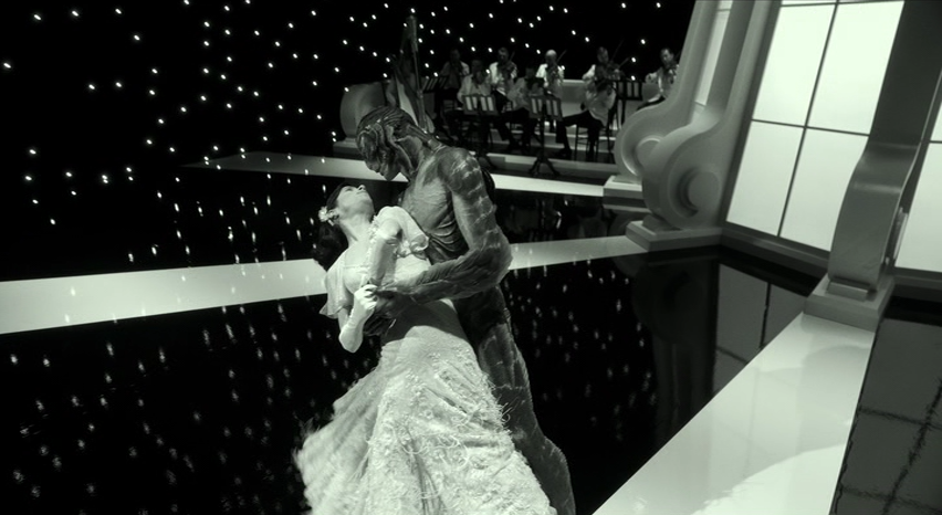
This, perhaps, is why Elisa’s musical fantasy is in black & white. Del Toro, a lover of Universal monster movies, is inevitably aware that the absence of “color” hardly means a flat visual palette. The shadowy landscape of those early horror films, expertly playing with the space between light and dark, is a source of their power. For Elisa, surrounded by a new wave of saccharine Technicolor, the bombastic black and white majesty of a 1930s musical is a similarly ideal escape.
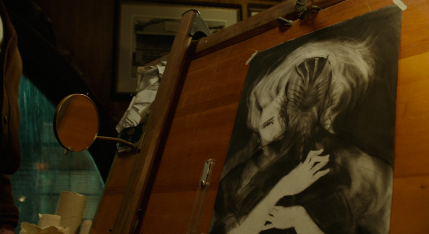
It has a similar effect on Giles. The creature doesn’t just bring him new hair, but a new artistic perspective. He has finally abandoned Norman Rockwell as well, but not for neon green pie.
This spectrum of color, depth and shadow is the film’s internal logic. Elisa and her new lover don’t need more time to build a rapport because they recognize each other instantly. They, and we, must be convinced by the design. This is true of every relationship in the film, every narrative beat, every resulting conflict. The design comes first, and everything else follows.
 Daniel Walber
Reader Comments (3)
Yes, agreed. The script does less work than expected because the design fills in, as a moving picture is perfectly equipped to do. Even the way that the lovers move tells you things that dialogue doesn't. Look at the way Elisa bites that egg before offering it to him. The way his hand sensuously slinks out of the water to accept her gift, once she's assured him it's safe. It's all there.
All of the commentary about green makes me ponder about the specficity of Michael Shannon's Cadillac not being GREEN but TEAL.
I would have loved that apartment!
I can't be the only one who, at least in the design, thought immediately of the films of Jean Pierre Jeunet. AMELIE, CITY OF LOST CHILDREN and MICMACS most obviously.