The Furniture: On Frida's Mirrors and Diego's Walls
 Wednesday, June 3, 2020 at 10:30AM
 Daniel Walber's series on Production Design. Click on the images to see them in magnified detail.
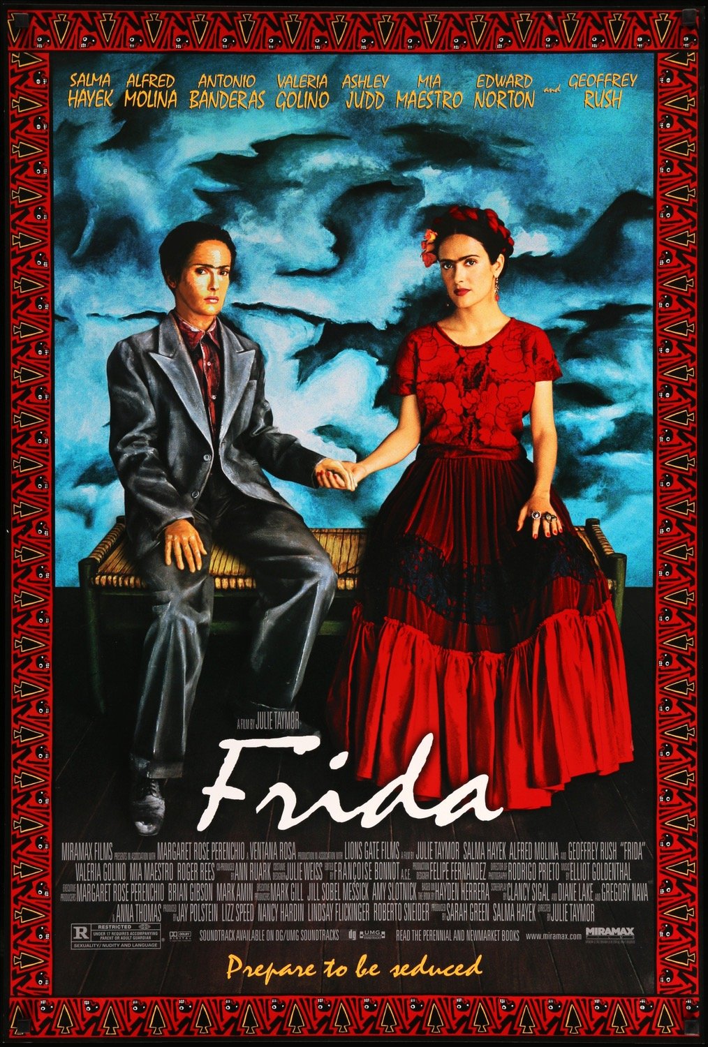
 Nearly 20 years on, Julie Taymor’s Frida remains both breathtaking (those Quay Brothers puppets!) and befuddling (why isn’t it in Spanish?). It holds up better as a visual experiment than as a biopic, despite the richness of Salma Hayek’s performance. Filmmakers have long struggled to bring the lives of visual artists to the screen in dynamic, resonant ways. Some fail.
When Frida does succeed, it’s largely due to its Oscar-nominated team of art director Felipe Fernández del Paso and set decorator Hania Robledo. Their work doesn’t simply represent the art of Frida Kahlo and Diego Rivera, but interprets it. By transforming Kahlo’s paintings into the stuff of cinema, they directly engage with their meaning - or, rather, Taymor’s own interpretation of those meanings. The result is a film with a lot to say about materiality and identity, the value of brick and the value of life.
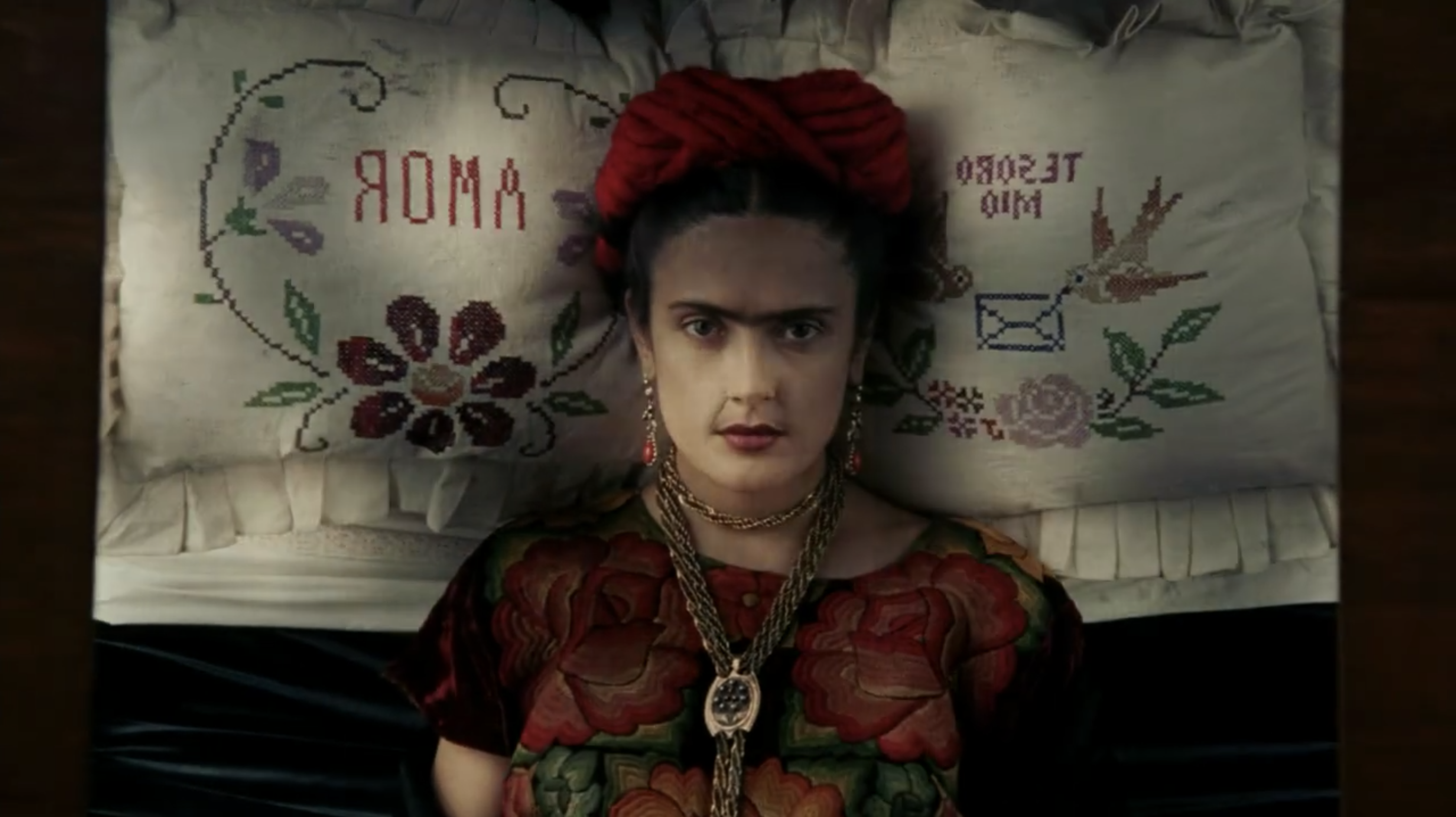
We begin with Frida’s bedridden journey to her first solo show in Mexico City. She is carried out of the house aloft, head resting on an embroidered pillow that reads “Amor” and “Tesoro Mio.” But then we see her through her eyes, as she looks up to the mirror into the canopy of her bed, the flowers reflected back at her.
Over the course of the film we see her through countless mirrors, reflecting both her art and her life. The next comes after we have flashed back to her youth, as she slowly recovers from her 1925 bus accident.
The mirrors themselves are never much to look at, usually bound by a plain wooden frame that quietly suggests those of her paintings. They follow Frida even away from her canvases - here she is at her wedding, precisely captured by the mirror on an armoire.
Initially, the mirrors just reflect. But as Frida’s art develops, her mirrors join her in pursuit of the surreal. After leaving Diego, she returns to her parents’ home and cuts her hair, eyes locked onto this new image of herself.
Then Taymor pulls back, revealing a doorway. Another Frida sits there, a melange of Hayek and the referenced painting. She is dressed identically to the “real” Frida at the mirror, seated on a yellow chair and surrounded by newly discarded locks. The mirror, meanwhile, has found itself resting on an easel. In it we see real-Frida looking at painting-Frida, who in turn looks directly at us.
Through film, the paintings become living refractions of the artist herself. In a later example, Frida paints herself in white, a double that gazes back at her. Then she steps into the painting to join herself on the bench, becoming yet another double. These scenes compound the sheer layers of identity that go into each self-portrait. Bringing them to life underlines their depth and their authority - an authority that Diego doesn’t necessarily understand.
Diego is impressed with Frida’s talent from the moment he sees her work, but still tells her that portraits are obsolete, a bourgeois waste of time. The implication is that the right form, both politically and artistically, is the mural. Through vast representations of history and politics, Mexico and the world can be changed. He’s introduced to the film while installing one of these projects, dwarfed by his scaffolding.
To further this point, Taymor prioritizes scenes of Diego at work in actual architectural spaces. His monumental ambitions are an ever-present aspect of his character.
This turns to parody when he and Frida travel to New York City. She imagines him as King Kong, climbing the Empire State Building to make yet another architectural mark.
Diego has been commissioned to create a mural in Rockefeller Center, keeping them in New York. But when he refuses to edit out an image of Vladimir Lenin, his patron (Edward Norton as Nelson Rockefeller) promptly pays him for the unfinished work and then destroys it.
Diego is devastated, but Frida tells him to get over it. Sure, she’s just as committed to revolutionary politics as he is. But she thinks that Diego has already won the important part of the fight - it’s not the wall itself that matters, but the story people will remember and the role he played in it.
Diego disagrees, of course. And when Frida suggests it’s time to go home, he stabs a painting disgust - a still life of an agave, which he sees as a symbol of an artistically frivolous life.
Which of them is right? The Rockefeller story has certainly far outlived the unfinished mural. And even if finished, it would’ve been one radical wall in a corporate landscape, paid for by one of the world’s most famous capitalists. Yet it was also part of Diego’s vision, the painting of materialist struggle onto architectural material. And it’s a far cry from Frida’s self-portraits, comparatively tiny representations of such comparatively tiny ideas as the self - at least from the perspective of Taymor’s Diego.
But Frida’s work isn’t really tiny at all. As the design of this film brilliantly explores, her self-portraits have a dizzying depth. They are mirrored visions of life itself, staring into our eyes as Frida stared into her own. They show the political value of a single life, and in particular the value of her own life - for which she has become an icon of feminism, of queerness, of Mexican culture, of so many marginalized identities.
And, perhaps, the way Taymor contrasts this with Diego’s massive muralism echoes into the present moment. What is more valuable, a wall or a face? Is the physical material of our cities more precious than an individual portrait, an individual life? Which is worth our devotion, our energy and our struggle? Where do we take Frida from here?


Reader Comments (10)
Last year I attended the Frida exhibition at the Brooklyn Museum -it was like stepping into this movie
Love this piece. these questions it asks, that you've eloquently put a spotlight on. the wall ? the face? feel as of the moment as any questions .I have never much cared for Taymor as an artist (too many ideas without the discipline to self edit and really put them over) but I do think her work here is stronger than her norm and I wish other filmmakers would push themselves as hard when trying to capture artists onscreen.
This exquisite piece is prompting me to watch Frida again tonight.
It should also be mentioned that funding for this movie was a notorious odyssey, even by Hollywood standards. A lot of these cameos by well-known actors in the movie were a way to secure parts of said funding and to gather interest.
Taymor’s visual sensibilities and Goldenthal’s score are a way for us to access Frida while we acknowledge that a Hollywood version of her story is never really going to be a definitive take on it.
Hayek does a fine job, as does Molina, but it’s the clear passion for Frida and her work that make this a yearly viewing for me. Those opening credits alone!!
What a fantastic article and write-up. Like James I'm going to rewatch straight away with all of your thoughts in mind.
I don't love the film but the visuals really are so special.
It is an amazing film and only someone like Julie Taymor would do that story justice and with the right actress in Salma.
I'm insist. To watch a character who is mexican, speaking english with bad accent and pronunciating words in spanish with the accent of an native english language speaker was very distracting for me, but the production design is without a doubt resembling the art of Frida.
Julie Taymor does a great job with the visuals (specially here and in Across the Universe) like the brief scene where the bed burning but I think she needs to work more as storyteller.
P.S. True story: when I visited the house-museum of Frida in Coyoacán, her weelchair it moved by itself
Man was that a great year for this category. Any of the five would've been worthy winners.
To this day, I can't recall a film with such a gulf between its stylistic heights and its storytelling ambition. I can still recall that early bus sequence. But I just wish it wasn't such a standard biopic in too many ways.