Daniel Walber's series on Production Design. Click on the images to see them in magnified detail.
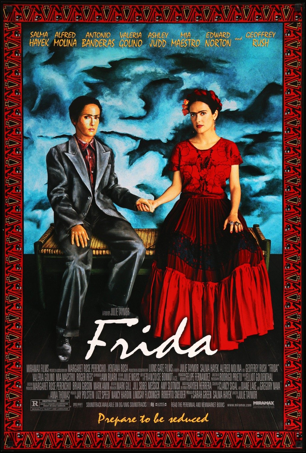
 Nearly 20 years on, Julie Taymor’s Frida remains both breathtaking (those Quay Brothers puppets!) and befuddling (why isn’t it in Spanish?). It holds up better as a visual experiment than as a biopic, despite the richness of Salma Hayek’s performance. Filmmakers have long struggled to bring the lives of visual artists to the screen in dynamic, resonant ways. Some fail.
When Frida does succeed, it’s largely due to its Oscar-nominated team of art director Felipe Fernández del Paso and set decorator Hania Robledo. Their work doesn’t simply represent the art of Frida Kahlo and Diego Rivera, but interprets it. By transforming Kahlo’s paintings into the stuff of cinema, they directly engage with their meaning - or, rather, Taymor’s own interpretation of those meanings. The result is a film with a lot to say about materiality and identity, the value of brick and the value of life.
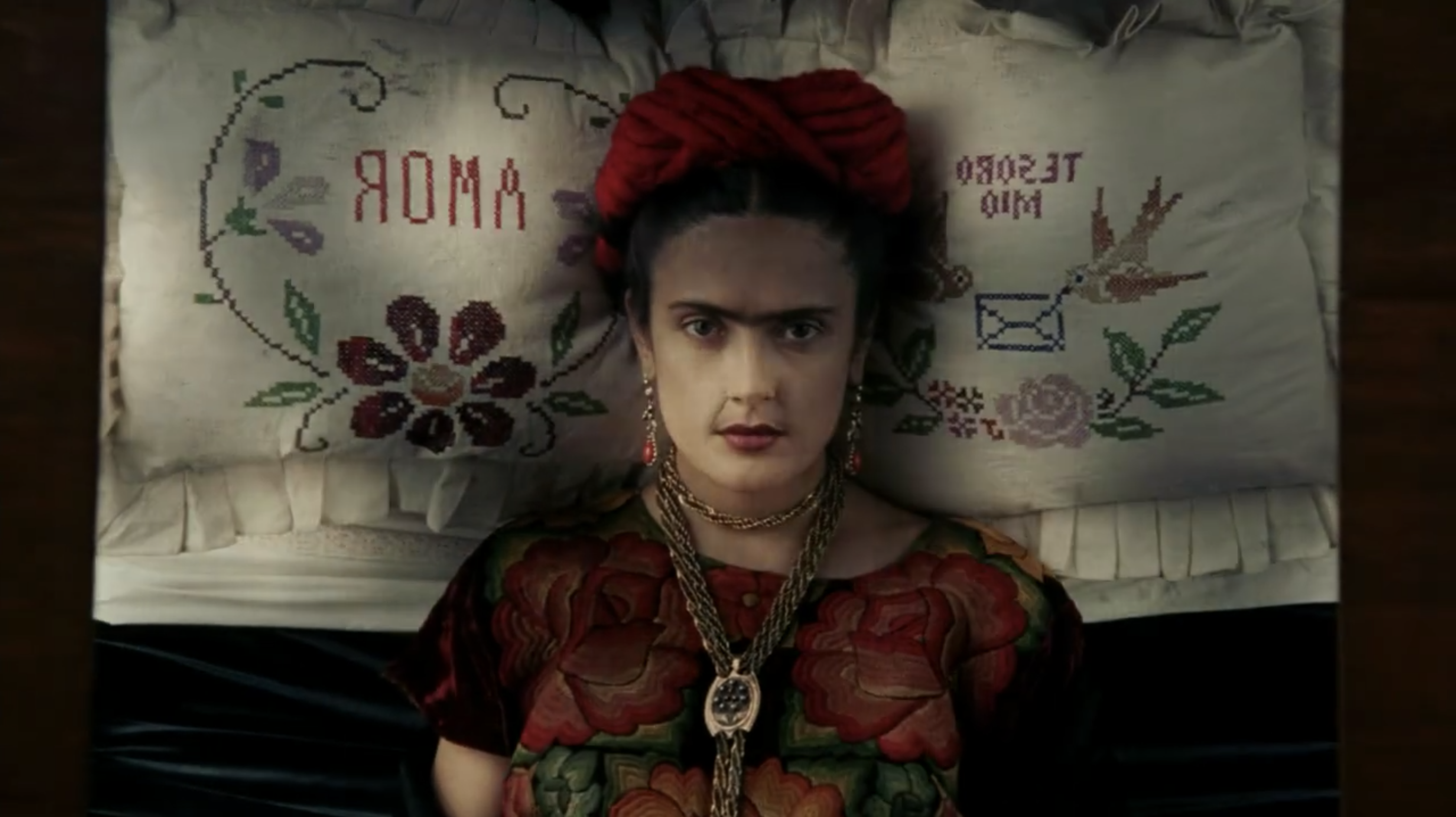
We begin with Frida’s bedridden journey to her first solo show in Mexico City. She is carried out of the house aloft, head resting on an embroidered pillow that reads “Amor” and “Tesoro Mio.” But then we see her through her eyes, as she looks up to the mirror into the canopy of her bed, the flowers reflected back at her.

Click to read more ...
 Sunday, March 19, 2023 at 6:01PM
  Paul Rudd vs Jonathan Majors in "Quantumania"


