


Dozen Best Movie Posters of 2022
Our "Year in Review" continues. Let the List-Mania commence...
 ciick to embiggen
by Nathaniel R
Movie posters are not what they used to be. This is not an aesthetic "everything was better in the past" complaint but a fact; they aren't as present an advertising force as they were when one tall rectangular image and tagline would do the bulk of the advertising work to define a film. Now that work is dispersed in multiple shapes and images and visual modes, the old school poster included. Posters aren't quite a lost art but they are in Big Hollywood which prefers to make every poster a hideous inhuman collage of movie stars, think Frankenstein's Monster if Dr Frankenstein, had eschewed body parts and just used hundreds of faces in mismatched sizes to build his undead "man".
But enough complaints. Let's celebrate the posters that did right by their movies this year...
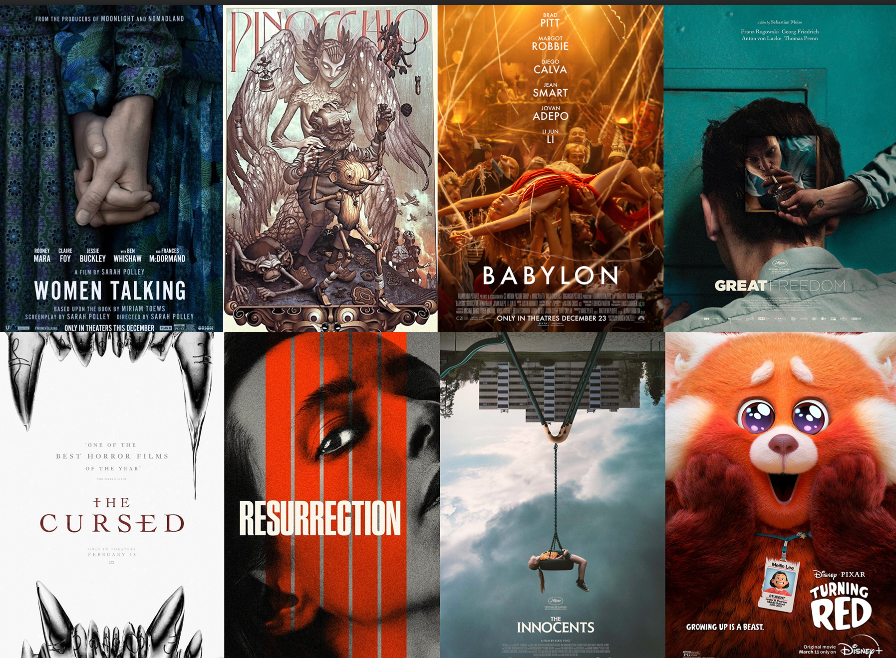
Before we get to the top 12 (obviously your "best" might vary so do speak out in responses) please to consider a whole mess of posters above which you can call the runners up. The teaser poster for Women Talking went with a simple visual shorthand for female solidarity with hands clasped, an infinitely better choice than the "look at the famous actors!" approach of the final poster; teasers are often better in this way thanks to risk and confidence, after which the marketing team then default to something safer and infinitely duller for the final poster. The main poster for Guillermo del Toro's Pinocchio was fine but the true hand-made beauty of the film is better conveyed in poster form by handing it to another artist, in this case James Jean. We love the curiousity-piqueing minimalism of the nightmare totem poster for The Cursed -- it's just carved silver fangs. The prison drama Great Freedom , the psychological horror film Resurrection, and the supernatural thriller The Innocents all chose optic puzzles to convey their highly specific atmospheres, confrontational questions, and existential quandaries. And finally, Turning Red offered up a moodswing ready character series featuring the protagonist Mei-Linn in her red panda form making many different faces. Funny, endearing, and on topic since the movie is about the chaos and hormones of everyone's teenage years.
But in the end the choice to begin our top dozen is...
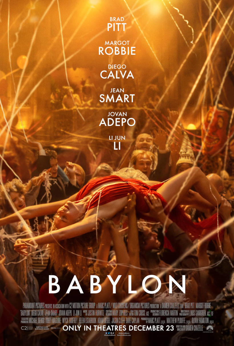
12 BABYLON
A literally golden bacchanalia... to celebrate Hollywood's Golden Age. The Damien Chazelle epic chose its chaotic opening party sequence for the poster which was the right decision. Centered is a dazzling sacrifical starlet/lamb for public consumption... which is just how starlet Nellie LaRoy (Margot Robbie) would have it. At least at first. But to borrow a title from one of the industry's earliest attempts at self-reflection... "What Price, Hollywood?" [Currently in theatrical release]
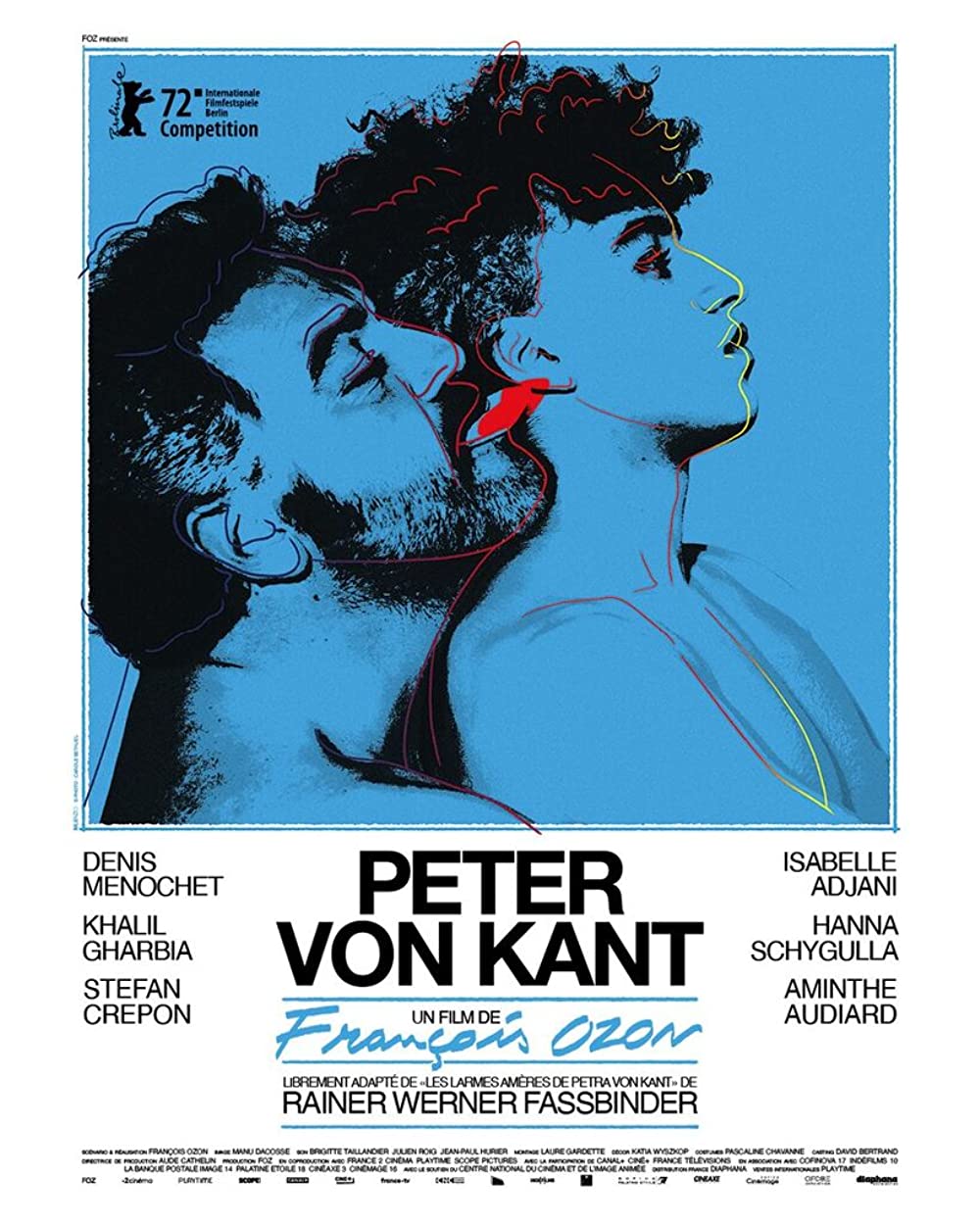
11 PETER VON KANT
As Jared Morabak basically suggests at The Film Stage If François Ozon is going to steal from / pay cheeky homage to the Rainer Werner Fassbinder masterpiece The Bitter Tears of Petra Von Kant, why shouldn't the poster steal from / pay exuberant homage to another artist? In this case the designers are riffing on Andy Warhol doing a movie poster for another Rainer Werner Fassbinder classic, Querelle. The circular referencing becomes a queer oroborus... with non-forked tongue. [Available to rent on most services]
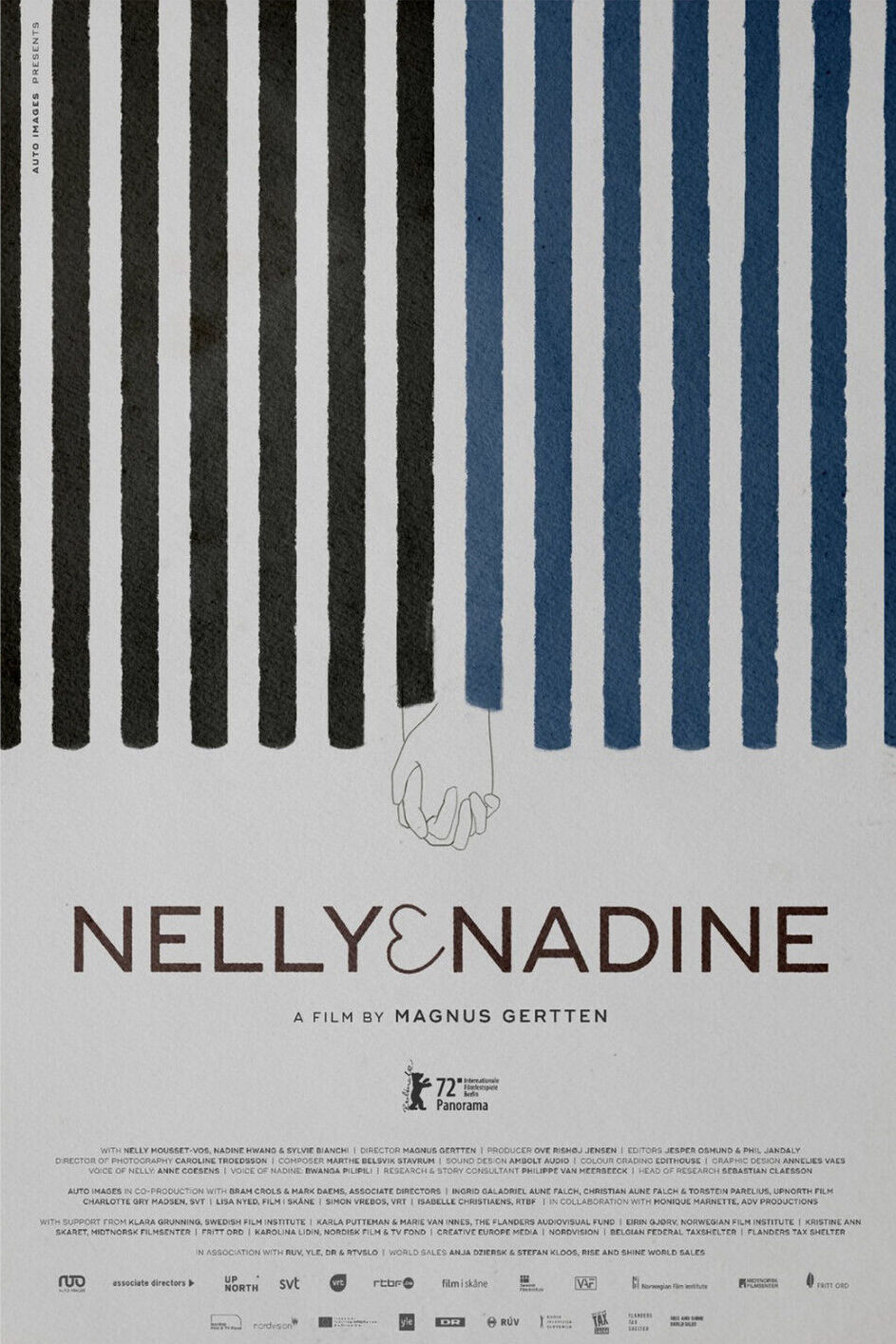
10 NELLY & NADINE
This acclaimed lesbian documentary about two women who met in a concentration camp won the Teddy Award at Berlinale. Though it sadly didn't make the Oscar finals, it wins our unofficial Best Documentary Poster award for this simple barely-visible design, clasped hands emerging from the bars. [Currently in theatrical release]
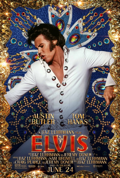
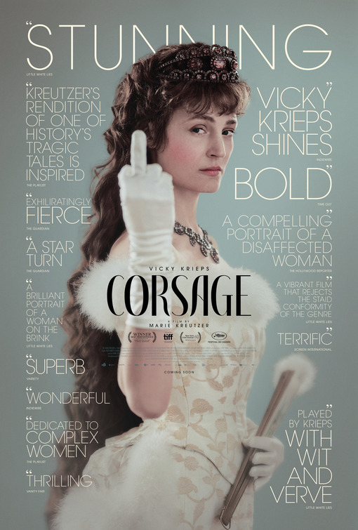
08 [tie] ELVIS & CORSAGE
These two posters make a wonderful imaginary duet. Elvis Presley (always looked at) is lost in one of his own chaotic wiggles the way he is sometimes lost in his own story. It's fun that the dazzle and baubles are all pointing right back to him, to keep him perpetually locked in view. Meanwhile Empress Sissi (always looked at) is staring right back at us with contempt, complete with flipped bird. She's a prickly royal and her peevishness is a great tonic for the laudatory words surrounding her. This is no stuffy period piece. [Elvis is available to stream on HBO Max and rentable from most services. Corsage is currently in theatrical release]
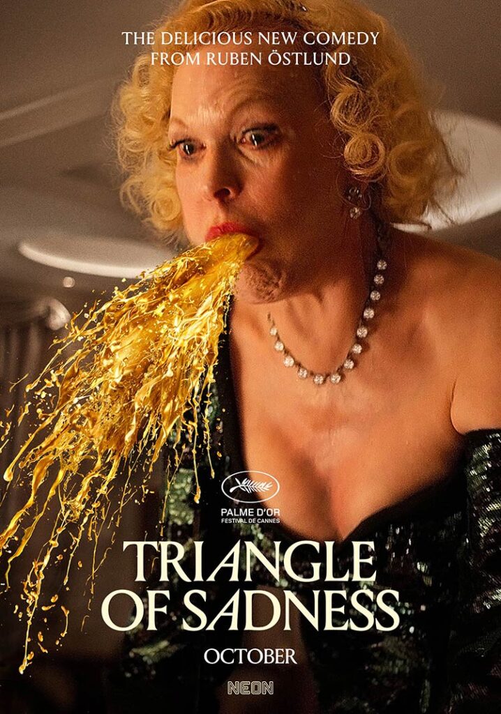
07 TRIANGLE OF SADNESS
Is this crass? You bet! Still, there is a rude visual thrill in reducing this satire of economic hiearchies (among other societal constructs) to an absurdly wealthy woman vomiting at us. It's the heightened color and crispness of the image that really sells it, even the vomit is pure gold. [Currently in theatrical release]
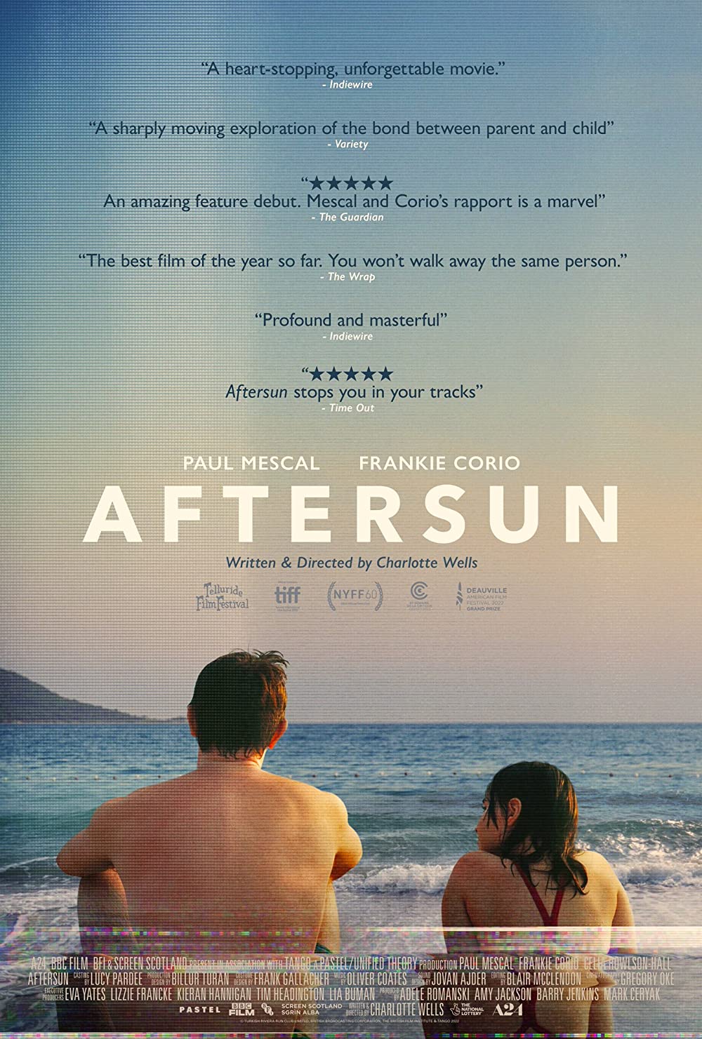
06 AFTERSUN
While main characters with their backs turned to the audience is all too familiar a look for movie posters, Aftersun earns the choice. It conjures the movies melancholy, the father/daughter intimacy, and places it squarely in the past via the visual distortion and tracking errors of an old VHS tape. It's other main posters do much the same thing but replace VHS noise with the fading and wear of old photos. [Currently in theatrical release]
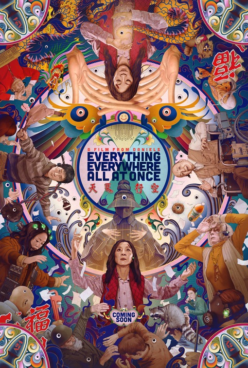
05 EVERYTHING EVERYWHERE ALL AT ONCE
Dizzying, evocative, funny, and serious all at once. But best of all its ultra specific to the film its busy advertising. Most of the movie's great visual gags are right here but you have to spend time looking for them and even if you'd did you'd still be surprised and delighted at how they're dispersed. That before / after effect is what makes the poster both effective and a collectable. [Streaming on Showtime. Available to rent from most services]
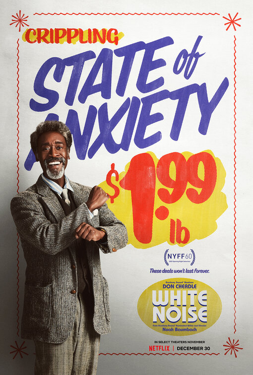
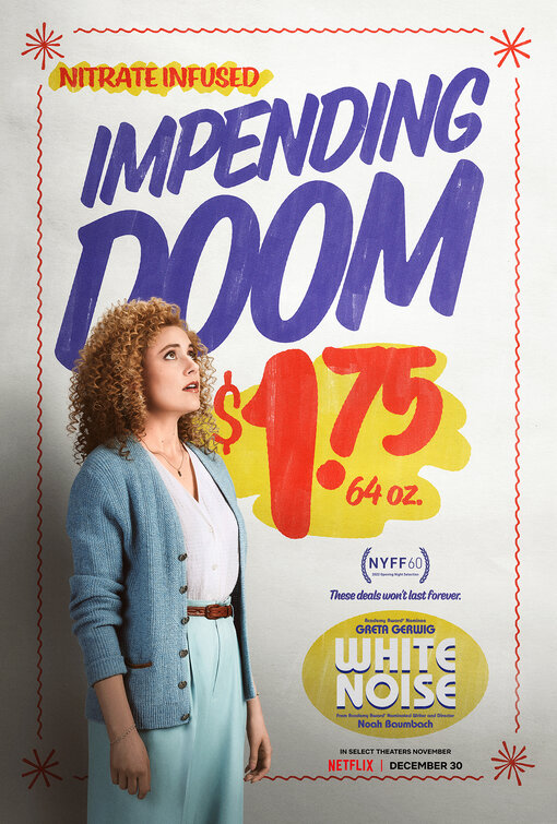
04 WHITE NOISE
How to sell an 80s-era intellectual comedy? The 'final' poster is a forgettable silhouettes but for the individual character posters the designers opted to use the blinding whites and primary colors of the grocery store -- the most memorable set in the film thanks to the justly lauded end credits sequence -- for the character posters. White Noise has divided critics but if you're on its wavelength it's very funny and these posters are incongruously cheerful jokes for its armageddon humor. [Streaming on Netflix]
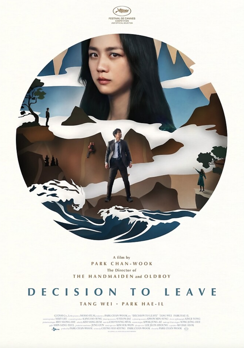
03 DECISION TO LEAVE
Park Chan-Wook's labyrinthine narrative isn't easy to sum up. This is one of multiple posters for the acclaimed noir and our favourite for its circular elegance and the evocations (without spoilers) of the narrative and the way the characters relate (and don't relate) as well as the literal and figurative "forces of nature" that play into the mystery. [Streaming on MUBI. South Korea's Oscar Finalist]
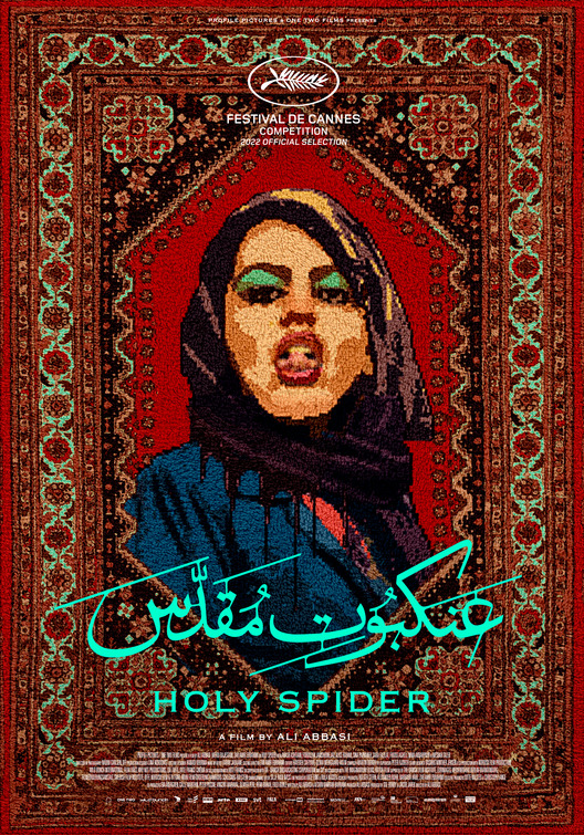
02 HOLY SPIDER
Denmark's Oscar finalist is a serial killer picture about a female journalist (Cannes Best Actress winner Zar Amir-Ebrhaimi) trying to cover the case of a serial killer who is murdering local prostitutes in the holy city of Mashhad. The poster ingeniously weaves the image of a defiantly erotic prostitute into the threads of a Persian rug. Striking in color and theme, the poster is as memorable as the film. [Currently in theatrical release]
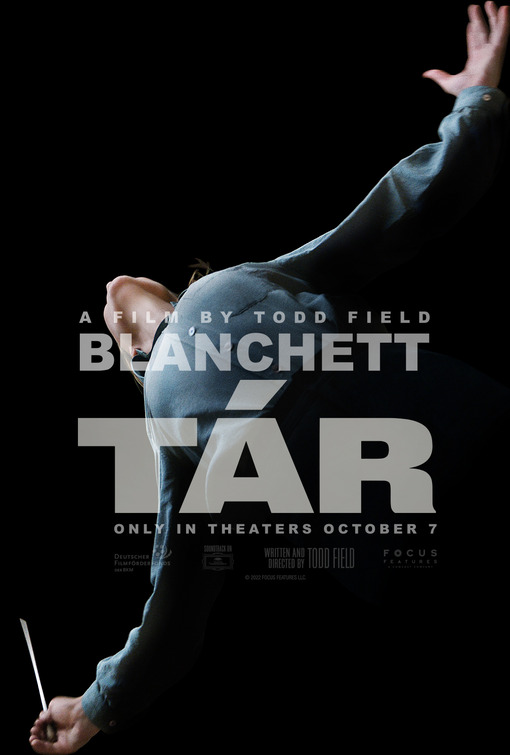
01 TÁR
While busy posters can be intoxicating (see Everything Everywhere All At Once) when a movie poster manages to distill its movie down to one bold self-mythologizing shot, it's just magical. This seemingly simple poster and its brilliant choice of giant font decisively captures multiple things about TÁR as a film: its muscular form, the symphonic milieu, Lydia's self-satisfied grandeur, the motion and sweep of music. What's more the camera angle and costuming basically remove gender from the equation, a subtle curveball since so much of Lydia's identity and sense of her own worth is from her accute awareness of her lofty achievements as a woman in a typically male profession. The one poster this year that screams "ICONIC!" [Currently in theatrical release]
HAPPY NEW YEAR READERS! What cinematic pleasures await us in 2023?
 NATHANIEL R
Reader Comments (4)
Agreed, on TÁR and EEATO. Also, nice to see THE CURSED mentioned for that minimalist beauty. Bring on the Top 10 and Film Bitch Awards :)
OMG I've gotten lost in the EEAAO poster. Very fun to revisit this post-watch
This was a great post. EEAAO is my fave film of the year and I haven't even looked in detail its poster yet! Delightful discoveries.
I haven't heard of Nelly & Nadine, but WOW at that poster design.
I love the EEAAO and the Decision to Leave posters.
The EEAAO so perfectly conveys the fun and the multitudes and invites participation.
And the Decision to Leave, omg. It’s like a stab through the heart. You’re right, that it captures the themes and makes you think again. And the exquisite balance and design and colour...wow.