Best Picture in Black-and-White: 2022 Edition
 Sunday, March 12, 2023 at 1:19AM
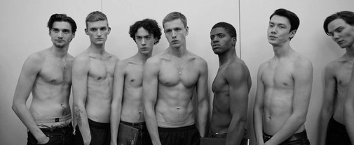
 Remember when Bong Joon-ho and NEON did a special re-release of Parasite in black-and-white? Since then, it's been an awards season tradition to imagine what the Academy's Best Picture nominees would look like devoid of color. This exercise is based chiefly on silly fun since there's more to black-and-white cinema than just turning the saturation dials down. However, it sometimes reveals exciting things about the films at hand. Whose cinematography relies the most on chromatic contrast? What picture would survive the best in monochrome, mayhap even excel? Last year, The Power of the Dog proved a silvery revelation, calling to mind midcentury revisionist westerns. Let's see if this batch of nominees includes a similar success…
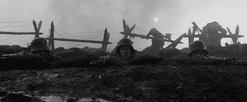
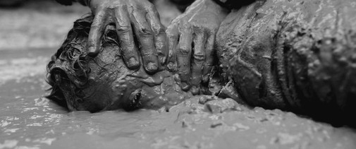
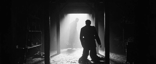
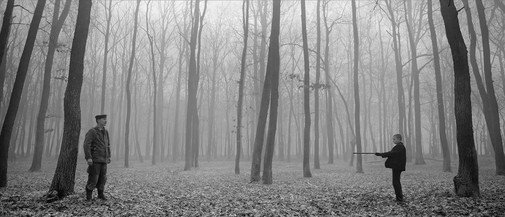
ALL QUIET ON THE WESTERN FRONT
Cinematography by James Friend
Clean out that too-modern color-grading, and the war film shines beautifully. However, such stylistic limits bring to mind the 1930 adaptation too much, calling for more direct comparisons that won't be kind to Berger's vision. Still, it looks better than I expected.
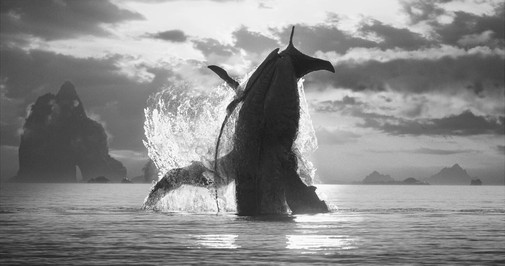
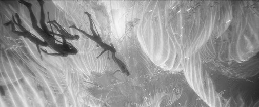
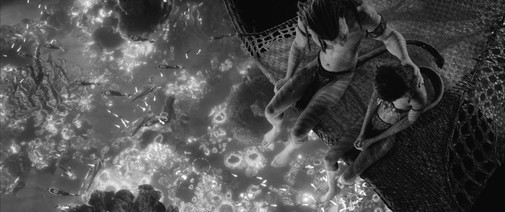
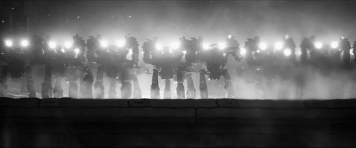
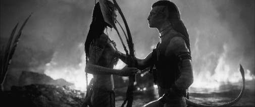
AVATAR: THE WAY OF WATER
Cinematography by Russell Carpenter
It turns out that Pandora is nearly ineligible in black-and-white. Despite the blue tone domination, Cameron's shots depend on a diverse palette, where the visual excess of an alien world is modulated through controlled color stories.
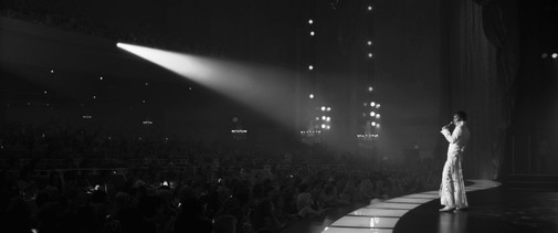
ELVIS
Cinematography by Mandy Walker
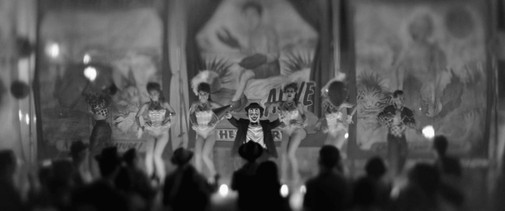
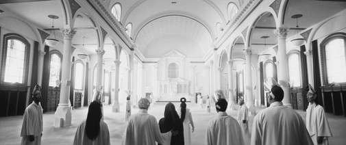
Going through the biopic in search of eye-catching shots was a nice exercise, for it clarified the brilliance in Walker's lensing. It's excellent work that sometimes gets lost in the editing noise, consumed whole by Luhrmann's frenzied rhythms. Yet, even without its vibrant hues, these shots dazzle.
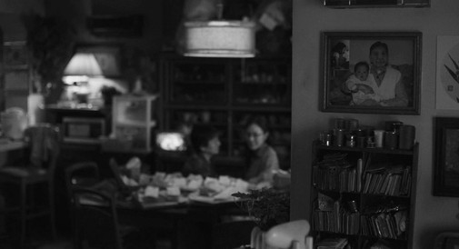
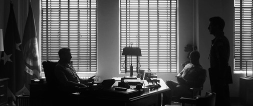
EVERYTHING EVERYWHERE ALL AT ONCE
Cinematography by Larkin Seiple
Though I share some of the Academy's affection for this year's frontrunner, its cinematography always felt like an Achilles heel. Take out the color and the situation doesn't improve, with some lighting choices feeling especially ugly within the picture's office building setting. Furthermore, you lose much of the multiverse variety when limiting the chaos to silver gradations.
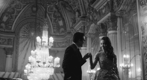
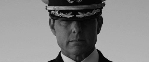
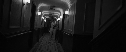
TÁR
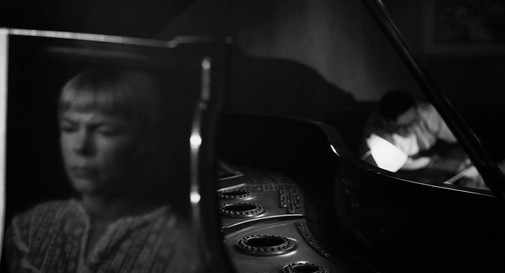
Cinematography by Florian Hoffmeister
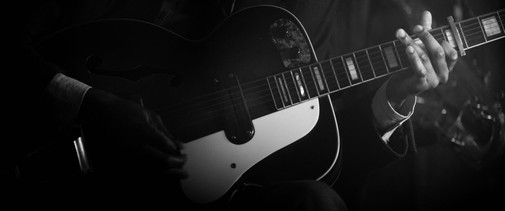
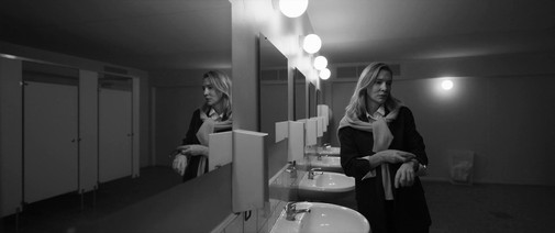
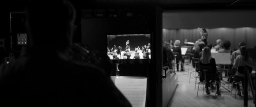
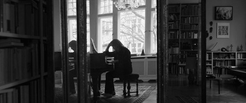
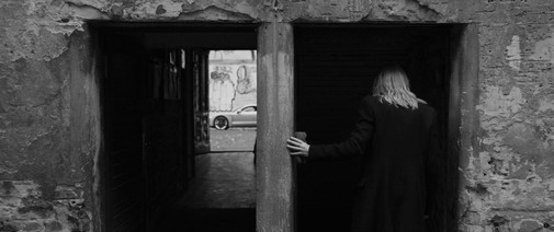
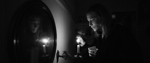
My pick from the Best Cinematography lineup unsurprisingly looks fantastic in grayscale monochrome. This limitation adds to the scalpel-like precision of many shots. However, I miss the light wood tones ever-present in the architecture, the flashes of red hair dripping guilt, and the brown decay punctuating Lydia's world of gleaming surfaces and sharp dark suits.
THE BANSHEES OF INISHERIN
Cinematography by Ben Davies
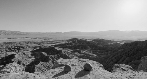
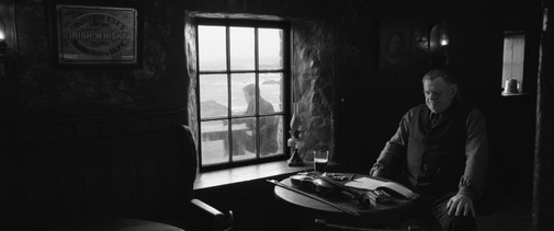
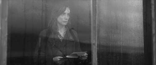
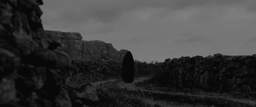
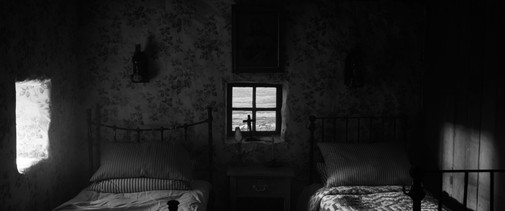
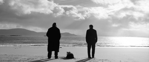
My dislike of Davies' work remains once you remove the inconsistent color grading that mars much of his visual presentations. Still, the stateliness conveyed by black-and-white does a lot to negotiate the levels of postcard prettiness inherent to the landscape.
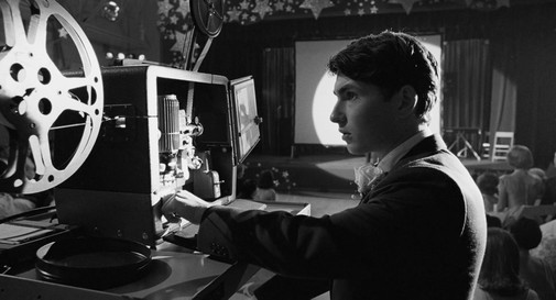
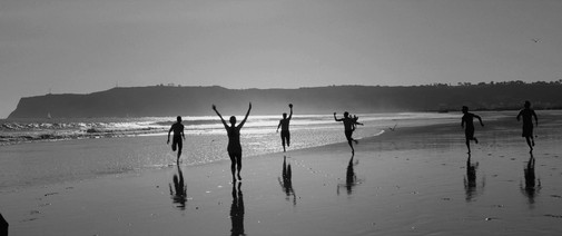
THE FABELMANS
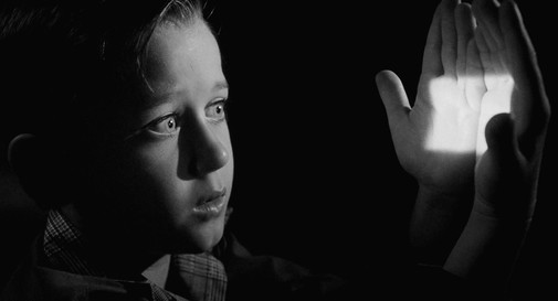
Cinematography by Janusz Kamiński
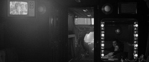
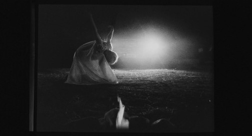
Like Holly Hunter once did, I wish Spielberg would just divorce his director of photography already. Their creative partnership has run dry long ago, with the Polish filmmaker's affectations becoming increasingly detrimental to each new film. Still, The Fabelmans is full of great compositions courtesy of its director and many a game of stylized lighting, making for a nice effect even without color.
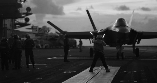
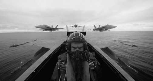
TOP GUN: MAVERICK
Cinematography by Claudio Miranda
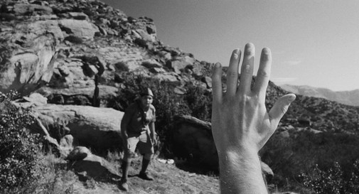
Top Gun really needs color to differentiate between the many golden oranges of sunset or the varying blues seen way up high in the heavens. Several action scenes become incomprehensible without the chromatic distinction between the sky and the ground.
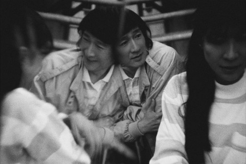
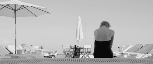
TRIANGLE OF SADNESS
Cinematography by Fredrik Wenzel
There's so much textural contrast between the ship and the wilderness that the aesthetic division of acts doesn't get lost when the color disappears. Still, it feels like a downgrade, especially noticeable during parts of the story where the labor of image-making for the Instagram age is at the forefront.
WOMEN TALKING
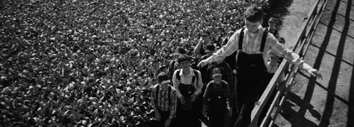
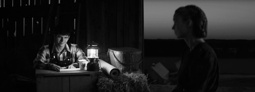
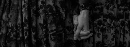
Cinematography by Luc Montpellier
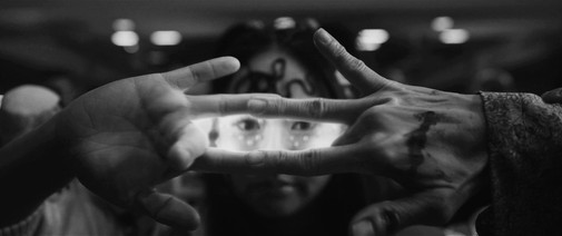
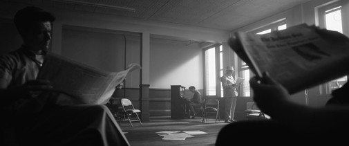
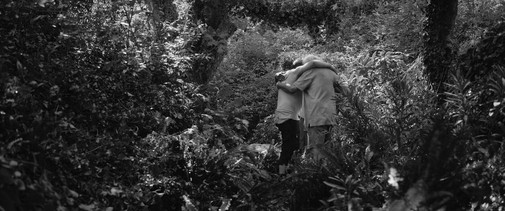
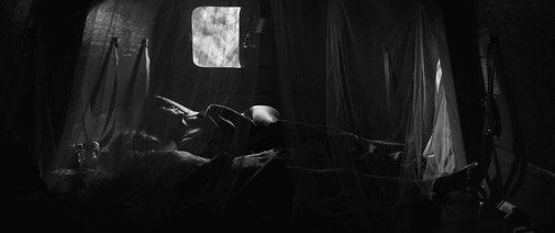
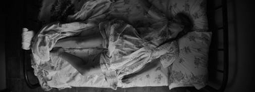
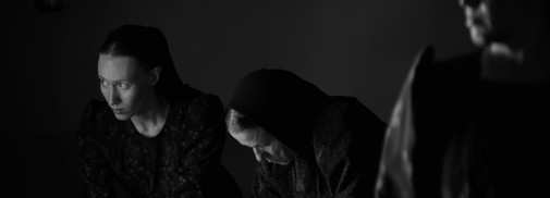
It's time for a bold statement – if Polley had delivered a black-and-white Women Talking to theaters, the film would have nabbed a Best Cinematography nomination. The lensing is so stark, so beautifully calibrated in terms of deep shadow and bright light that it only gains with the transformation. Honestly, the muddy colors of the original are already so faint that a better exercise might have been to restore the images to a less desaturated form.
Which of the 95th Academy Awards Best Picture nominees would you like to rediscover in black-and-white?


Reader Comments (5)
ALL QUIET and TÁR, I'd wager, would work either in color or in black-and-white. Hoffmeister's work is incredible while I understand your qualms on ALL QUIET's color grading.
ELVIS and THE FABELMANS all looked much better to me in B/W. Either removed the visual noise (former) or just evoked a stronger sense of nostalgia while deconstructing it too (latter).
My personal pick is WOMEN TALKING - it looks stunning in B/W and probably would convey its atmosphere even more (and I love it already in its current form). I do wish they have gone all the way with B/W. It recalled some really evocative European films in those still (I remembered THE WHITE RIBBON for some reason). Montpellier's lensing is terrific.
The others do not really benefit from B/W and were heavily reliant on colors to tell their stories (and that's not a bad thing at all).
Always loved this series, Cláudio.
The Avatar B&W photos took my breath away. So beautiful!
This is a really cool exercise, and you’ve done a great job choosing the shots for each film. Such a lot of work!
For me, the Avatar photos stand out as showing the technical innovation, imagination, and freedom of that film that get taken for granted when we are highlighting narrative.
I love this series! And I think you're right re: WOMEN TALKING. In fact I love that film, but I honestly think the lensing held it back a bit. They either needed to make it B&W as you say for a more evocative feel OR saturated the images more to really convey that this is happening in the present day. The in-between choice of desaturated color they went with never sat right with me.
OR my preference which would've had the movie either in B&W or its current form but then the colors appearing/brightening (ala Wizard of Oz) at the end of the movie once they've made their final decision. It's obviously showier and a bit of a cheap trick but I think it would've been effective!
I just watched Women Talking and... whoa... that is a film and fuck us men for being such assholes.
Women Talking in B&W resembles The White Ribbon.