Oscar History
Film Bitch History
Welcome

The Film Experience™ was created by Nathaniel R. All material herein is written by our team. (This site is not for profit but for an expression of love for cinema & adjacent artforms.)

Follow TFE on Substackd

Powered by Squarespace
Keep TFE Strong

We're looking for 500... no 390 SubscribersIf you read us daily, please be one.  

I ♥ The Film Experience

THANKS IN ADVANCE

What'cha Looking For?
Subscribe

Entries in Unsung Heroes (14)

Friday
May132011

Unsung Heroes: The Sound Design of 'Searching for Bobby Fischer'

Michael C here from Serious Film to showcase an achievement in a film that has been near and dear to my heart for almost two decades.

What is the sound of a person thinking?

Most of us probably don’t often consider such lofty questions, but when you are a sound designer dilemmas like that crop up all the time. The sound design team behind Stephen Zallian’s 1993 chess prodigy drama Searching for Bobby Fischer faced that challenge and then some when they set out to make a chess story work on screen despite it being the least cinematic subject imaginable, give or take the Dewey Decimal System.

Zallian’s solution was to ignore the intricacies of the game, constructing the matches as stylized montages that emphasize the emotions of the players over tactics. The sound designers – under Head Sound Editor Beth Sterner - outdo themselves in these scenes, building crescendos out of the furious clacking of pieces and the occasional island of stillness. Not only does this make chess palatable for general audiences but, more importantly, it gets to the heart of the material.

For a serious chess player, especially a seven-year-old one, the stakes are life and death. When, for example, a queen is blundered away, the echo of the piece against the table perfectly captures the sudden pit of the stomach realization of an irrevocable screw up. Without a moment spent explaining the rules, much less the advanced strategy at play, the sound design allows us to the grasp the changing balance of power every step of the way.

Beyond sidestepping the tedium of the game, the sound team deserves praise for creating a series of distinct aural environments to show the journey of the young chess genius. During the first joyful scenes of play in the park the soundtrack is bursting with life. The main action has to jostle for room in the mix with the sounds of players, passerby, and city life. The more Josh is pulled into the insular world of serious chess the more the life is leeched out of the soundtrack. By the time young Josh is having his final confrontations with his teacher, you would think they were playing in a monastery the way each sound echoes in isolation. From the sound design alone we can understand the sacrifice that is being asked of this boy in order to be the best.

At one point, the chess hustler played by Laurence Fishburne insists Josh remember that his opponent is not the pieces on the board but the flesh and blood person sitting across from him. The filmmakers take their lead from this, letting the emotions of the characters, and not the strategy of the game, take center stage. In its own modest way the sound team, with help from the stellar editing of Wayne Wahrman, does for chess what Scorsese did for Raging Bull, abandon the literal reality of the sport in order to get at the subjective experience of what it feels like to be in thick of the battle. 

Friday
May062011

Unsung Heroes: The Casting of 'Zodiac'

Hey there, film experiencers. Michael C here from Serious Film. After nearly two dozen episodes of this series I think it’s about time I touched on what is probably the most important under-the-radar job there is: the casting director.

Think about the challenges casting director Laray Mayfield was up against filling out the cast of David Fincher’s Zodiac (2007). 

The sprawling, decade-spanning narrative covers dozens of important speaking roles, various cops, reporters, and victims, which the viewer is expected to keep straight as they appear and reappear over the course of the story. Actors have to be cast who can embody the personality of the character in a way the script doesn’t have time to explain. Yet within those types, she has to find performers who can deliver a unique flavor that stands out from the pack. Dermot Mulroney, Donal Logue, and Elias Koteas all make believable cops, but no one is going to confuse one with the other.

John Carrol Lynch, loveable "Norm" no more.When it came to casting Zodiac himself, Fincher went with the bold choice of having different actors appear as the killer in order to fit the conflicting descriptions the surviving victims gave in each incident. Mayfield and Fincher somehow manage to pull it off without distracting or confusing the viewer. Each of the various Zodiac incarnations has a distinct feel – the Zodiac at the lake is more thuggish than the sinister Zodiac who threatens the woman and her baby on the highway – but the technique never calls attention to itself.

Mayfield outdid herself with the casting of the more substantial roles of the Zodiac suspects. With a story this maddeningly ambiguous the suspects need to project everything and nothing. We need to believe we may be in the presence of evil, but not tip the scales so far that we can’t buy it when the leads don't pan out as hoped. The casting of John Carroll Lynch – loveable Norm from Fargo – as lead suspect Arthur Leigh Allen is a particular masterstroke. In that riveting interrogation scene the viewer studies Lynch’s face along with the cops trying to decipher if they are witnessing the sneering arrogance of the Zodiac or just dumb belligerence. 

Along with her intuitive casting choices, Mayfield distinguishes herself with the depth of her talent search. Names like Anthony Edwards, Ione Skye and Charles Fleischer aren’t exactly at the top of every casting director's  A-List, but they’re perfectly deployed in Zodiac. They slide into their roles with utter believability and their underused star power in small roles adds immeasurably to the film.

It’s outside the box thinking like this that led Mayfield to provide The Social Network with one of the most memorable ensembles of recent years.

There is little fame and glory to spare for the casting director, yet one hears over and over that it is in the casting that most films are made or doomed. As a viewer, all I can judge is the finished project, and going by those results I think it’s safe to say Laray Mayfield is doing her job as well as anyone working today.

Thursday
Apr282011

Unsung Heroes: The Production Design of 'Oldboy'

Michael C from Serious Film here. I watched the subject of today's column again recently for maybe the third or fourth time and it simply demanded to be written about.


What is it about Chan-wook Park’s Oldboy (2003) that makes it so difficult to shake? 

My thoughts kept returning to it for months after seeing it for the first time. I certainly admired it for its wickedly clever plotting and for the actors' fearlessly committed performances. Yet there are lots of movies I admire that don’t haunt me like this one did.

I think I find my way back to Oldboy so often because it feels unlike every other movie out there. The world of Oldboy is presented as a version of reality (nothing takes place without an explanation, however over-the-top) but the more I think about it, the more I realize Oldboy is as much a fantasy as Star Wars or Blade Runner. Only instead of being set in the future or on a different planet, it takes the world we know and edges it into the stuff of nightmares. A place where seemingly normal locations such as a schoolyard or a computer lab are warped and foreboding in ways we can’t always put our finger on. 

And that is just what the production designer Seong-hie Ryu does with the mundane locations. The script of Oldboy calls for a few places where there is no precedent to draw from. The task of designing a room where a man has to remain imprisoned for fifteen years for no apparent reason is a daunting one. That horrible little room is the emotional core of the whole story. It needs to make an impression. Ryu responds with a masterpiece of art direction, and he does it with some cheap motel furniture, a sickening color scheme and above all else that hellish “inspirational” painting on the wall.

But as unforgettable as that room is, the real tour de force of production design is the apartment of the story’s villain Woo-jin Lee. Just as challenging as crafting a cell worthy of the film's riveting opening sequence, is the creation of a stage suitable for the operatic tragedy of Oldboy’s climax.

So many of the details are so perfectly chosen, from that pond with its narrow walkways to the ominous littering about of antique cameras. My favorite detail is that amazing giant cube that opens up into a closet. It serves the multiple purposes of 1) being objectively fascinating to look at. I’ve never seen one of those before. 2) Fleshing out the character of Woo-jin Lee. Be wary of any man with a closet like that. 3) Being just the right amount of creepy and portentous, and 4) Being a great subtle symbol for the hidden secrets that are about to reveal themselves. Not bad for one piece of furniture.

That apartment, along with that prison where Oh Dae-su spends those fifteen years, goes on a list alongside Jack Rabbit Slim’s in Pulp Fiction and the lair of the Pale Man in Pan’s Labyrinth. Movie locations I will not soon forget


Saturday
Apr232011

Unsung Heroes: The Character Design of 'The Iron Giant'

Michael C here for an episode of Unsung Heroes dear to my heart. It took years for today's film to be elevated to something approaching its proper status. I feel like it's my duty to heap on it some of the praise it deserved when it first hit screens twelve years ago.


There are some elements to our favorite movies that our so beloved, so much a part of our imagination, that it’s tough to think of them as the result of a creative process. Like when you hear how the time machine in Back to the Future was originally written to be a refrigerator or how Errol Flynn was the second choice to play Robin Hood after James Cagney. The way we know it is so perfect, so unavoidably the way it should be that it’s difficult to get your mind around the fact that it didn’t spring from the script to the screen fully formed. 

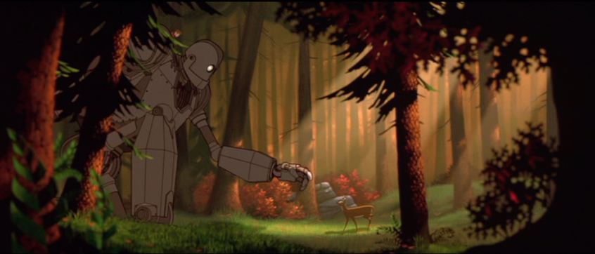
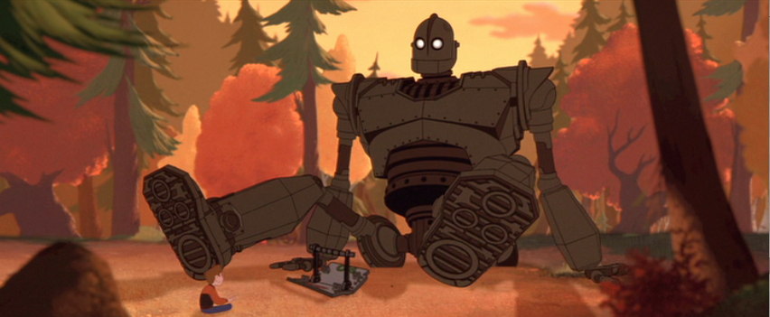
The design of the Giant from Brad Bird’s The Iron Giant (1999) is that way for me. The Giant is beautifully designed down to the smallest detail that reading Ted Hughes’ original children’s book I was a bit shocked to discover how little of it is there on the page. The most detailed the description of the Giant comes on page one when his head is described as being “the shape of a dustbin”. Every other description is limited to it being “giant” or “iron” or both. The book’s illustrations by Andrew Davidson not surprisingly depict him as an eighty foot tall Tin Man, with maybe a little Gort mixed in.  


This makes the achievement of the film’s animation team all the more impressive. With his hollow eyes, bucket head, and immobile grimace it is astonishing just how expressive the Giant is. I was reminded of Gromit from Wallace and Gromit. The Aardman animators got around Gromit’s lack of facial feature by giving him one extremely expressive brow. The Iron Giant team manages a similar trick with mechanical shutters that act as eyelids. These, combined with body language (I love the way he clenches his fists in determination before blasting into space the final time) are incredibly effective at giving the simple Giant a full range of emotions.

Apart from expressing character there is also the basic beauty of the Giant’s design. The title character’s sleek 1950’s B-movie–flavored look is more visually arresting than an army of garish, cluttered Transformers. Part of the wonder of the character is that he seems plausibly functional.

Its ability to put itself back together is present in the book, but Hughes has him stumbling around sticking in limbs like a Mr. Potato Head, nothing like the movie Giant ‘s wonderfully intricate systems of moving parts. 

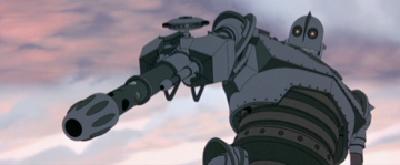
All that attention to detail pays off in spectacular fashion during the climax when the filmmakers reveal an amazing series of surprises about the Giant’s design, including rocket feet and an increasingly terrifying series of hidden weapons. You get the feeling the film’s artists, notably Steve Markowski, head animator for the Giant, could take him apart and put him back together again. It’s that depth of knowledge that makes a character, animated or otherwise, one for the ages.


Friday
Apr152011

Unsung Heroes: Jim James and Calexico in 'I'm Not There'

Michael C. from Serious Film here, eager to dive back into a film I’ve been meaning to revisit for ages: Todd Haynes’ whirlwind Dylan collage I’m Not There (2007). All this Mildred Pierce talk has given me Haynes on the brain.

I was the ideal audience member for Todd Haynes’ I’m Not There. I am a devoted Bob Dylan lover, a big admirer of Hayne’s work, and am literate in pop culture to the point that when Haynes paid simultaneous homage to Fellini’s and Pennebaker’s Don’t Look Back I had no trouble keeping up. And while I found lots to admire in this hugely ambitious project – and I was grateful Haynes didn’t attempt a traditional linear biopic – the film mostly left me cold. I was too conscious of the intellectual constructs at every turn. Dylan’s music can be pretty cerebral at times too, but I love it because he combines that obliqueness with the ability to absolutely destroy me emotionally on a consistent basis.

And yet –and yet - right at the heart of the Richard Gere section of the film, the section I found most problematic, there is this amazing scene that I haven’t been able to shake since I first viewed it four years ago.

If I’m Not There is a whole movie constructed of tangents then the scenes involving Gere playing a character named Billy the Kid riding a horse around a bizarre Old West town called Riddle may be a tangent too far. I get that it’s supposed to represent Dylan’s self-imposed exile in Woodstock in the late sixties, and that the sequence is wild grab bag of Dylan references, but these scenes still stop the movie cold with their randomness.


Or at least that's the case until all the townsfolk wander to the center of Riddle to hear Jim James of My Morning Jacket sing a hypnotic cover of Dylan’s "Going to Acapulco" backed by the band Calexico. 

Covering Dylan is almost a genre of music onto itself and this incredibly soulful take of a relatively obscure track deserves a place along side the all time greats. For a little over three minutes I don’t care about Haynes’s thesis statement. Nor do I care about making sense of the riot of costuming and set decoration I’m witnessing (love the random giraffe). For those three minutes I don’t care about anything but the fact that James, Calexico, and Haynes have managed to tap into that thing I love about Dylan. All those levels of meaning can take a back seat to the visceral experience of the music.

We all have are our favorites movies, the ones we know scene for scene, line for line. But equally valuable are the individual moments, those stand alone gems from those films that otherwise didn’t reach us. The “Going to Acapulco” scene from I’m Not There is such a moment for me. I doubt I’ll ever unravel the mystery of why it made such an impression on me, not that I have any interest in doing so.


Related posts:
all episodes of "Unsung Heroes. Also check out the new songs-in-movies series "Mix Tape"